
Polybook – drgnclw
Forum Archive › Polybook – drgnclw
- This topic has 201 replies, 15 voices, and was last updated 4 years, 8 months ago by
odunov.
-
AuthorPosts
-
March 22, 2019 at 3:20 pm #44098
@drgnclw what u show so far is pretty awesome for a 1st character . my only concern is the wrinkles on the pants feel stange to me but that is very minor issue ! i think that this guy will shine once the face textured ! keep the good work
March 22, 2019 at 9:15 pm #44099@malhomsi Thanks! I guess I could have matched it better to the reference. Comparing it now, the pants seem to be tighter, the wrinkles seem to be finer/thinner and focused more around the knees.
Here’s my reference https://armstreet.com/store/armor/medieval-hosen-hound-of-war
March 22, 2019 at 9:50 pm #44100@drgnclw Have you watched the wrinkles video in the concept section? I watched it recently and it really helps.
March 23, 2019 at 6:13 am #44101@silentheart00 Thanks for reminding me that. I’ll watch it after I’m done with this project. Funnily enough, 2d drawing courses and tutorials can help with sculpting 😀
March 23, 2019 at 10:26 am #44102@drgnclw Been following this on the Discord and my Lord has it come a long way, the materials along are making me jealous.
March 24, 2019 at 3:42 am #44103@thecabbagedetective Thanks, man 😀 Looking forward for your character’s progress.
March 24, 2019 at 11:18 am #44104@drgnclw nice progess, man!
March 24, 2019 at 2:52 pm #44105@nekronavt Thanks, Pavel 🙂
March 25, 2019 at 2:28 pm #44106@drgnclw Your character is turning out really well! The breastplate material is fantastic. And I honestly don’t see a problem with anything else, nor the colors you’ve chosen. What do you think needs critique?
March 26, 2019 at 2:15 pm #44107@theluthier Thanks! Seeing a lot of different colors together kinda scared me that day because I haven’t textured a character before. The day after that I was more comfortable with my color choice. Now I can see some stuff that I can improve but they are either about design or the base materials I’m using (for example the fabric texture doesn’t look good up close) At this point, I need a time machine to fix them 🙂
I have two specific questions, though.
https://i.pinimg.com/originals/68/4e/d5/684ed52be886afdc3a9b553721446a8d.jpg Here’s my main inspiration for the helmet’s painting. The gold paint’s reflection kind of looks metallic to me. I don’t know what kind of a paint/material it is and the only way I can get a similar result is using a metallic value of .6-.7. Would it be acceptable or is there another solution for this?
It’s obviously a WIP. I’m going to refine the lines a lot more and add some leaves like the reference and change the text’s color 🙂
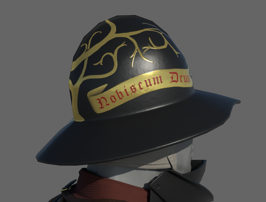
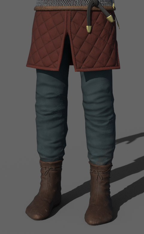
And my second question is about the pants’ color. I used a greenish blue to get some contrast with other colors ( @malhomsi gave me the advice on the Discord server) and I think it looks fine. However, I had the thought of using lighting to get that contrast instead of changing the color scheme. I’m really inexperienced with lighting, though. Would it be worthwhile to try?
March 26, 2019 at 4:10 pm #44108@drgnclw The helmet reference is very interesting. I love the detail and elegance of the design. While I’m not an expert in medieval soldiers or armor, my impression is that this particular helmet feels a bit flashy next to the humble earth tones of the rest of the outfit. My first thought is to make the helmet a similar texture and material to the breast-plate.
BUT if you’re set on this helmet, my advice is to not leave out any detail. I know you’ve said it’s a WIP and you’ll be adding the leaves. It feels WIP next to the reference which has tons of variation in the gold color and surface quality (like your breast-plate has already). So make sure you nail the detail and I think you’ll arrive at a quality worthy of the reference.
I think you’re close to the metallic quality. Honestly it looks like your HDRI (or lack of HDRI?) may be the problem. It doesn’t seem like there’s enough for the gold to reflect realistically. An HDRI will provide that world of reflection where the default grey scene + lamps do not provide enough for realistic reflection.
As for the pants, I think both the tope and dark green are good choices. I prefer the tope personally. But either way should be fine imo.
March 26, 2019 at 5:09 pm #44109@theluthier My idea is matching the helmet with the brass buckles and metalwork of the belt, the sword and its scabbard (Which I haven’t textured yet. They will be brass too) So I’m hoping things will make more sense when the sword is in its place.
Though there aren’t many surviving examples, from what I’ve gathered, some soldiers had their helmets painted to make them more aesthetically appealing and because it was cheaper than a shiny polish. I’ve seen some considerable variety ranging from simple checker patterns to a monster face.
https://s3-eu-west-1.amazonaws.com/lowres-picturecabinet.com/101/main/2/429356.jpg
The artwork in the example is really cool but the shape of the helmet is rather crude and more on the cheap side compared to some other knightly helmets.
Once all the branches and the leaves are there, I will add the shadow details on the intersections then some grunge, wear and scratches. I’m aware the details are critical.
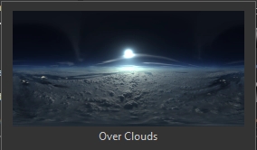
As for the HDRI, This is the one I used. I wasn’t aware of it at the time as I though I was just using one of the studio HDRIs. This isn’t a particularly good one but it’s useful to see places like underside of the helmet or the boots. SP is a bit lacking in that regard.
 March 27, 2019 at 9:03 am #44110March 27, 2019 at 10:13 am #44111
@drgnclw it is a badass work !
March 27, 2019 at 4:22 pm #44112@drgnclw I starting to come together real nice. This is some wicked awesome character for your first try!! I like the darker pants better 🙂 keep it up!
-
AuthorPosts


- The topic ‘Polybook – drgnclw’ is closed to new replies.