
BC4-1810 Homework, Grady Pruitt
Forum Archive › BC4-1810 Homework, Grady Pruitt
- This topic has 56 replies, 10 voices, and was last updated 7 years, 10 months ago by
Kent Trammell.
-
AuthorPosts
-
October 13, 2018 at 12:21 pm #42297
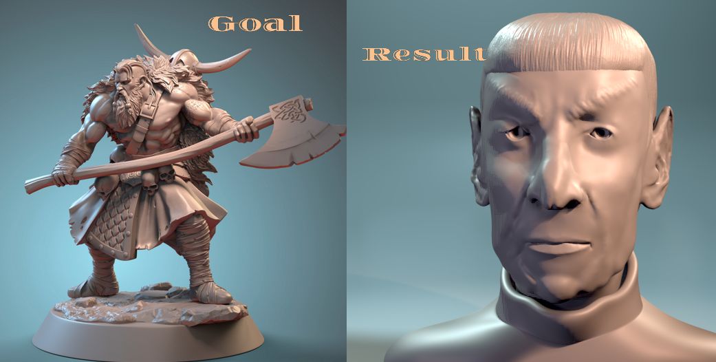
At this point… I feel like all I’m doing is minor tweaking to try to match better, but this is a much closer result, I think.
 October 14, 2018 at 5:24 am #42298
Well… If I don’t get any more work in, I’m happy with how far I’ve gotten, but hoping I can find a little time to work on this on Sunday. I’d like to work in some imperfections, even if only a little.
 October 14, 2018 at 5:39 am #42299
@gradyp It’s come a long way, looking great Grady! 😄👍🏻
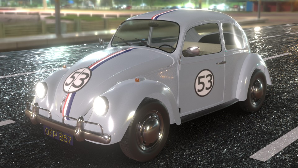
October 15, 2018 at 12:57 am #42300Wish I’d spent a little more time sooner on some of the other things so I’d have had a little more time to work on imperfections here at the end. Still… All in all, I’m pleased with how this one turned out. After fighting against this all week, I went with reference and changed the color some… I kept feeling like it should be light blue, but all the references I kept finding were saying it was more of a pearl white. This was a fun one to do.
(Car model by Natman on BlendSwap)
 October 15, 2018 at 2:58 pm #42301
One thing this week as brought up for me… I’ve been wanting to do a 1957 Chevy Bel Air Sedan, and almost went with that one for my project this week. I decided to hold off on that so that I can go through the vehicle course stuff most went through over the summer. That particular project has a bit of meaning for me, because my great-grandfather had one he bought for $3000 that has been in my family for years (and still was last I knew).
That color match exercise taught me that you can go beyond 3-point lighting and have some fun with it 😀
The VW Beetle was just fun to do 😀 Don’t know why I got out of working on Blender so much of this year, but this class has been a fun way of getting back into the flow 😀
October 15, 2018 at 4:12 pm #42302@gradyp Grady that car is fun like that! 🙂
Anyway seeing this second, somehow warmer version in colors, it straight suggests that is the better one, but only till the point when not scrolling back, because then realizing that the first one is still good. So finally being not sure which one 😀
October 16, 2018 at 12:52 pm #42303@gradyp A little late to the party. Lighting match looks good. Either car looks good, but I like the warmer version more. Good work.
October 18, 2018 at 4:30 pm #42304Hmmm… Not seeing a grade for me on the spreadsheet for week one or two. Maybe just an oversight…
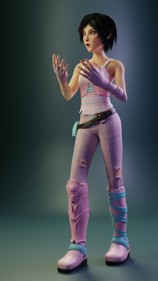
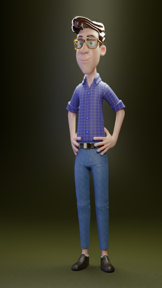
Anyway, been having fun the last few days with this week’s stuff. While I didn’t create new texture maps for the skins on these, I did create the materials for all and even did my own textures on all the clothing. Still not done… Been having to go back and forth between 2.8 and 2.79 to get everything working correctly and as such, the hair on these are just placeholders until I get them back into 2.8. If nothing else, I’ve learned quite a bit on the lighting side, I feel.
Comments and suggestions welcome, particularly on the SSS.
 October 20, 2018 at 2:01 pm #42305
I’ve had to go back and forth on these to get things to work.. had to use 2.79 to pose, then started trying to texture in 2.8, but ran into problems (specifically on Victor) trying to go into edit mode, so went back to 2.79 and imported the textures I’d done and tweaked them, making sure I had slots for the hair, then went back into 2.8 to get the new hair shader BSDF… Fun challenges all around, but I like the results.
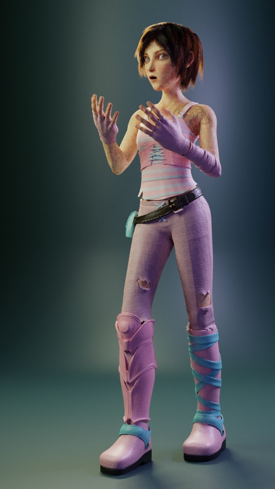
With Sintel, for some reason, the packed textures weren’t working in Cycles, but when I unpacked and relinked them, it worked. not sure why, but it did.
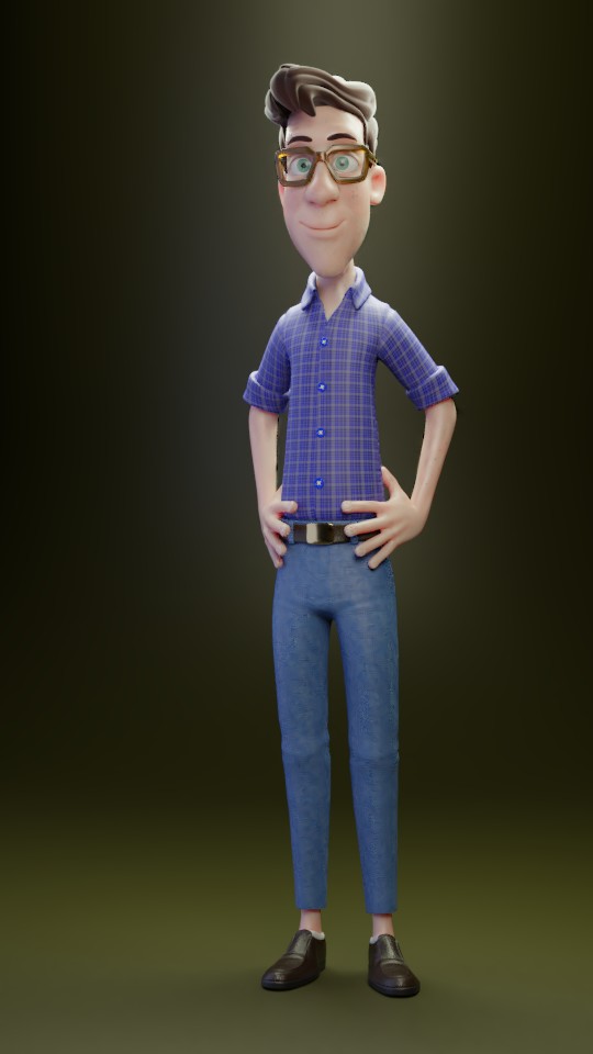
Finding the right way to do the hair on Vincent was a little tricky. I think I eventually went with a darker color and the roughness way up to get it to look like this using the shader node. the big difference is that Vincent’s hair was a solid, rather than particle, hair.
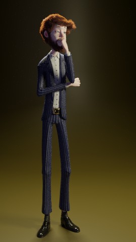
Other than not being able to go into edit mode, Victor wasn’t too hard. In fact… It may seem like I did a lot of work to do 3 characters (and, it was, sort of), but a lot of textures are reused with modifications for that character. Even the leather was a reuse of the one I did on Herbie.
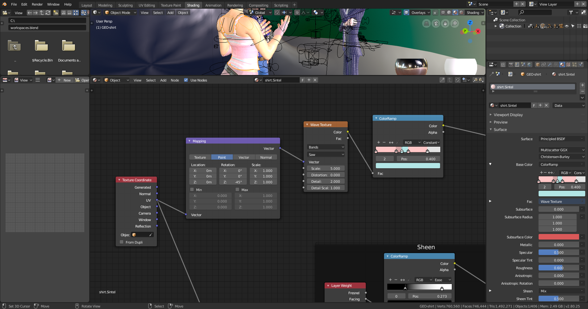
For anyone interested, the stripes are 100% procedural on all 3. The only difference on the pinstripe suit was that it was only 2 markers. Vincent’s plaid was a little more complicated, but was achieved by duplicating the stripes, rotating one 90 degrees and then color mixing them. It’s actually 2 sets of criss-cross stripes on the plaid to get the yellow stripes to mix correctly. You can adjust how often the stripes repeat simply by adjusting the scale of the wave texture.
Incidentally, @theluthier … You mentioned Bartek Skorupa’s wood texture in the shader forge tutorials.. it was that tutorial, or specifically, the mod function, that was the key to being able to doing stripes like this… but the Wave function with the Saw mode (which wasn’t available when Bartek did that tutorial) handles what the Mod node group did, but in a better way. that you don’t have to pay as much attention to the shift.
One note… here, I’ve used UV coordinates… the BEST way to do use this pattern on material like clothing is to mark your seams where clothes would naturally have seams. Like for a shirt, along the under side of the sleeve, around the arms, around the collar, along the shoulder, etc. For Vincent’s, I did create a separate UV map (so it didn’t interfere with the main UVs) to get the look… I could have done it without doing that, but I think the area around the shoulders was better when done with the more natural seam placement. That said, I have used this node set up on generated and Object, so it can work on those as well.
I think the biggest thing I learned, though, was in lighting. Particularly when Kent said to use area lights in the last stream. So this time, I only used area lights to light everything.
(Got one more rendering and I’ll work on the color match later tonight/tomorrow)
October 20, 2018 at 2:34 pm #42306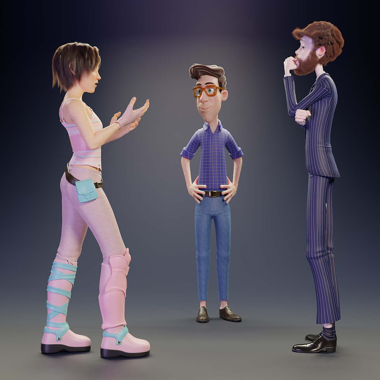
Vincent and Victor listen to Sintel describe one of her adventures.
October 20, 2018 at 4:37 pm #42307@gradyp really great work. Lovely scene you made
October 22, 2018 at 2:50 am #42308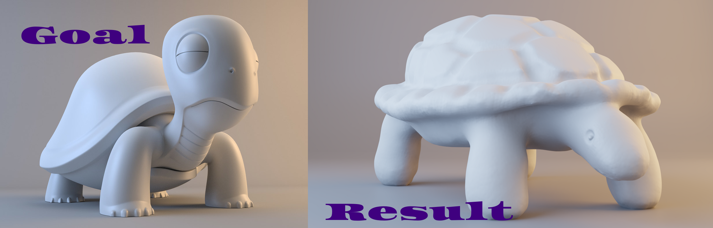
I had a lot of trouble with this one. I don’t think my material was quite right, so the highlights never quite looked right. and I couldn’t quite find the right color/saturation/light strength combination that more closely matched.
All that said, I think this is much better than the original render I did to show off this sculpt that I did. It’s from a personal challenge I gave myself to spend 15-30 minutes each day for 30 days to get back into the habit of working in Blender while practicing sculpting and working on learning to focus on larger forms first before jumping into detail. The shell detail came outside of the 30 minutes, and I fixed the feet so they all touched the floor. It’s also one of hte first things I ever had 3D printed, so this model is among my favs, even as “bad” as it is.
(and thanks to @yukinoh1989 for finding the great image to match to.. Was one of the only ones I found with an object that felt it was of “similar” size and theme.)
October 23, 2018 at 9:06 am #42309@gradyp I’m scratching a hole in my head trying to figure out how I’ve missed grading ALL your assignments so far…sorry about that! I’ll catch up with your thread today.
October 23, 2018 at 4:42 pm #42310Again, sorry for being so late. Here comes 3 weeks of feedback 🙂
Week 1
Kudos for exploring Eevee with the toy truck exercise in week 1. I feel that Cycles has a slight edge in realism over you Eevee one but not by much. Truck definitely feels plasticky in both.
I don’t have any significant criticism of your day time bedroom scene. Looks believable to me and appropriately colored (or desaturated) according to the seemingly overcast environment in the window. Your bedside lamp in the night scene is a little too strong imo. It’s illuminating the brightly all by itself. I do like the warmth in contrast with the bluish moonlight.
Adding in the additional effort of the light match, you’ve earned an A+ in my book for week 1.
Week 2
Your light match is very close to the source. The only thing that’s missing imo is the subtle red fill light coming from the right. It’s most apparent on the edge of the axe blade and under the skirt around the character’s left knee. It’s quite subtle but noticeable the more I look at it. Interesting choice to go with red there…I wouldn’t have thought of that. It’s a B on that one for me.
Your beetle made my favorites as I remember. I like the variety of reflections especially. It really helps to establish the objects into the believability/tangibility zone. A
Week 3
3 characters this week? Way to take the easy way out Grady… 😅 Yeah right, you did a ton of work. I like your Sintel version. The pink and teal work well together, both in lighting and material colors. Vincent looks good aside from the yellowy-green bg/floor color. They don’t jive as well as they could. I swapped in a purply pink which works a little better imo:
 Victor has a similar issue, but I didn’t swap out the color for a new background. I love the 3 rendered together! Nice group shot, good lighting to go with it. Oh and the SSS looks pretty good. Not too translucent nor is it too subtle. Only note from me is that Vincent is a touch shiny on his arms.
Finally, your light match is super close to the source. Hard to believe they’re not different models rendered in the same scene. Good job!
A for week 3 👍
October 23, 2018 at 4:48 pm #42311@gradyp glad I could help. You’re work sure is amazing. Especially those characters. Great work
-
AuthorPosts


- The topic ‘BC4-1810 Homework, Grady Pruitt’ is closed to new replies.