
Collab2021 – WIP – hoidolario
Forum Archive › Collab2021 – WIP – hoidolario
- This topic has 51 replies, 11 voices, and was last updated 5 years, 4 months ago by
Martin Dablander.
-
AuthorPosts
-
April 18, 2021 at 12:18 pm #67123
Homework Submission – Week 2 – Nature-Rocks
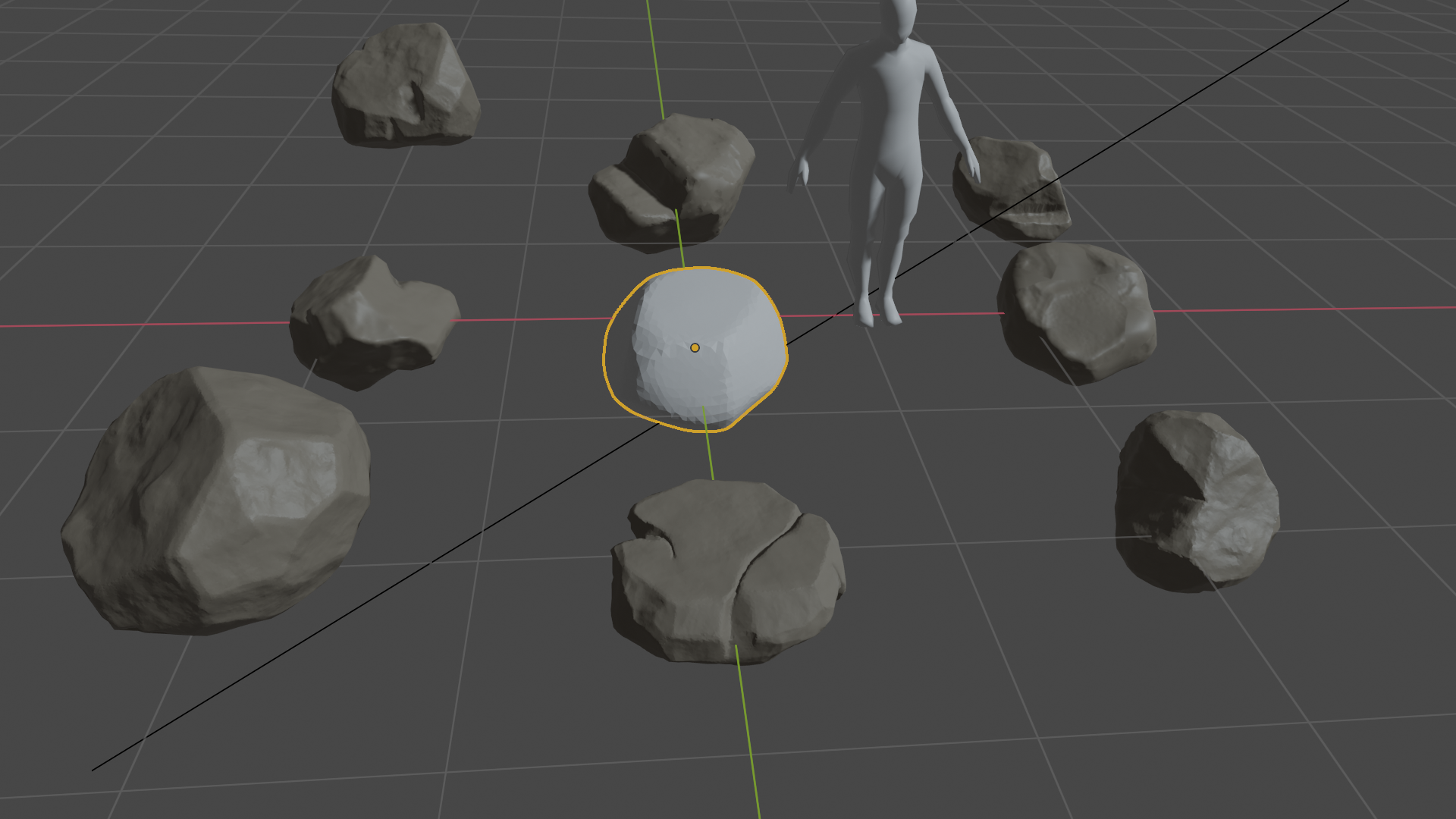
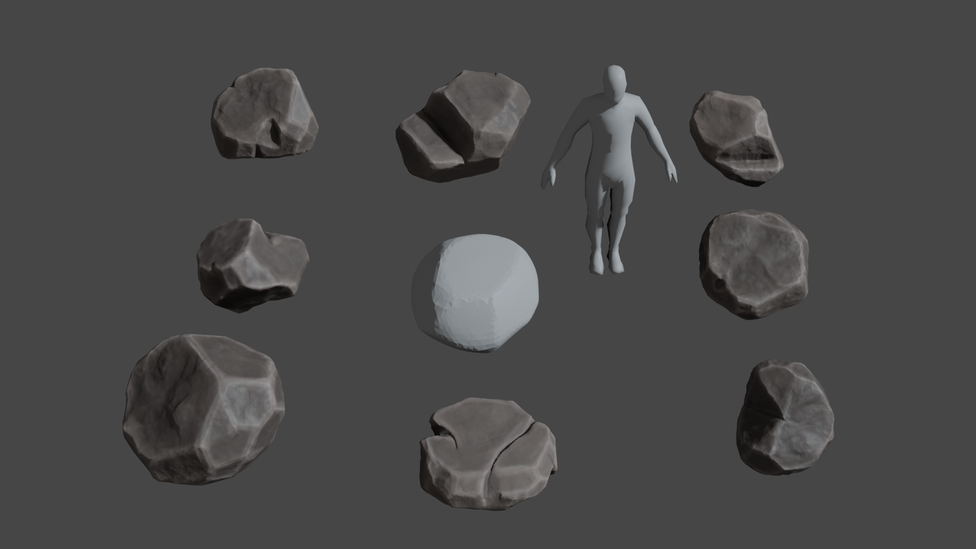
So. Finally done with my homework. All of my low poly rocks got a UV-unwrap plus a normal map baked onto. It was my first time baking, so I had to wrap around my head a little bit, but it was much easier than the retopo task. The rocks got only a basic color so there is a lot coloring to to do for next week. Will there be a color palette or are we supposed do pick colors from the reference picture? All the Normal maps are uploaded to google drive, and a master file is saved also there.
Here is a picture of the low poly rocks with their normal maps.
 April 20, 2021 at 11:41 am #67124
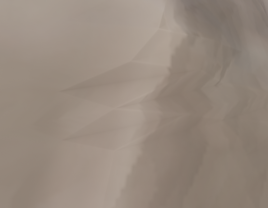
In the last two days the rocks got some base coloring and textures (Ambient Occlusion and Dirty Vertex Painting). I tried to pick some colors from the reference picture. While painting I noticed that unfortunately nearly all of them have some shading artifacts. I’m sure that is a result of a bad retopo. Don’t know how to fix it at this stage. The good thing is, that you only can see the artifacts if you come really close. So maybe that is not so bad.
Artifacts
 April 21, 2021 at 9:51 am #67125
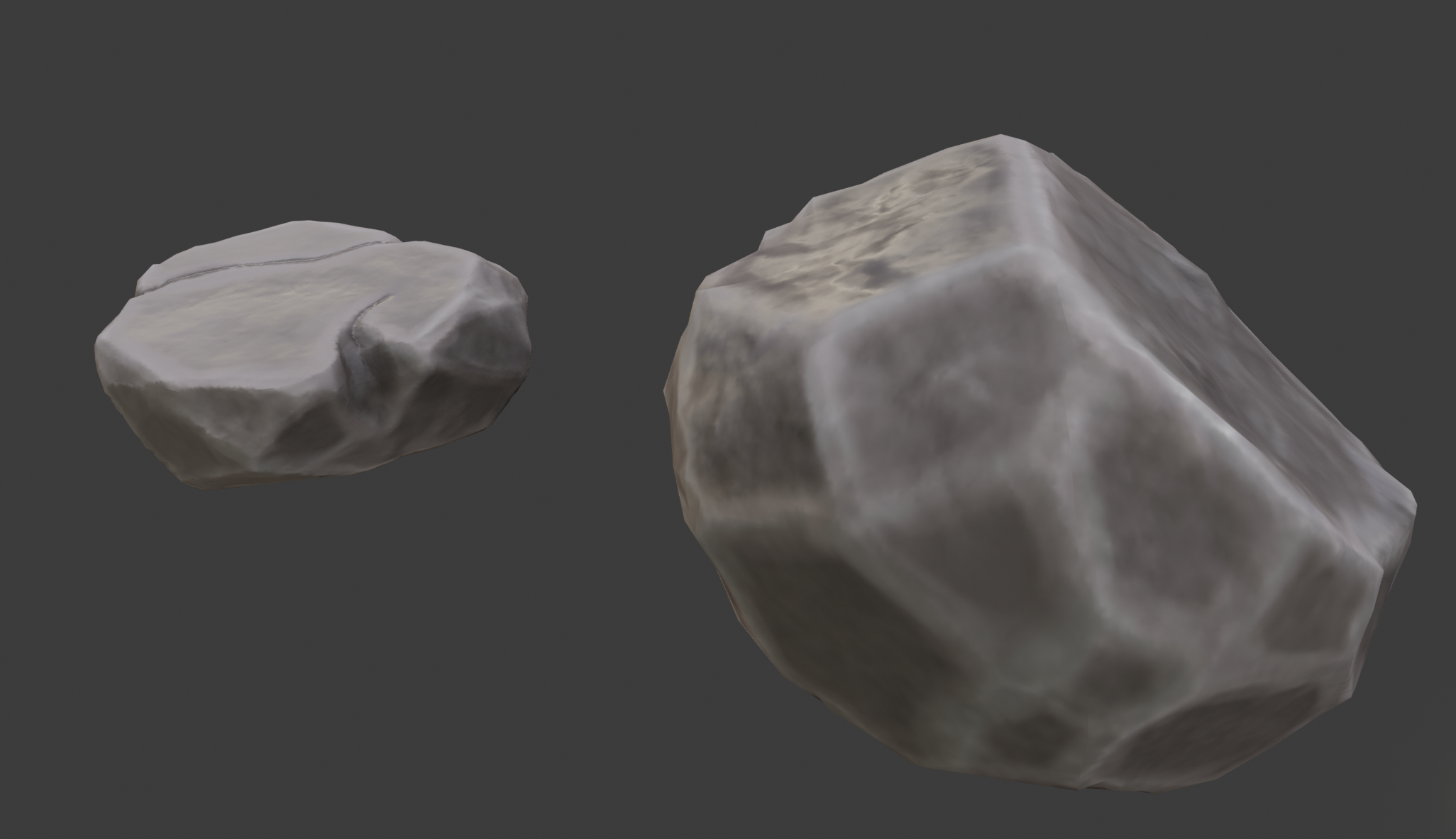
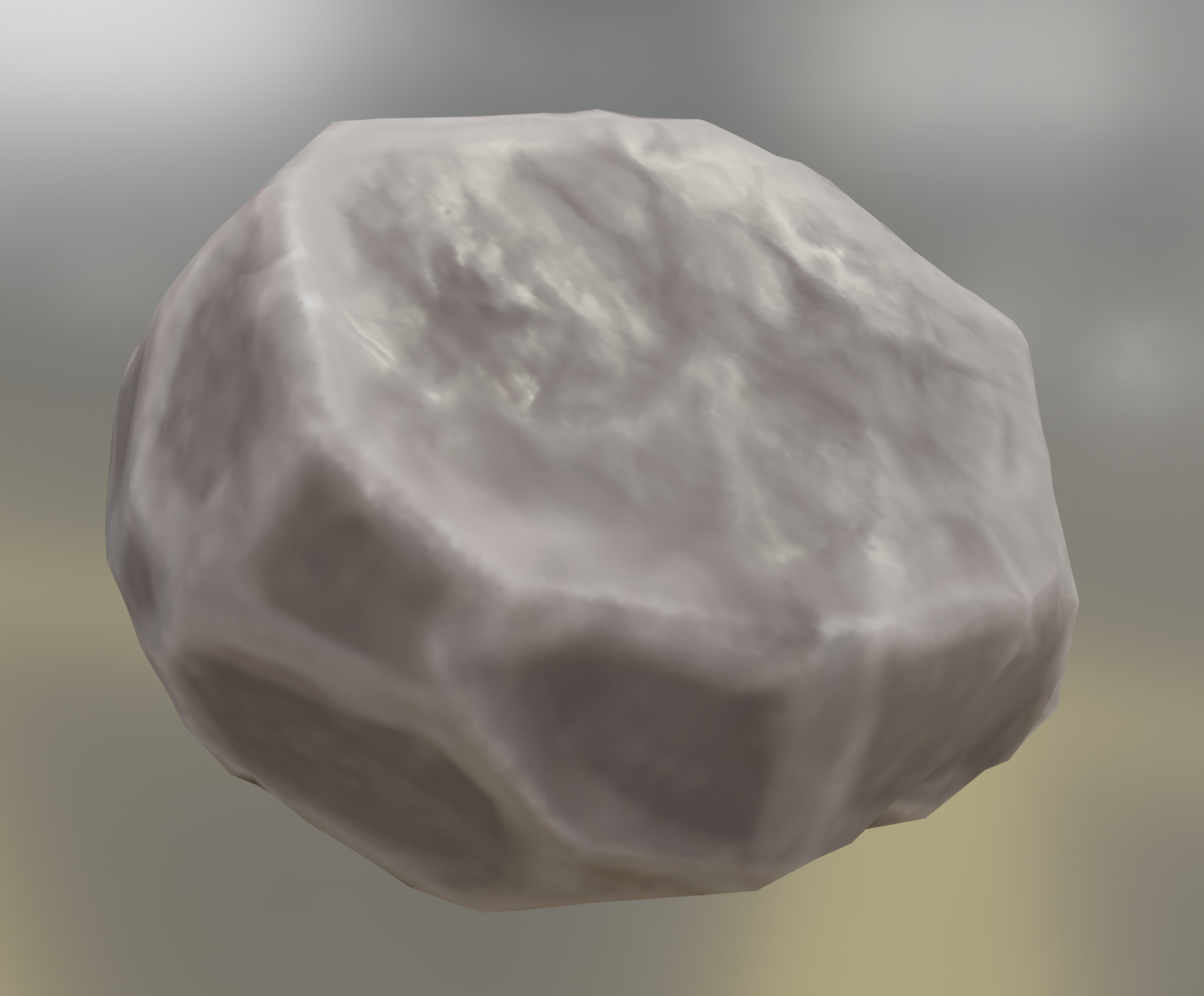
Because every rock had its own UVs and texture set, and I did not want to redo the painting process, I spend todays time in figuring out how to reduce the texture amount, and how to combine all the existing UVs. As a final result I was able to reduce the texture size from 16MB to 4MB and form 32 different Textures to only 2. After that I played around with some roughness and specularity settings. Is there anything left to do, or should I consider the rocks finished? If so, is there any easy stuff I can help out elsewhere? Bear in mind, that I’ m a beginner tough. @spikeyxxx
 April 21, 2021 at 11:18 am #67126
Hey Martin this is great!
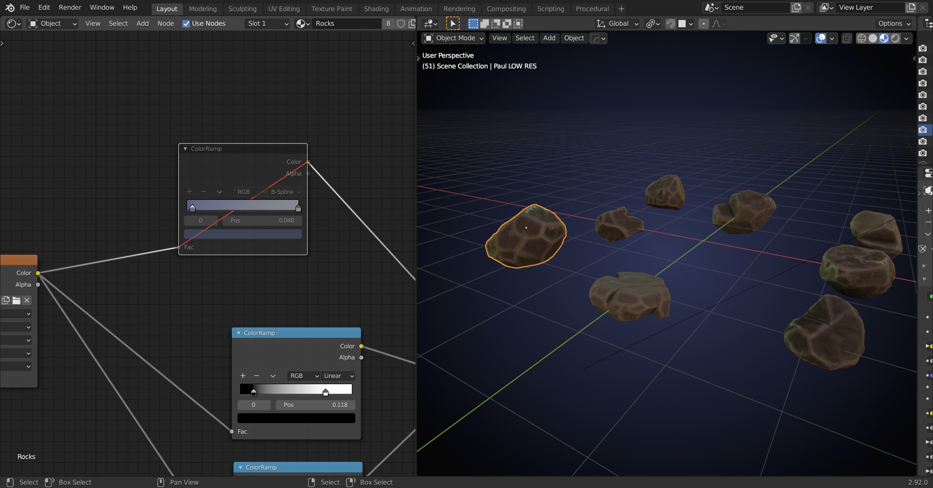
The only thing that is bothering me, is that the contrast of the edges is too strong to my liking.
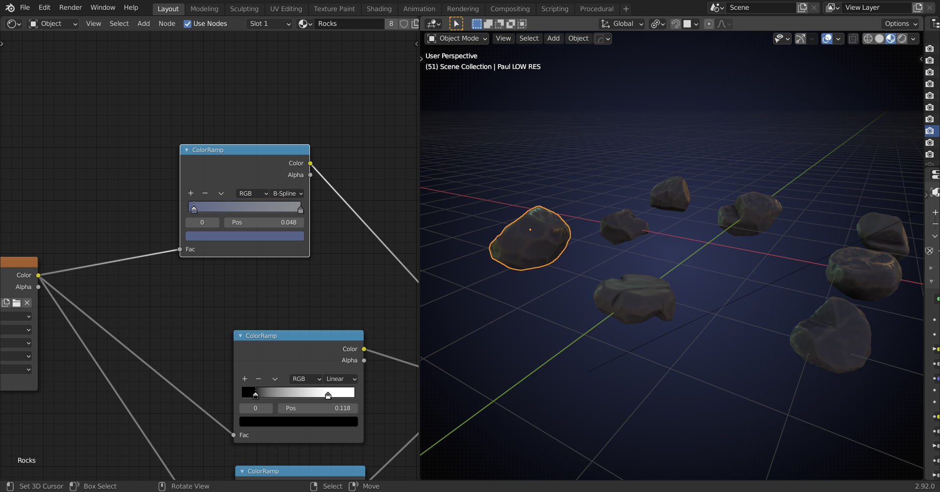
Maybe use a Colorramp after your color texture to reduce that…
Your version:
 with Colorramp:
 With different lighting…your version:
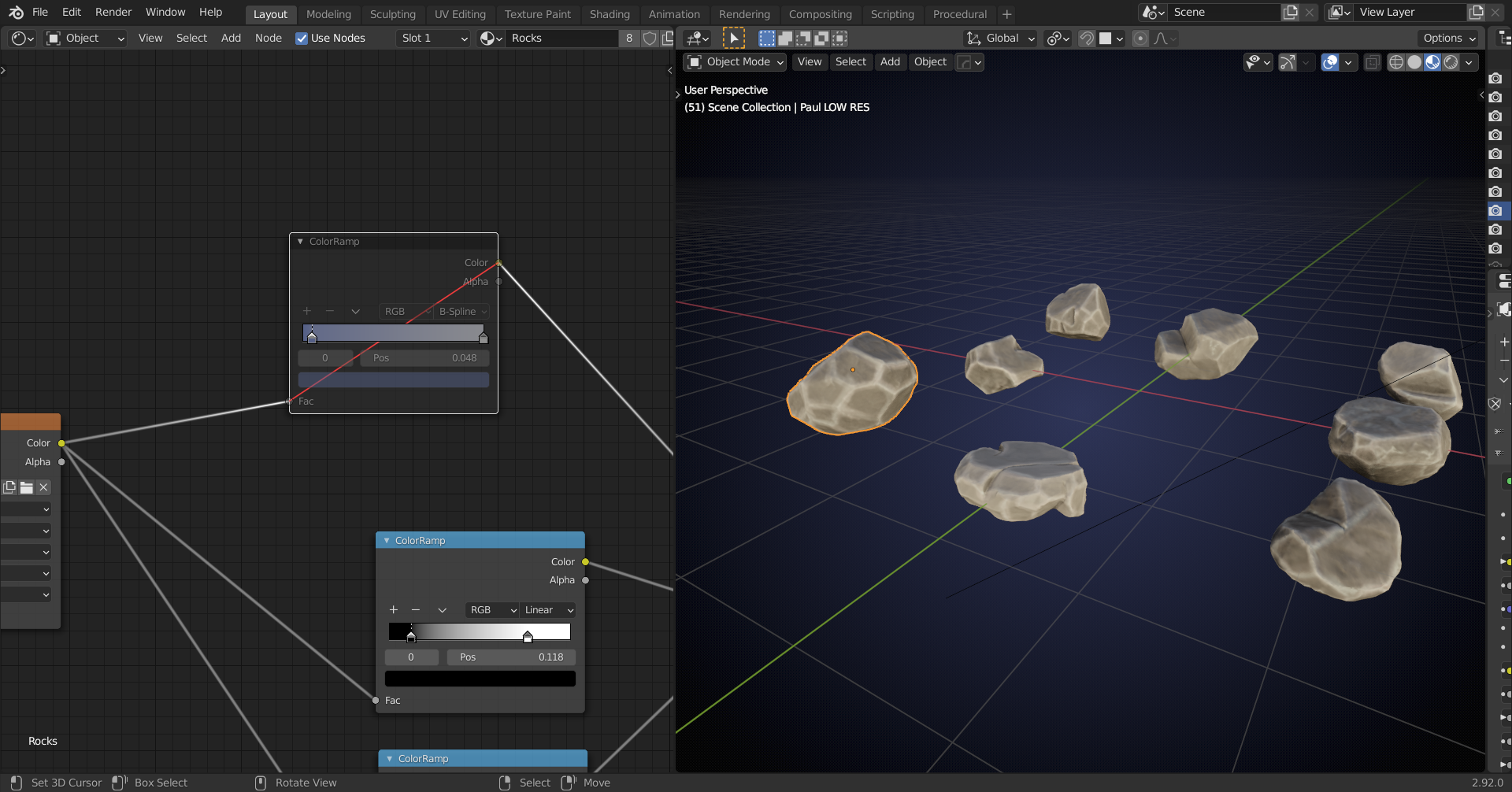 and with Colorramp:
 I don’t mean to say: ‘use exactly this Colorramp with these values’ or so, just find a way to reduce the contrast (maybe just a Color > Brightness/Contrast Node…)
But this is only my personal opinion; if you like the contrast, then keep it!
The rocks with their detailing and Normal Maps look absolutely fantastic!
April 21, 2021 at 2:35 pm #67127Thank you @spikeyxxx. You are absolutely right about the contrast. I had so much fun in painting, that I didn’t notice it. Furthermore it also does not match the artwork, so I habe definitely to to something against that. I will try your suggestion with the color ramp. It looks like it has the desired effect.
April 21, 2021 at 5:02 pm #67128Great job @hoidolario ! Definitely full points for the week 2 homework. I see you’ve gotten some good texturing in already, but I want to go back and look at the low poly topology first since you mentioned getting some artifacts.
If you have the time, I would recommend going back and trying the retopology again. You mentioned using RetopoFlow and I’m guessing used contours? I would actually recommend using mostly just PolyPen for these and placing vertices wherever the mesh substantially changes direction. Since these will be given a baked normal map and won’t be animated, you can even use triangles where necessary. Here’s a quick example of what I mean:
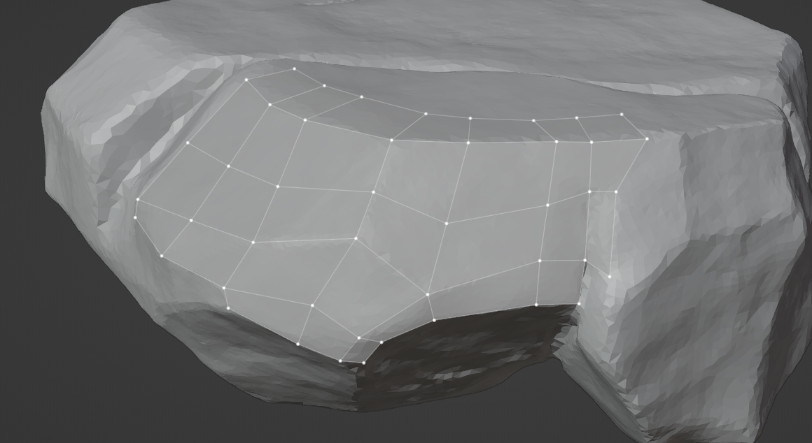
It’s a lot more simple while still keeping tighter details like the cracks. Try to also avoid everything pinching together at a point like in the center of yours. Again, if you need to connect things with triangles, that’s totally fine, but try to keep the geometry as simple as possible, especially where it is flat.
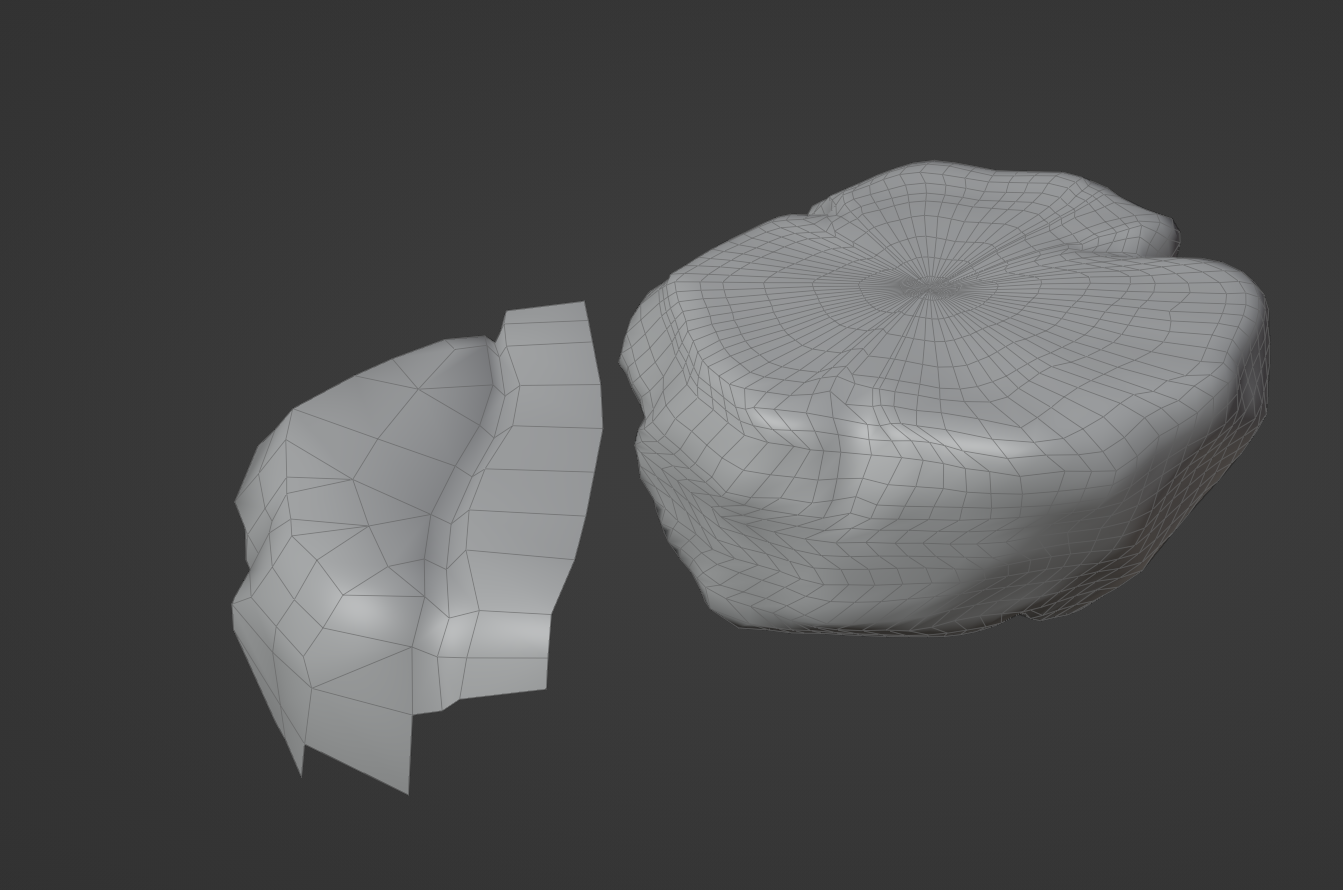
Apologies it took us so long to grade as it will likely mess up your texturing work, but now that you’ve textured these once it should be a much faster process this time around. If you absolutely cannot afford the time then you could also experiment with the Quad Remesh in the mesh data properties. From what I’ve tried on your models it makes the result too mushy and you’ll lose the nice areas like the cracks, but it could help with getting something down quickly.
Super great work so far, I know this is a pretty wild trail by fire for your experience level, so congrats on kicking butt so far and keep up the good work!
April 22, 2021 at 2:58 pm #67129Hello @jlampel Thank you for your nice grading and critique. As you suggested I started the retopo again trying to consider your advice. I don’t know how long it will take tough. If you find time maybe you can have a short look at my new mesh, and see if that is better now. II’m starting to get comfortable in using the RetopoFlow tools now, but there is still a lot to learn. There are still some problems I don’t know to solve properly, but I hope the low poly style it is more forgiving about these mistakes. Here are some pictures until where I managed to come today.
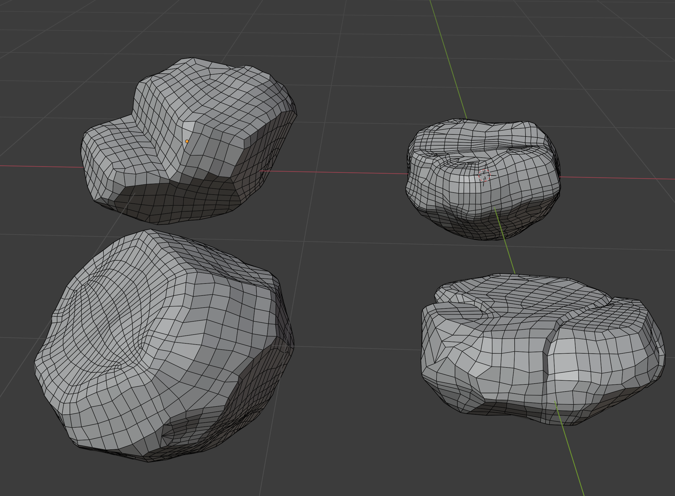
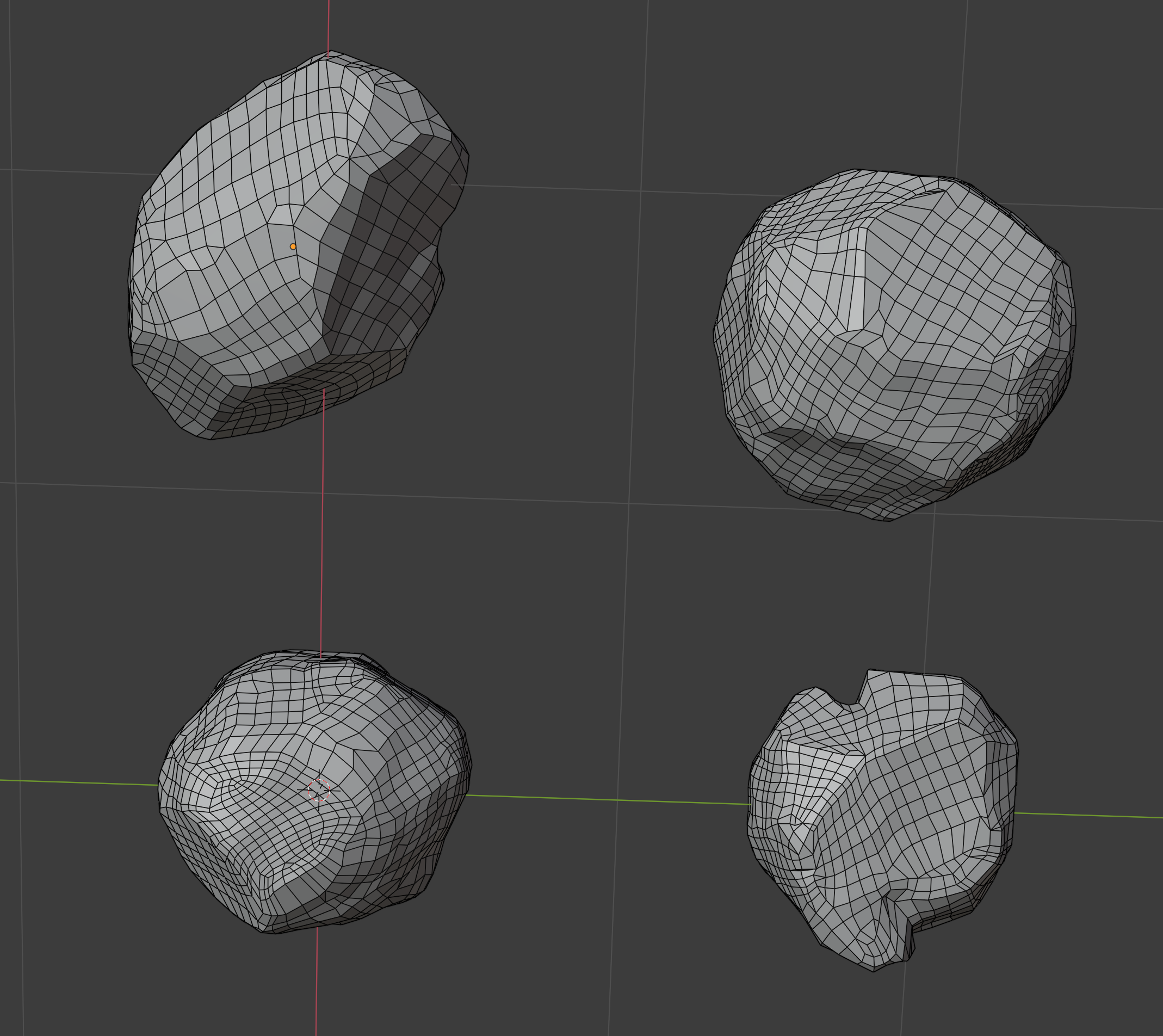
Still don’t know how to deal with such mesh properly.
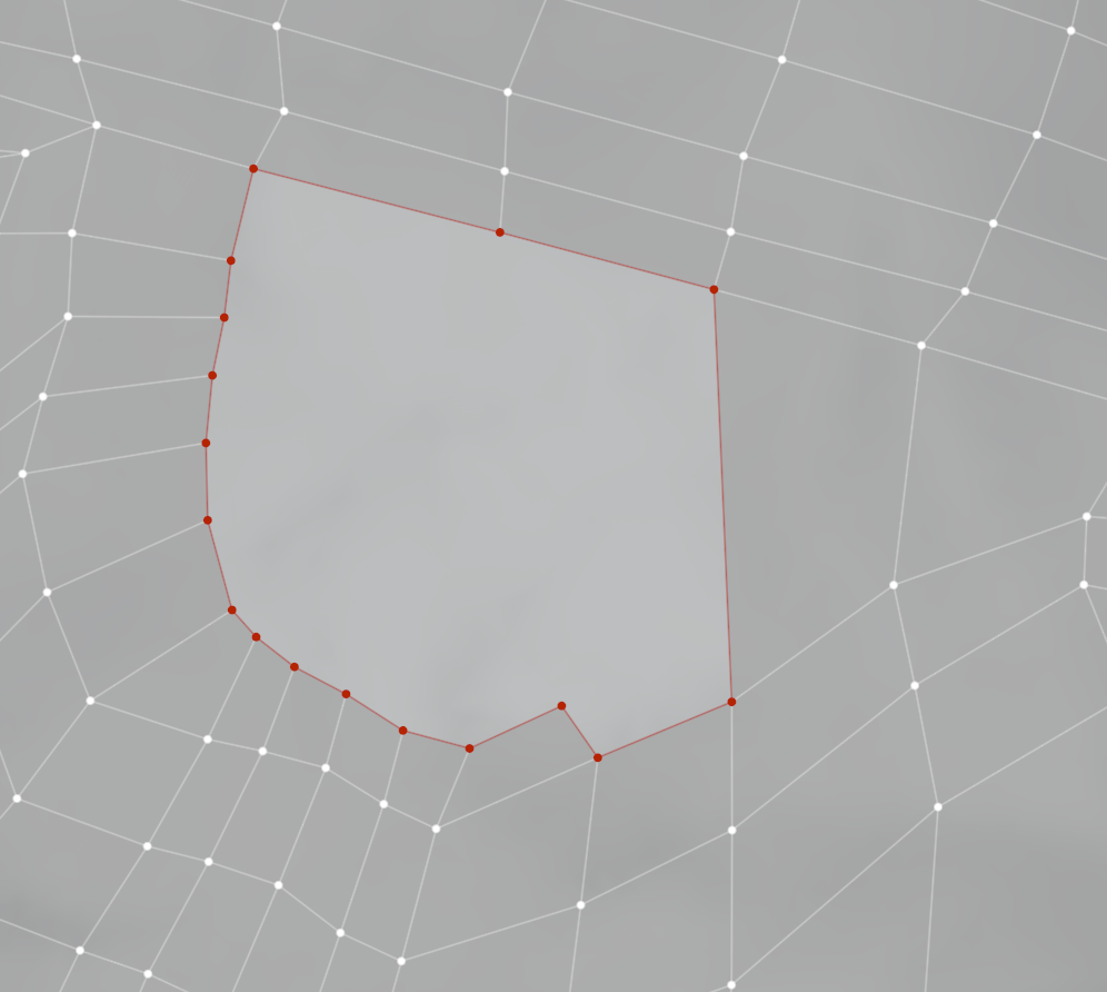 April 23, 2021 at 2:14 pm #67130
Nice job, that is looking much better!
I think part of the problem you’re having in areas like that is overcomplicating the geometry a bit too much. There shouldn’t be that many vertices that need to be combined to begin with. Here’s an example on the left of the density that’s needed for the project in comparison:
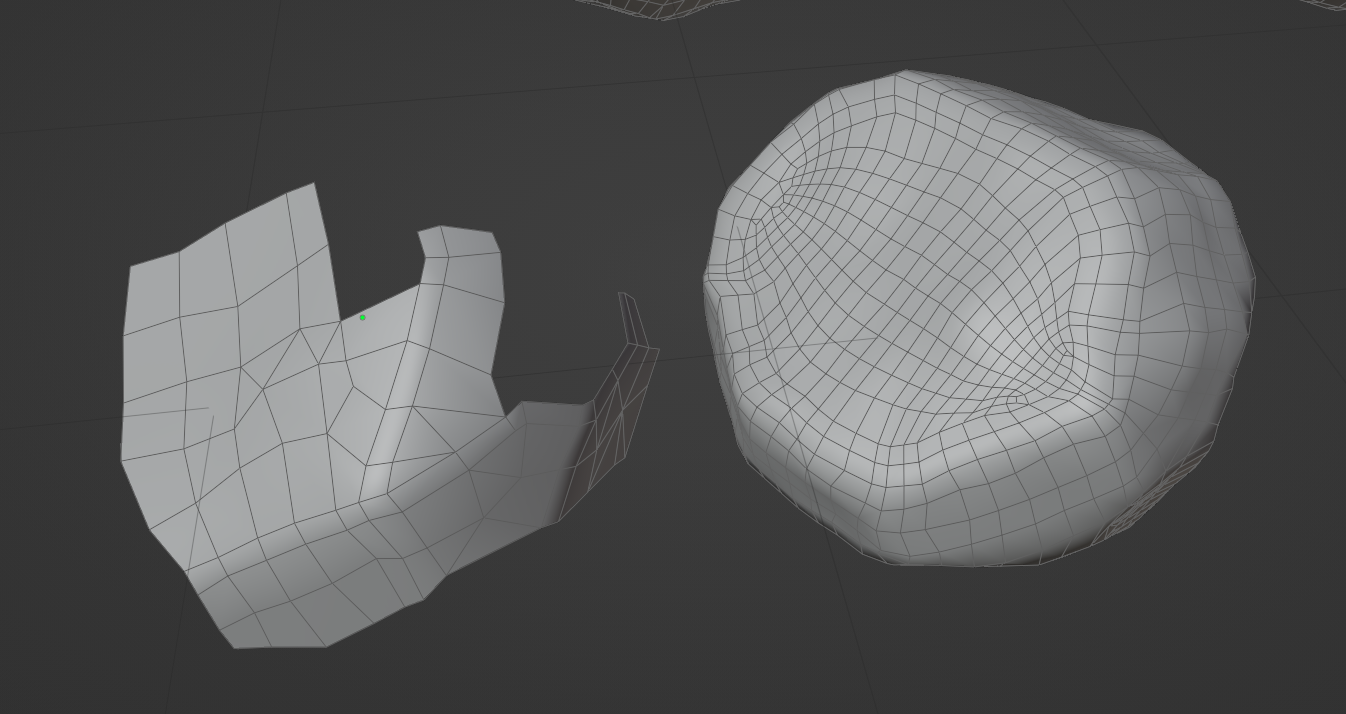
Try to focus on vertices and not so much on edges and faces. If there’s a change in the surface that alters the silhouette of the object from any angle, put a vertex there. If not, a vertex is not needed. You might even try working entirely in triangles if you want to shift to that mindset.
If I had to close a gap like that though, I would do the same thing you did, but try to keep the vertices a little more evenly spaced apart so that the faces aren’t quite so stretched:
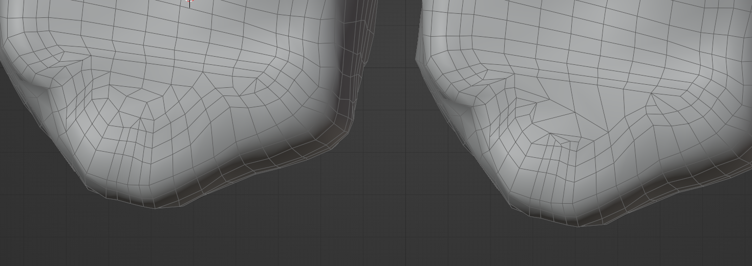
Overall though, these are looking much, much better! You may want to go in and reduce the topology in some of those areas where it gets tight on surfaces that don’t need that much detail, or take another shot at lowering the poly count even further like in the first example in this post if you have the time, but what you have now certainly looks usable to me and we could make it work.
April 25, 2021 at 2:12 pm #67131Homework Submission – Week 3 – Nature-Rocks
First of all I want to say thank you, that you took so much time and effort to provide me some guidance to the retopo workflow. I really appreciate that. I had a hard time in understanding how much mesh density is needed, and how to achieve a properly shaped low res object. I repeated the retopo of my rocks. This time I had much less of these shading issues. Except for one I am really satisfied with the result. After that they got their normals baked and a cavity texture from dirty vertex painting. At last I painted a color texture and played around with the specularity and roughness settings. This time I tried to avoid too much edge highlighting. @spikeyxxx Hope that looks better now.
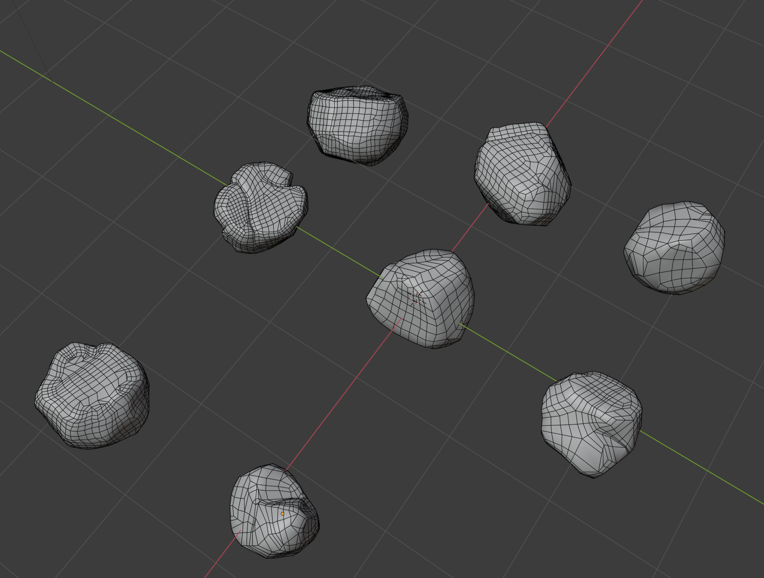
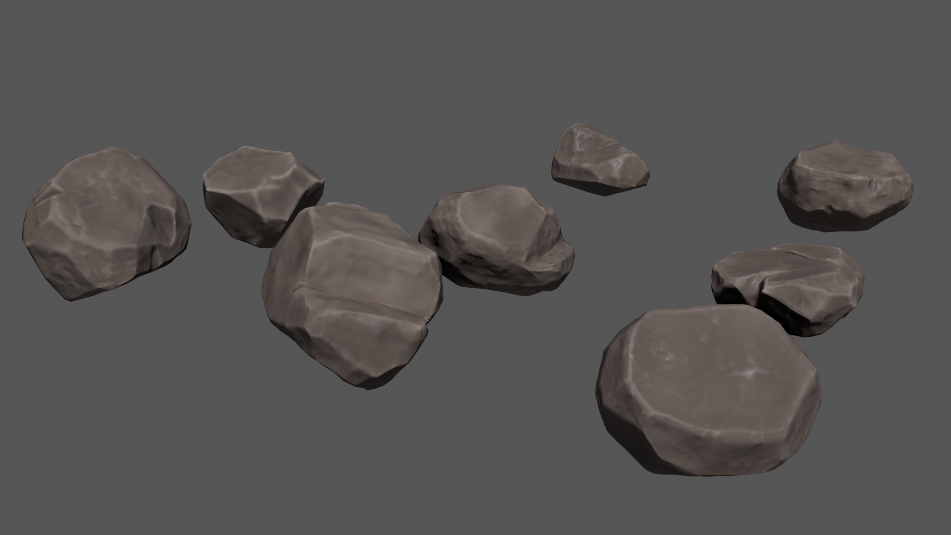 April 26, 2021 at 4:51 pm #67132
Yes, this is looking awesome! Way to go! Full points for week 3.
To polish these off, I’d love to see some extra work done on the color and potentially normal/bump maps. A larger scale gradient or noise of some kind would be helpful, and some smaller scale nicks, chips, and speckles would be awesome. Here’s some inspiration:
ArtStation – Stylized Rock, Shukar Parkin
ArtStation – Stylized Rock, Shukar Parkin
ArtStation – Stylized Rock???, Yunfei Li
These details could either be painted on or procedural adjustments to the current textures that are then baked to new image textures.
April 28, 2021 at 9:13 am #67133Here is an other update from my rocks: I added some procedural nodes to the material to get some more stony look. Feel free to have a look at the shader and add some critique. If everything is OK then I will bake new image textures with the adjustments and work on a final presentation.
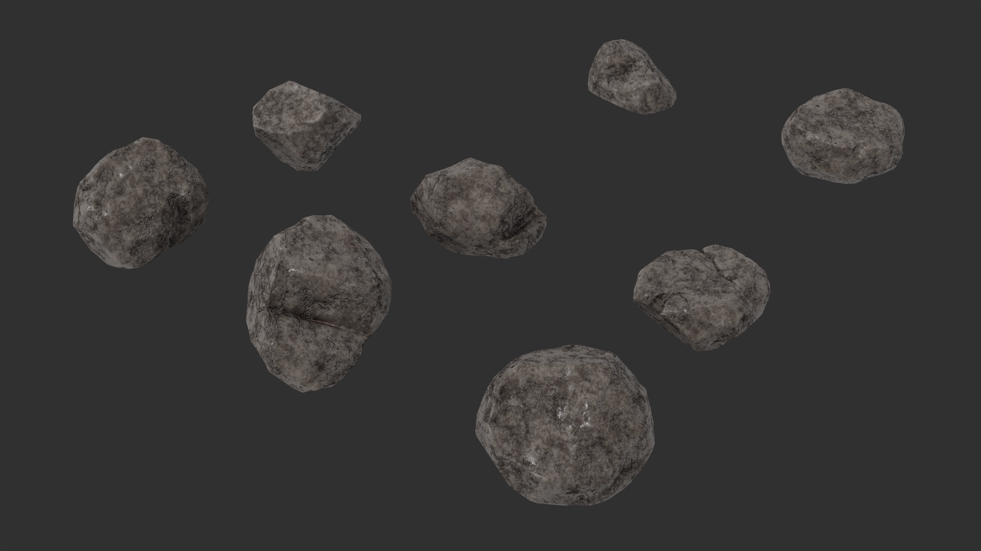
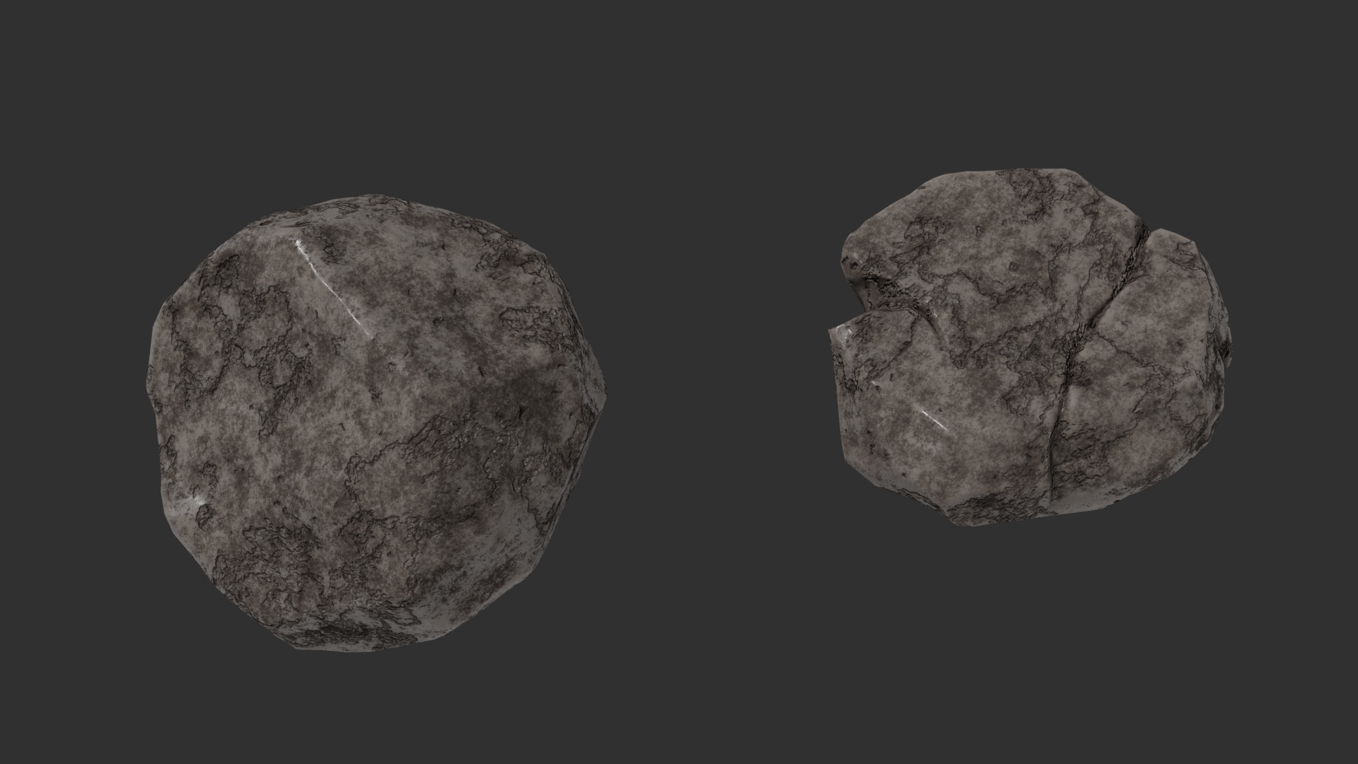
 April 28, 2021 at 11:39 am #67134
Hi Martin, looks great, but personally I would prefer the earlier version as this is more in line with the artwork..
Maybe find an in-between…some of this new detail (I’d say about 20-30%), but mostly keeping the stylized look from before.
But, Jonathan is the one deciding, so better wait for what he has to say.
Anyway, they are both looking great, it is mostly a matter of what style we want to achieve…
April 28, 2021 at 12:56 pm #67135Wow, that’s a sweet procedural texture! I like it, and I agree with @spikeyxxx that it’s a bit too strong. This would be excellent as a subtle detail to support the nicely painted map you did earlier with the highlighted edges like below. It doesn’t have to be exactly like this, but just as an example:
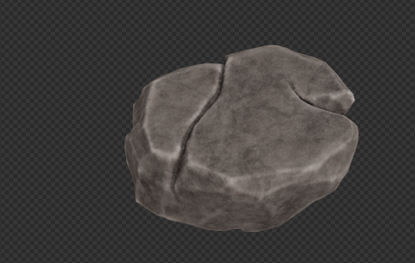 May 1, 2021 at 5:13 pm #67136
@hoidolario, it looks like you are finishing up with your project. And, your rocks look great. I’d love to post your artwork in the TSMF Blog. Please let me know if you create a money shot.
May 2, 2021 at 3:39 am #67137Hi @splat21. You are right, the rocks are finished. I worked on the shaders after Kents live Stream and incorporated his suggestions. I will post a final render today as a Homework submission, and I am working on a money shot thought I have no idea how to present the rocks in an interesting way til now. Feel free to take the final render in your blog once I have uploaded it today.
-
AuthorPosts


- The topic ‘Collab2021 – WIP – hoidolario’ is closed to new replies.