
BC4-1810 Homework, silentheart00
Forum Archive › BC4-1810 Homework, silentheart00
- This topic has 86 replies, 18 voices, and was last updated 7 years, 10 months ago by
silentheart00.
-
AuthorPosts
-
October 18, 2018 at 10:41 pm #41821
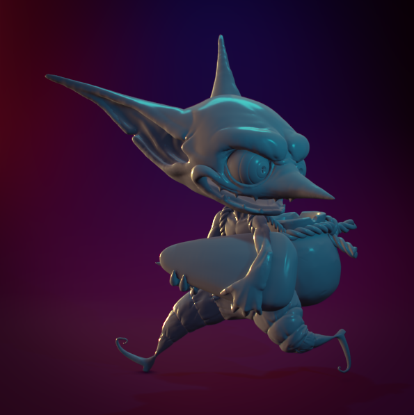
Fiddling around with the goblin model. Not a bad start but will keep tweaking. Also, in Eevee.
 October 19, 2018 at 4:22 am #41822
@silentheart00 really nice work. I love the lightning so far.
October 19, 2018 at 11:26 am #41823@silentheart00 Ooooo, Eevee, go for it! I’m really liking the vibrant lighting atm, looking forward to the finished result.
October 20, 2018 at 10:13 pm #41824Funny how a little lighting really messes with the colors, huh?
 October 21, 2018 at 1:28 am #41825
@silentheart00 Yeah it does have quite the impact and changes the whole feel of your image 🙂
October 21, 2018 at 6:06 pm #41826Homework Submission Week # 3, Part 1
My attempt at the lighting match. Couldn’t seem to get the green quite right and there’s weird shadow artifacting in the ear.
 October 21, 2018 at 9:39 pm #41827
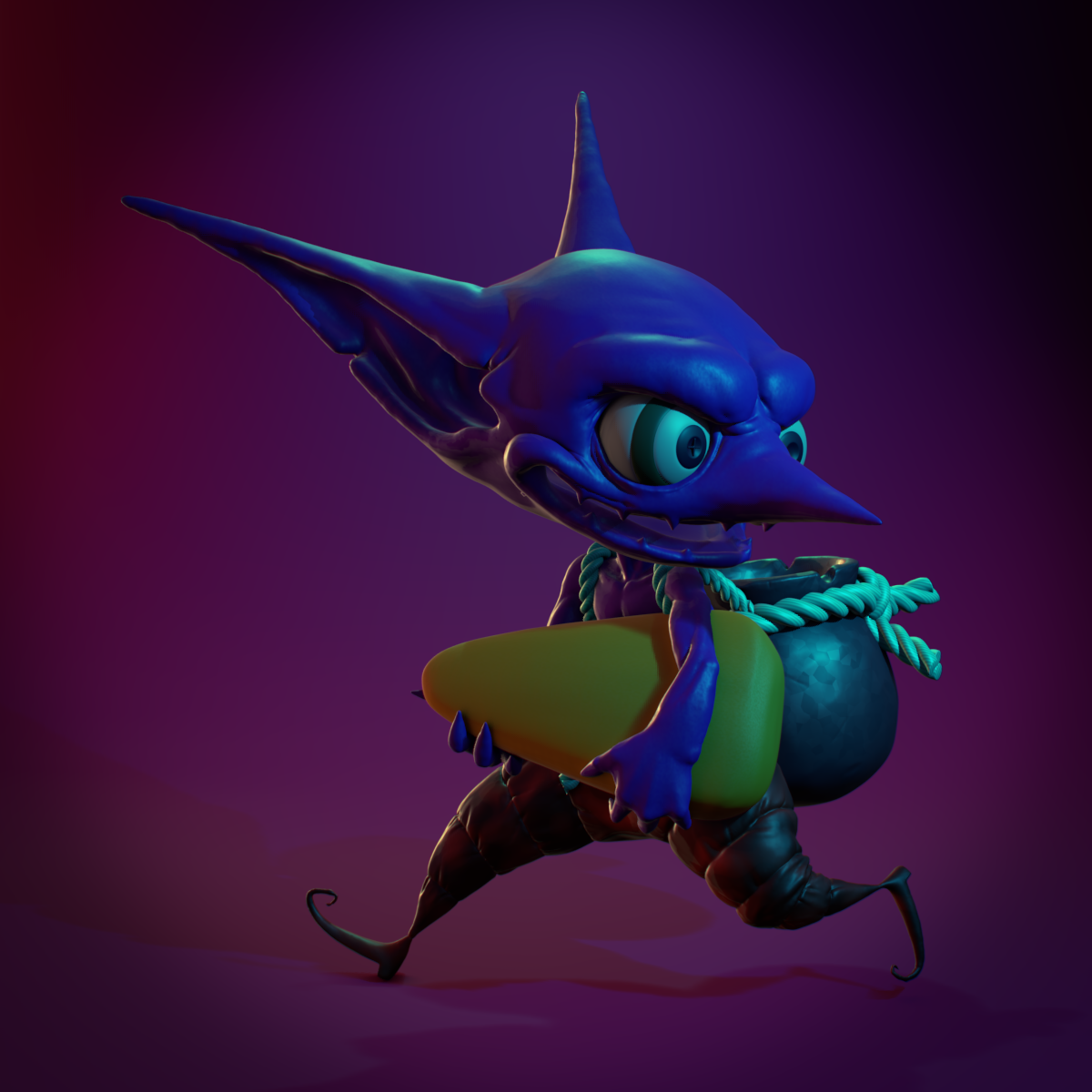
Homework Submission Week # 3, Part 2
Some very basic stuff. Not a lot of time.
 October 22, 2018 at 8:16 am #41828
@silentheart00 both are very good, even if you didn’t seem to have the time you wanted 😀 I think on the color match, it’s close, but the light on the camera left seems a little too far forward compared to the goal. It may just be, though, that it just appears that way because his ears stick out more and that his body is turned more in that direction. Kind of hard to say for sure, but that’s my impression.On the character texturing, I like the simple choice of the coloring. if there’s anything to critique, I might have chosen a slightly different color with a bit more contrast to the background for the pants and back (and that could just be a matter of adjusting the Value component of the HSV to a lighter value) but it’s still an appealing image.
October 22, 2018 at 9:53 am #41829@silentheart00 Ah, I see you liked the Catwoman statue too. 🙂 I’m using it for Week 4 lighting match and I have to say that it was the most difficult one of them all. I think you got your match pretty close, though, good job.
October 22, 2018 at 1:16 pm #41830Very nice work this week @silentheart00. Your light match is super close! And I really like the source render. Just added it to my lighting collection. The warm yellow to blue to green is something I’ve not seen too often. A very appealing combination. It’s an A from me but my one note is that breaking up the smooth surface would have been a nice touch imo. Seeing the texture on the statue/platform in the source makes me wish it was on the goblin as well to a degree.
Your character render is good but seems to have the same issue that a few others have had. My overarching critique is that the color scheme is a bit all over the place; kinda rainbowy and lacking complimentarian color choices. The red and purple lights themselves go great together but it clashes with the various colors of the model. I went and desaturated the image and found that the lighting values are great!

So I suppose the practical advice is: Be aware that colorful lights and colorful models can be too much of a good thing. If you’re lighting a grey or single-colored model, lean on more colorful lights to make the image more interesting. If your model is textured colorfully, perhaps go easier on the color of the lights to avoid clashing.
It’s still great work and worthy of an A to me.
October 22, 2018 at 2:04 pm #41831@gradyp Thanks for the feedback. I’ll keep that in mind in the future.
October 22, 2018 at 2:04 pm #41832@shiennar Thanks.
October 22, 2018 at 2:13 pm #41833@theluthier I thought about breaking up the surface a bit for the lighting match, and yeah, it would’ve made it a bit better.
Well, at least I’ve got the value down. And yeah, it’s a terrible color scheme. Why I just kept with it is beyond me. Maybe I was freaking out about the time too much. Oh well. It was fun to experiment. Thanks for the critique.
October 22, 2018 at 10:58 pm #41834@silentheart00 Nice lighting match.
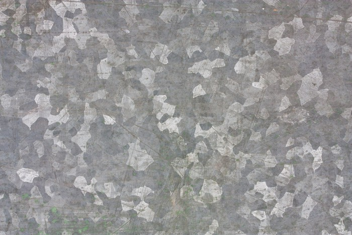
I really like the shader/texture in the Goblins pot. It’s so close to a zinc metal pattern I seem to enjoy for some reason.
And once again I love those purple colors. It just pleases my eye.
October 23, 2018 at 11:09 am #41835@swikni Thanks! It’s a voronoi texture changed to “Cells” instead of “Intensity.” I thought it looked neat, too.
-
AuthorPosts


- The topic ‘BC4-1810 Homework, silentheart00’ is closed to new replies.