Awesome job, I’m loving how this has turned out! When viewed from the side this looks much less flat and much more interesting.
I do still think the overall structure is a bit boxy:
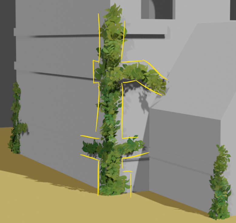
It’s a hard problem to solve, because I can see that you’re following the lines of the house which are inherently straight. The concept art is following those same lines, but I think the difference is that it’s less dense, which makes the boundary of the ivy appear less uniform.
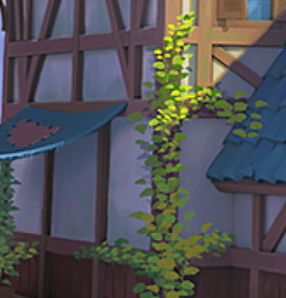
My theory is that actually removing some of the cards to reduce the density could help the distribution to look more natural, but I could be wrong.

