
Trying to decide on a color scheme
Forum Archive › Trying to decide on a color scheme
- This topic has 14 replies, 10 voices, and was last updated 8 years, 7 months ago by
trlewi.
-
AuthorPosts
-
January 12, 2018 at 2:23 pm #9416
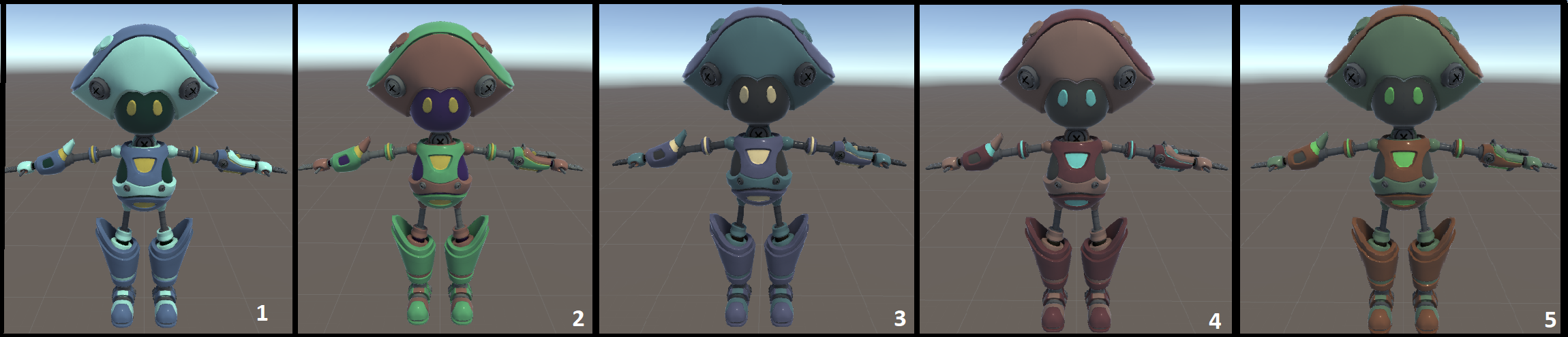
So i am struggling because the character is suppose to be reminiscent of a poison mushroom but he is a robot. number two is the original color scheme but I’m just not loving it. Looking for some feedback and maybe votes on which color scheme you would pick if you had the option in a game.
 January 12, 2018 at 2:54 pm #33191
Mouse is no painter but I can vote. My vote is Nr. 1
January 12, 2018 at 4:22 pm #33192I see where you’re going with the original color scheme, but maybe the green is too saturated for something based in nature, like a mushroom. I like the green of 5 better. Feels a little more natural, like a mushroom. I like the overall design of 5 better. Green evokes certain emotions and associations, like poison, nature, maybe some mystical presence. Then the brown is kind of neutral, but also natural, like mud or dirt. Then the little pops of a more saturated green kind of give a warning, like a brightly colored poisonous animal. Out of all of these, 5 attracts my eye the most.
Have you heard of a color gamut? It might be useful to use in this instance since you’re going for a specific look. Take a look at this video for more info: https://www.youtube.com/watch?v=qfE4E5goEIc
And remember, colors are relative to each other, and changing just one can have a huge impact in the overall design. Check out the Bezold effect, like this: http://www.opticalspy.com/uploads/1/4/4/9/144966/4249055_orig.gif
January 12, 2018 at 4:57 pm #33193Thank you! I agree totally, I’ve asked a few people and a lot of people said they liked the overall look of 1 but thought that 5 fit the character the best. So I am starting to think I am probably going to go with number 5 and offer other color schemes to players in the game for completion of certain things and for purchase. I will definitely take a look at those resources. Thanks again!
January 12, 2018 at 10:46 pm #33194I did say that No.3,4,5 are what attracted my eyes.
If it’s my choice to choose I choose No.4.
May be you should add some texture overall the body to make it look toxic.
Like this,if you did not tell me that they are mushroom robot ,I don’t even know about it.
https://www.greenoptimistic.com/wp-content/uploads/2015/04/mushroom.jpg
Nice modeling anyway.
January 13, 2018 at 9:57 am #33195I’d pick no. 4 or 5 for the poisoned mushroom bot. If you were making poisoned tree frog bots, then I’d vote for no. 1 or 2.
January 14, 2018 at 5:02 am #33196In general good work. Personally I think number 5 suits your motive the most.
But if you want to take it further I would like to make a suggestion. Get on google images search or Pinterest and gather all motives that you associate with poison and robots. Because there is a lot more out there… It is not only green. Make a collection of poisonous mushrooms but don´t forget to include other themes of nature as well (just look at the ball fish.. who is extremly poisonous).
How to combine the theme of nature/poison/organic with Robot/metal/mechanic? Brown is associated with earth and dirt. But maybe the Robot as a metalic clean origin color but got rusty over the years. Or his poisonous aspect changed his original material… deformed its texture. What if he is overgrown with moss?Try to tell the robot´s story through your design.
Doing some research and collecting a solid reference collection helps your creativity to discover new grounds.
Hope I could help you a little bit. Have fun creating.
January 14, 2018 at 9:01 am #33197No 3 caught my eye and made me think poisonous the most.
Regardless of the colour you choose I would think about making the accent colours a little brighter as in nature when something is poisonous commonly there is a bright warning colour to caution against consumption. Now this is not the case for mushrooms. So the dark blue/green hues and the yellow stand out the most to me.
Good work on the model.
January 14, 2018 at 1:22 pm #331982 & 4 are my faves
January 14, 2018 at 2:32 pm #33199Thank you so much for your advice! I am going to be adding some texture and stuff to add some more intrigue to the design. I wanted him to maintain a clean and well maintained look because his character is the captain of the “royal guard”. however I will be adding a little bit of paint fading around the edges. So I will post when I complete that. I did choose to go with number 5 for the default color scheme by the way. 🙂
January 14, 2018 at 2:40 pm #33200Whats the overall background colors, if there is any?
January 14, 2018 at 9:11 pm #33201well the background will be filled with vibrant odd colored plants. lost of glowing bright colors across the spectrum.
January 14, 2018 at 9:13 pm #33202Sounds good idea and good choice to for going No.5,It seems like your original design but with better shading.
January 16, 2018 at 9:32 am #33203Great work 🙂
I think 4 and 5 are closest to the feel you want.
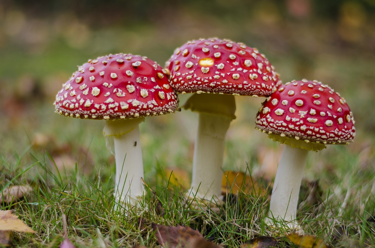
If I may add something, it looks to me like you have shaped his head to be mushroom like, and there are spots on top so Im assuming the top of his head to be the top of a mushroom and the lower part with the two big bolts in to be the “underside” of the mushroom.
If it was me, I would add some sort of texture, be it realistic or stylised, to push the feel of the underside of the mushroom and sell what it is based on. Otherwise it may just get mistaken for some sort of pirate hat inspired head. The texture I am talking about is in the pic below , that sort of “ribbed lines” effect that you always see under mushrooms :

only my opinion though 🙂 , good luck with the project!
January 18, 2018 at 2:14 pm #33204Yes I would have to agree. This should help to make the mushroom relation easier to read.
-
AuthorPosts


- The topic ‘Trying to decide on a color scheme’ is closed to new replies.