
Séb’s progress
Forum Archive › Séb’s progress
- This topic has 47 replies, 8 voices, and was last updated 4 years ago by
Adrian Bellworthy.
-
AuthorPosts
-
June 19, 2021 at 4:28 am #14080
Here’s a few takes on the projects I’m working on.
Currently: pothead: https://cgcookie.mavenseed.com/community/11484-seb-s-progress?page=2#answer-54455
June 21, 2021 at 11:05 am #69105Nice work @slenaerts , Keep posting your work on your modelling journey, write some notes and ask for feedback, it will help you greatly with the learning process. Also check out the community forum occasionally, look at other peoples work and see if you can learn anything or how you may have done things differently.
Look forward to seeing your progress.
June 21, 2021 at 11:37 am #69106Thanks @adrian2301, will do!
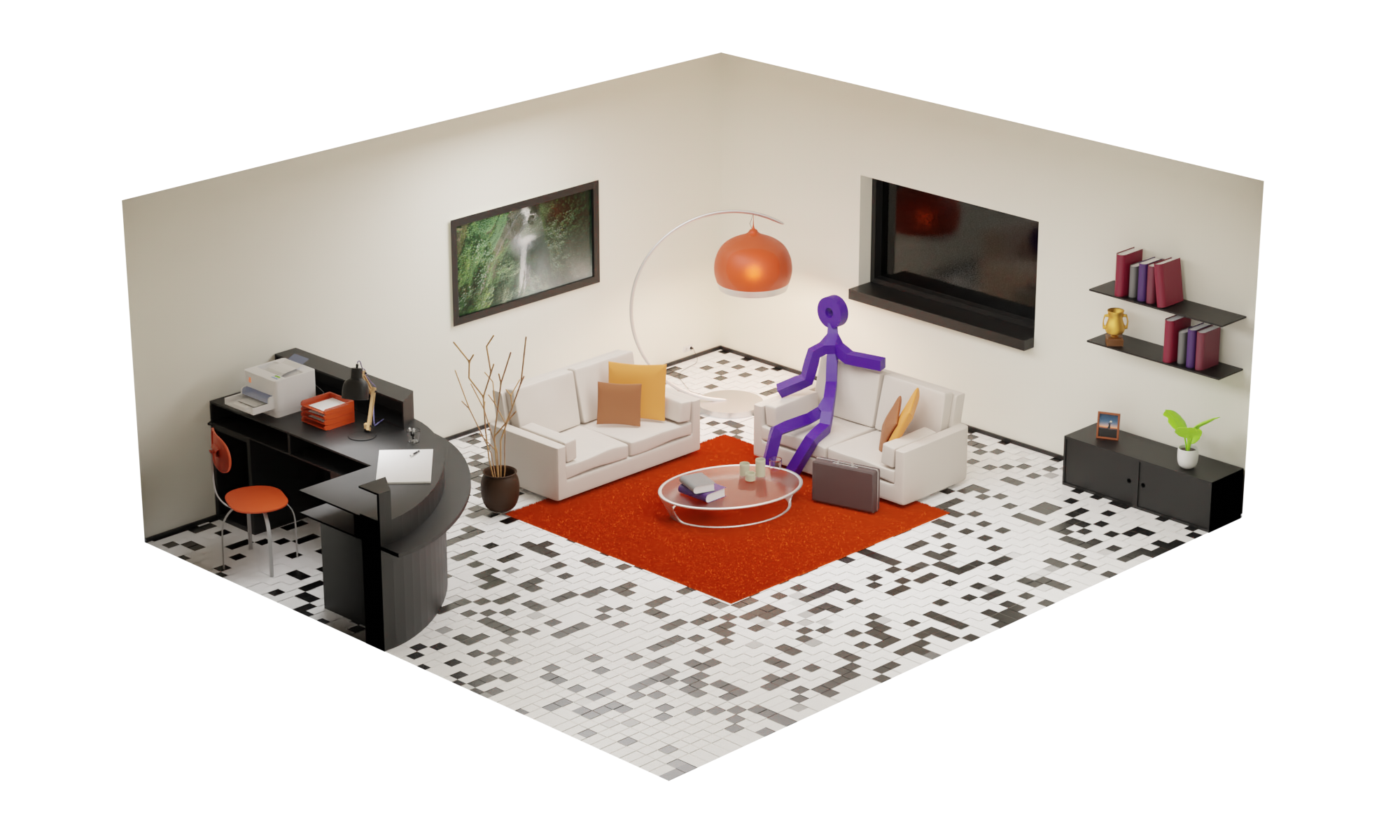
June 22, 2021 at 6:24 am #69107This one I like to call Hangman goes therapy. Done after my exercise submission as extra warm-up.
I’m struggling with the required level of detail of such a low poly render: When I see other people’s work all elements look very identifiable. Whereas I feel the added detail (printer and desk lamp ) seem to be distracting and making it harder to see. Should I take smaller portions of the room and increase the relative size of everything? I’m not sure. I’ll keep on testing though.
 June 22, 2021 at 7:05 am #69108
Nice work, the sofa’s and table look a bit out of proportion though.
A good habit working in 3D is to try and always model to real world scale.
Hangman Goes to Therapy, I’m not surprised, being the fall guy in a game for all these years.
June 30, 2021 at 11:00 am #69109Playing around with more complex shape transitions, trying to get the topology as smooth as possible. Still some issues around some forms
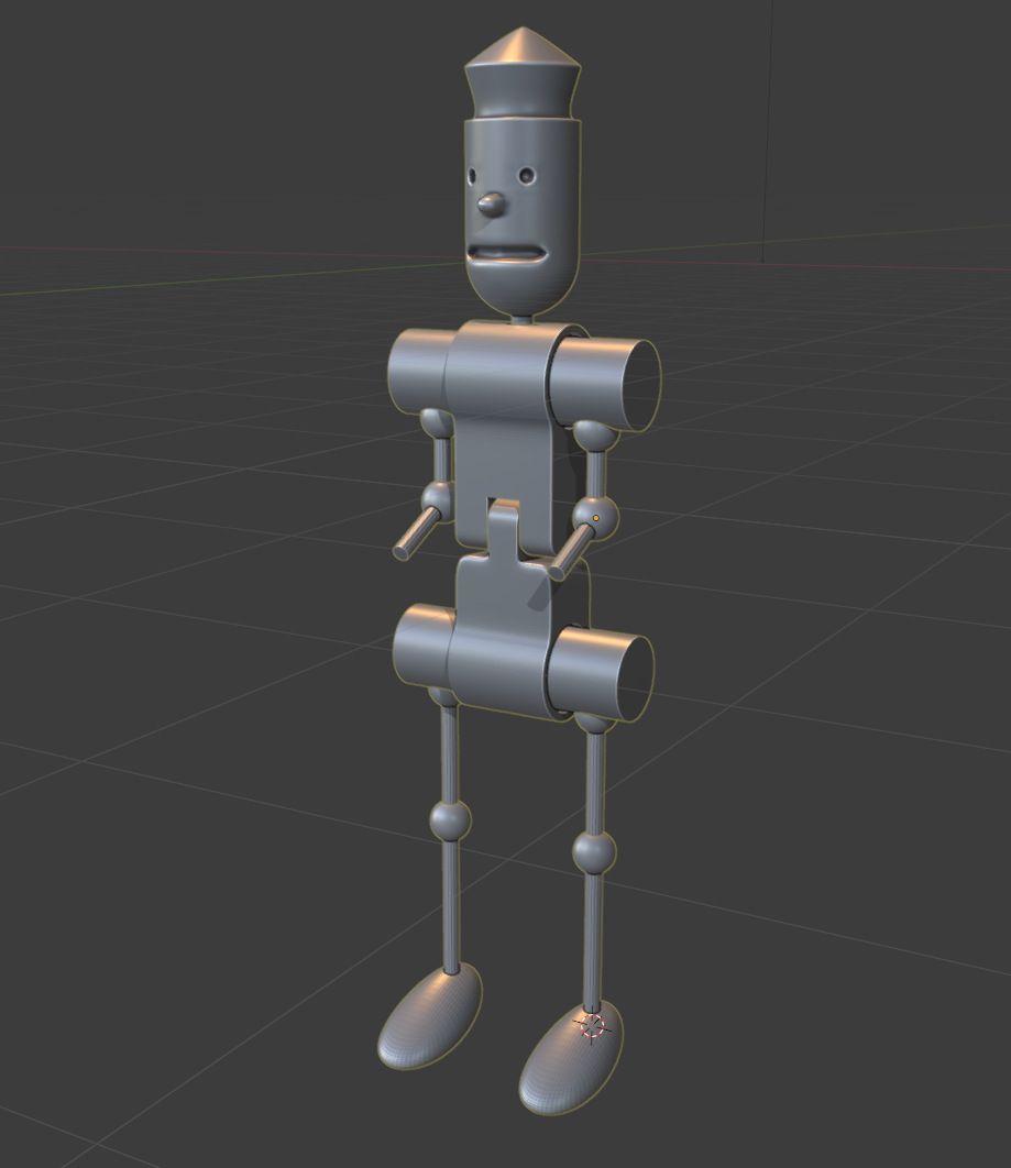
around the eyes specially
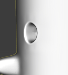
I get these irregularities and not sure how to polish them out.
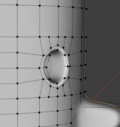
adding edge loops seem to increase those imperfections. how would you go around fixingthis?
June 30, 2021 at 1:57 pm #69110You just have to keep adjusting vertices until the shape looks right . I think the eyes look fine, at the distance people will view it from they won’t notice minor imperfections, unless they’re looking for them.
June 30, 2021 at 4:35 pm #69111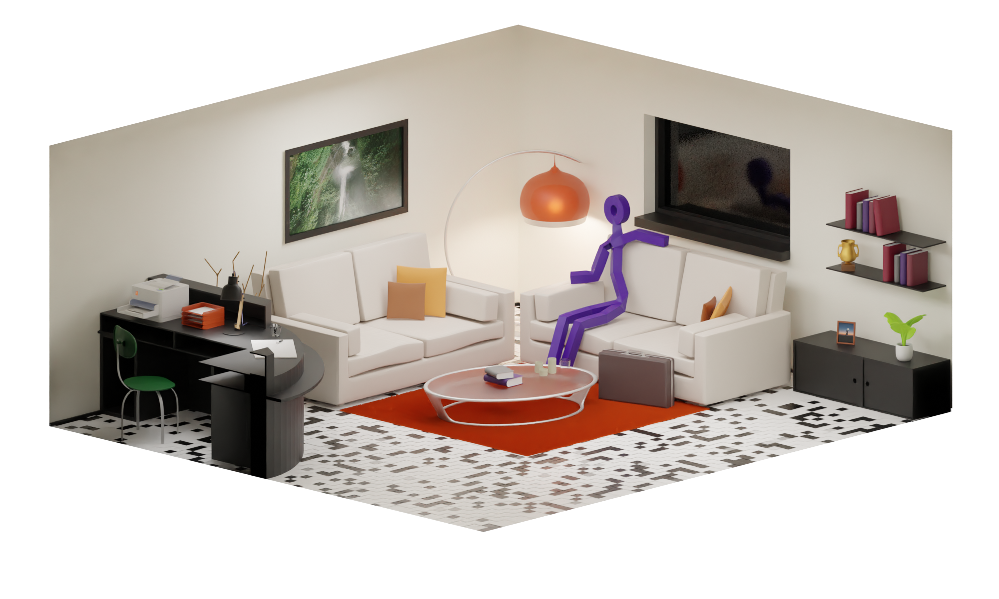
@adrian2301 you were right, changing the sizes of the sofa’s and the height of the wand decoration and this is a totally different image :).
June 30, 2021 at 11:44 pm #69112Check out this tutorial by Josh Gambrell:
He explains it really well.
July 1, 2021 at 12:18 pm #69113@slenaearts Shrinkwrapping this part of the mesh around the eyes to a cylinder without holes would help. The “Hard Surface” modeling tutorials by Josh Gambrell are really excellent!
July 5, 2021 at 1:08 pm #69114Creating some low poly visuals for a slide deck at a client. Still some tweaking and detailing to do, but I’m starting to like the result.
 August 2, 2021 at 1:45 pm #69115
Chapter Lighting a bedroom with Blender; Trying to make the sunset while I’m brushing my teeth atmosphere.
First I tried with a sunset image, but I felt the way the sun reflected on the clouds did not make any sense
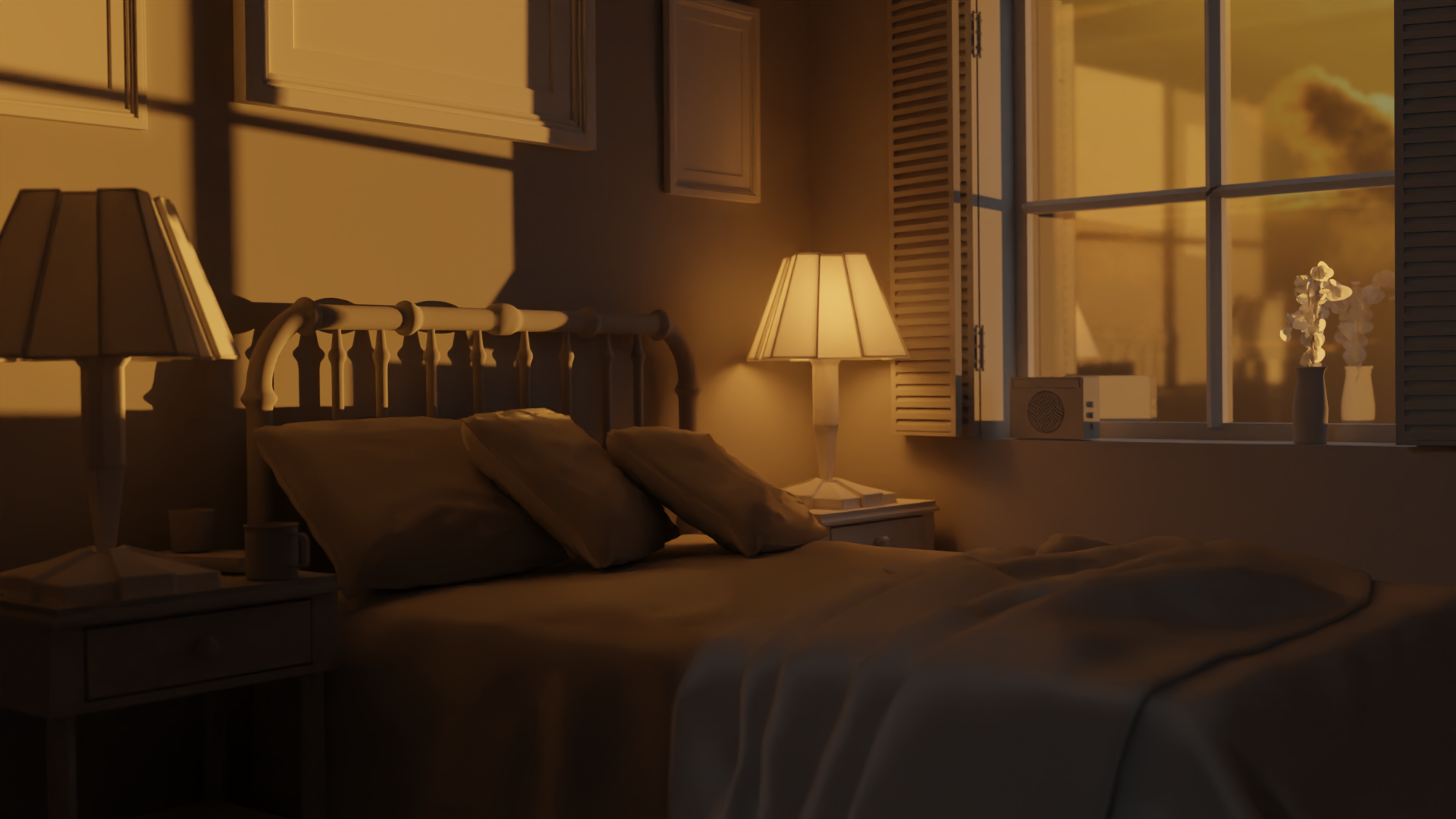
I put the same image as a world background and suddenly the angles seem more believable. I’m not sure though if the sharpness of the shadows are correct. Should it be more sharp or not. In this image the bathroom light is too discrete.
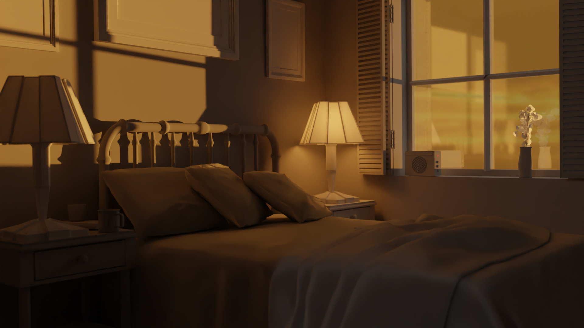
I’m not sure where the white/blue color on the window sides is coming from, given the color temp, I would expect it to be yellowish as well like the wall.
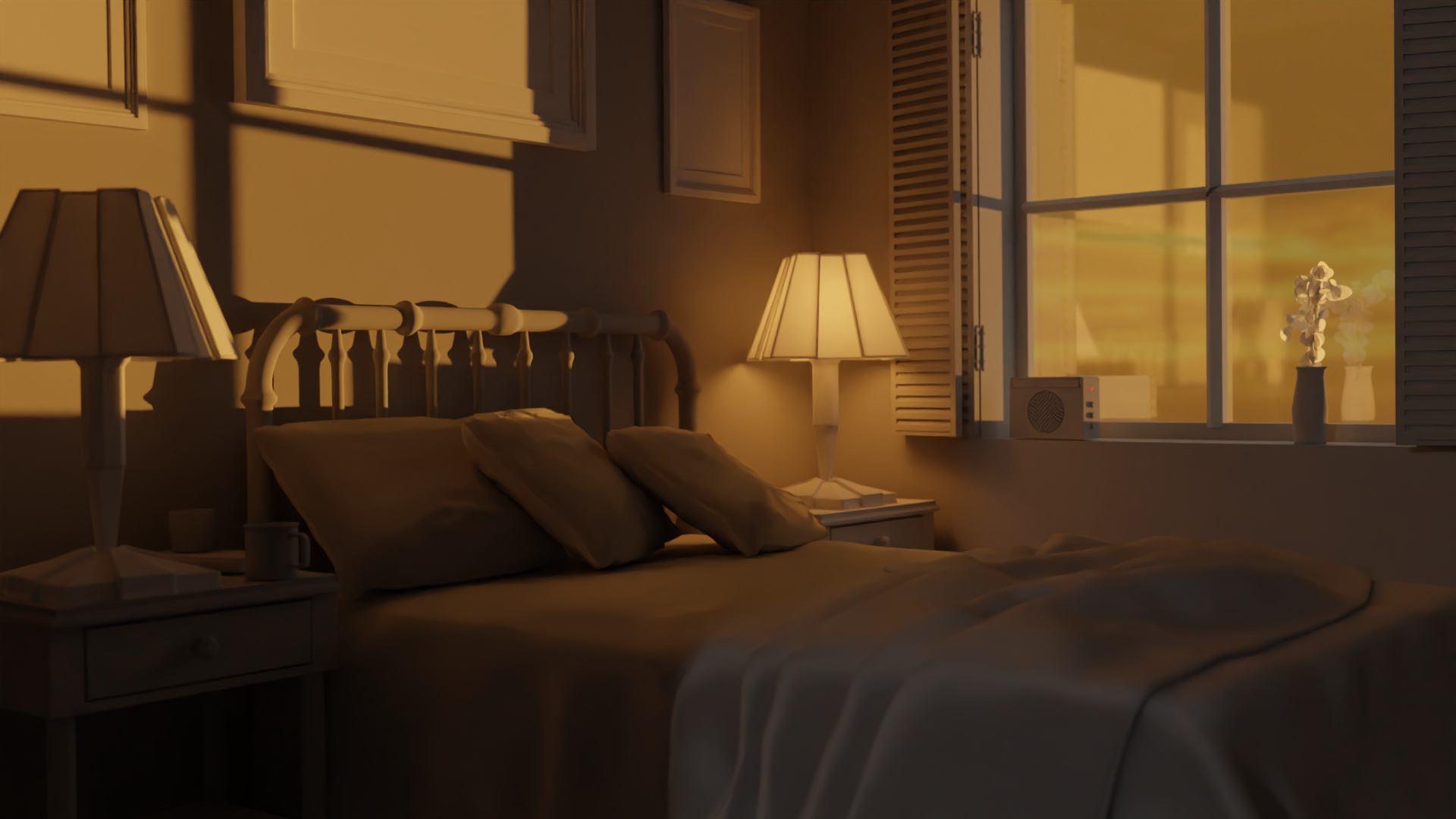
Below I increased the bathroom light value a bit. The bedlight seems a bit too shiny, but since it is in a corner where the sunlight doesn’t reach, maybe it is believable. @jlampel, What would you do different in these renders? I must admit, this is quite challenging as it seems you can be off by miles just by a tiny change.
 August 2, 2021 at 9:13 pm #69116
Small changes really do make a difference! It’s way too easy to get lost tweaking values.
Nice work on these! I’d say #3 is the strongest. One thing you could do to help with the light from the bathroom is move it left or right so that it doesn’t line up perfectly with the bed sheet and and potentially increase the values just a little so that there’s a nice rectangle of light spilling across the bed and wall. Aside from that I would increase the strength of the sunset a bit as well, which will in turn bounce more light around the room. While it might not seem very bright in person, I bet it would still seem more powerful than the lamp.
Hope that helps!
August 3, 2021 at 12:06 am #69117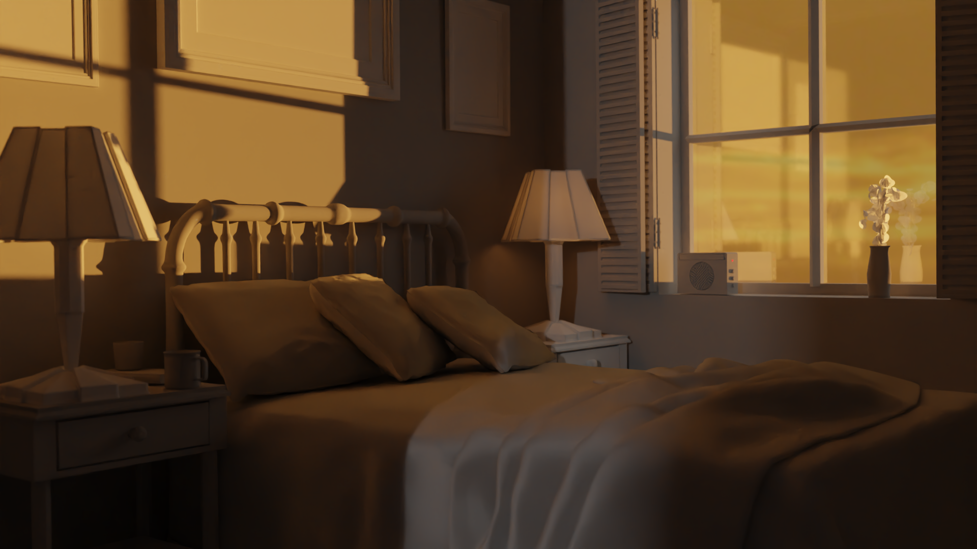 It does look better! thanksfor the tips !August 3, 2021 at 1:20 pm #69118
@slenaerts That’s already looking great without object colors 👍!
-
AuthorPosts


- The topic ‘Séb’s progress’ is closed to new replies.