
Finished my first Character, critique needed
Forum Archive › Finished my first Character, critique needed
- This topic has 30 replies, 8 voices, and was last updated 8 years, 3 months ago by
silentheart00.
-
AuthorPosts
-
June 3, 2018 at 1:46 am #36893
This looks great! I love the cat headphones touch.
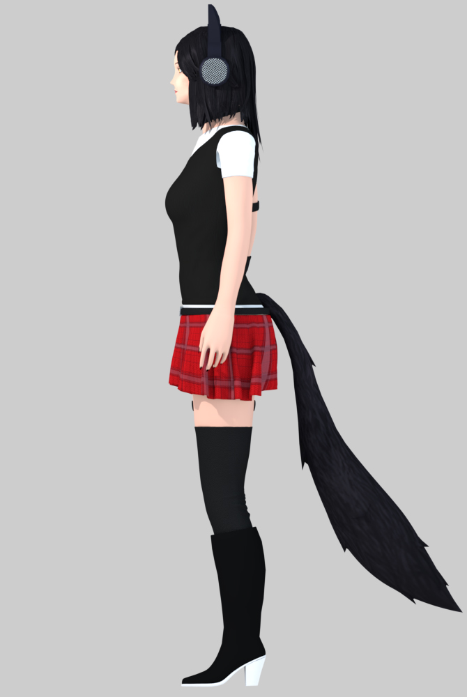
As for constructive feedback, the anatomical feature I notice the most is that the legs seem far too short, but maybe that’s just the perspective. If none of these are orthographic view shots, it can help to include one.
The thing that detracts most from believability for me is the lack of texture. Perhaps this isn’t your focus for this project, but it is important to consider in the long run. I don’t think a model can be considered done until proper texture has been applied. I only see stripes on her hair and the inside of the headphones, for example. If there is texture elsewhere, it is too subtle. Even for a cartoon style, she looks a bit too perfect. This is just a side effect of using a computer for art. As artists, we must fight the perfection of the computer generated image and add our own imperfections. This will make the art closer to reality. Consider adding subtle tonal variations in the skin, some sort of hatch texture to the shirt to represent fabric, perhaps with the help of a normal map. Things like this really make the model shine. For texture help, the Piero and pancake hobo tutorials on here can’t be beat.
You may not want to go back and retexture now, but it will add life and believability to your characters in the future. Applying proper materials also helps, which is in the tutorials above.
Overall, a great start, and I hope to see more work from you!
Edit: Just noticed the texture on the skirt- that part looks great, details like that truly enhance the image.
June 3, 2018 at 4:58 am #36894@polygondust Thanks for your feedback ! I have prepared a few High res renders for you: First the Orthographic view :
 Then a bigger Front and Back view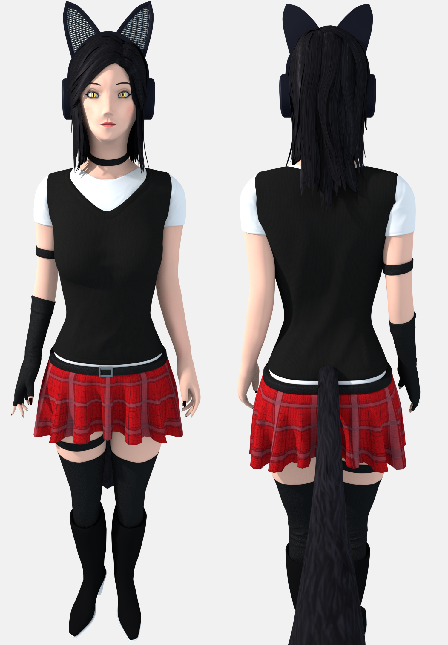
And some close ups :

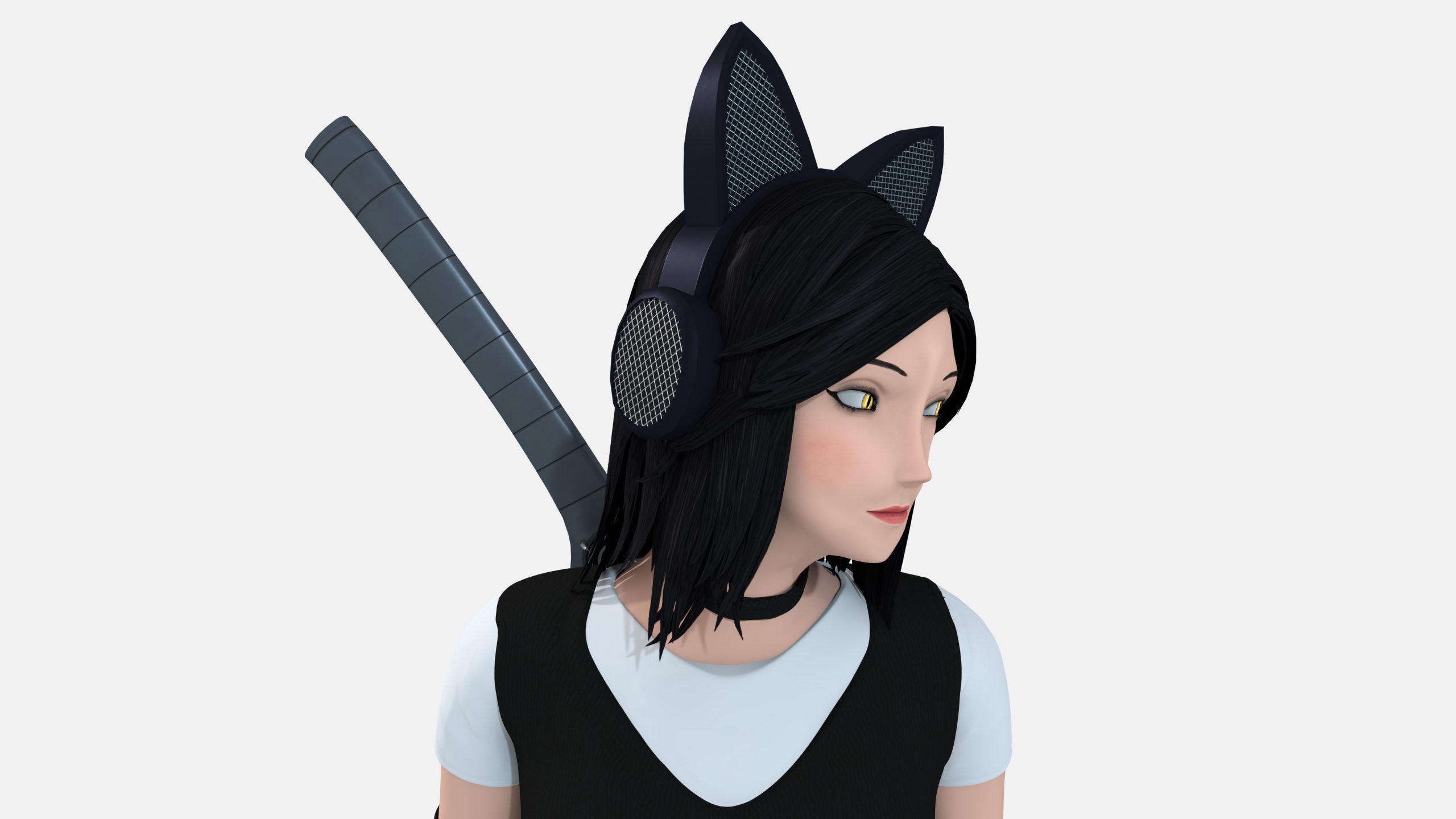
 The problem was that i tried to cramp to many objects into two sheets, i actually took my time to Hand paint all of the textures.I admit that the Headphone details are really subtle. But if you have any tips on improving please tell me, hand painting textures is the newest subject i am learning. Or maybe the problem lies in the Lighting and Camera setup? (if the details are not big enough press right click on one of the Pictures and select view image)June 6, 2018 at 1:22 am #36895
I have some things to note, as well:
- I agree with the facial feature critiques. They look a bit generic, a bit glossed over. Maybe a study of different facial features would help to develop your understanding and give her more personality. In the image of her head being tilted, it looks like there’s a ridge of her nose going up into her forehead. Might want to review some anatomy to help fix that in the future.
- I think the eyes are a little bit far apart, maybe a touch small, as well. My rule of thumb is to divide the face into 5 equal sections along the eye line so then the proportions work out more realistically. Typically, I shoot for one eye length between the eyes and one eye length from the eye to the edge of the face. Hope that makes sense.
- I think her eyebrows are too high. She kind of looks perpetually surprised. Or maybe that’s how you rigged them.
- The lips look narrow in a width sense. The corners of the mouth typically fall in line directly under the pupils.
- Can’t tell if it’s the perspective, but her elbows look too high, which is pulling the arms up and making them look short. The wrist falls around the crotch level, then the hand extends from there. Then split the arm length roughly in half and that’s where the elbow falls. If the character is young, she’ll have perky breasts, which sit higher than her elbows.
- I think the lower half of the legs are a bit short. Legs are roughly twice as long as the torso, and then the foot extends out.
- The palm section of the hand looks a little too “boxy” or “straight,” if that makes sense. It looks like you used a box and then added fingers. Try curving that out. Look at your own hand in a relaxed position. It curves when relaxed, right? You are your own best reference. Use yourself!
- Hard to critique the fingers, but I suspect similar proportion issues. That’s okay. Double check your proportions all the time.
- I like the materials and textures used in the clothing. Brings a sense of realism. However, it’s hard to tell what those textures are unless zoomed in. If you want to fix that, go for it.
- The clothing is a bit simplistic in the detail. Maybe add a decal on the black shirt that subtly shows the character’s personality. Do the headphones have to be black or could you add some details there? Do the stockings have to be a solid color? Maybe you could add a snazzy stripe? What can you tell us about her personality in her choice of clothing? I know you said you were kind of going for a comic book style, so maybe adding details like that would help tell us about her personality without adding things like seeing the thread pattern.
Some resources to pick up if you wish:- Figure Drawing for All It’s Worth by Andrew Loomis – An excellent resource for anyone looking to improve their character portraits and proportions. The art style is older, but the art instruction is sill relevant.
- Anatomy for the Artists by Sarah Simblet – Breaks down each part of the body from bones to the cardiovascular system to muscles and how each part of the body relates to each other.
- Character Design Quarterly – Talks about stylized characters, but has good tips for when you want to design a new character that isn’t stylized.
If there are any others, feel free to add!June 6, 2018 at 1:36 am #36896A critique for the weapons because I completely forgot about them:
It’s easy to reach for grey when you don’t know what else to do with the weapons colorwise. Fight this urge! It’s another opportunity to show her personality! You can bring some of that red into the guard, hilt, or scabbard or some section of the guns. Weapons can be highly personalized, so check some out. Does she have a personal insignia? Is she part of a company that has a recognizable logo that’s on all her equipment? Take a look at your favorite game weapons. Why are they so memorable to you? What makes them stand out from other game weapons? How do they tie into the user’s personality and design? Does it make sense in the overall design? Start developing your critical eye. You got this.
June 6, 2018 at 3:51 am #36897@silentheart00 thanks for all the feedback! Really helpful i learned a lot from this and i will definitely use when revisiting this project.
Funny enough my favorite weapon is the Desert Eagle. But you are right, overall details are lacking, while writing this i came up with a few ideas.
June 6, 2018 at 9:10 am #36898I played with the head around a little and tried to apply all of the ideas.
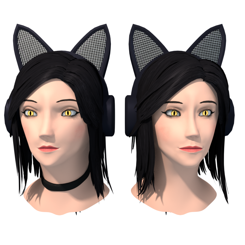
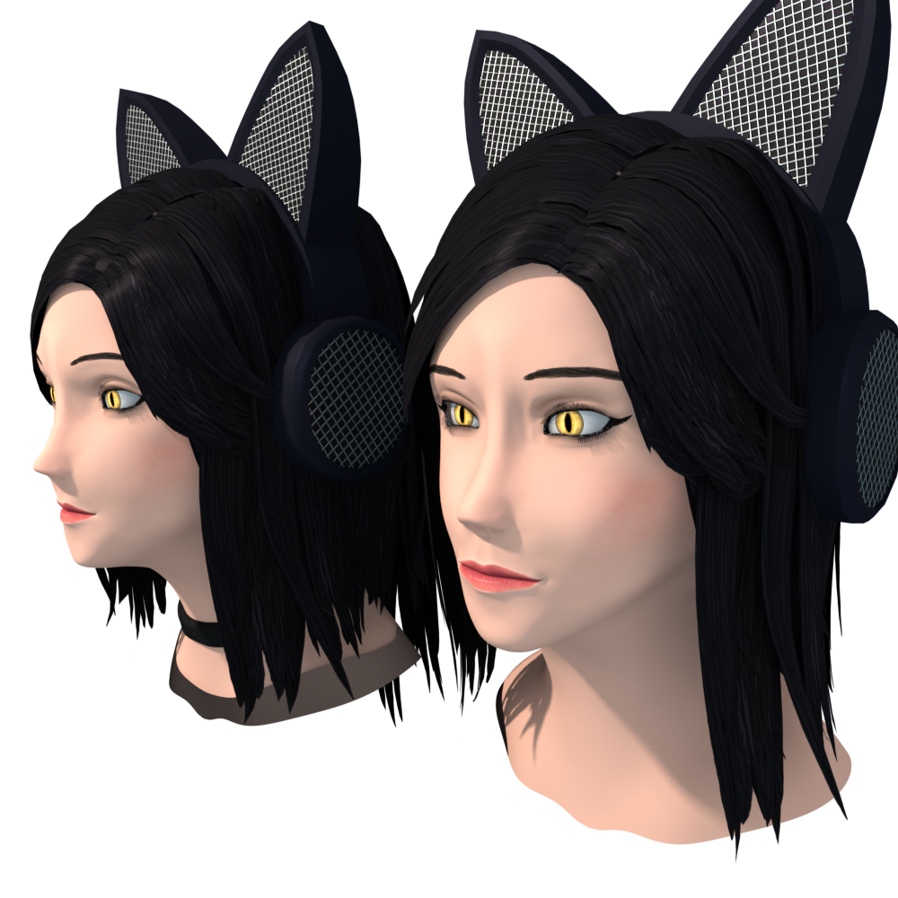
 I hope i made a mistake while sculpting, this does not look good to me.June 6, 2018 at 12:52 pm #36899
@projekt154 This might also help: https://www.youtube.com/watch?v=vIKxffo7YsU&t=454s.
June 6, 2018 at 3:47 pm #36900@baukepost This will definitely help for later projects, thanks.
June 6, 2018 at 11:49 pm #36901Yeah, the eye spacing looks better. The lower lip shape maybe could be a little more rounded; it looks like it’s coming to a pinch than a round lip shape, which I like in the left image.

The nose is better; that weird ridge is less prominent.
The nose still looks a bit generic and the nostrils aren’t clearly defined. It’s okay, I’m terrible at noses, too. Try adding a harder crease in the nostrils.

Good progress. Maybe you should add skull studies and muscle structure studies to your routine. They don’t have to be every day; maybe once a week or every couple of weeks. Practice what you can when you can. You got this.
June 7, 2018 at 9:35 am #36902@silentheart00 are we still talking about a cartoon style here ? This doesn’t feel right , if you understand. Even in that video the chap was talking a lot about the differences between individuals. I was kinda only looking for really bad errors, “okay” is more then enough for me here in this project, sorry if i miss something here.
June 7, 2018 at 9:50 am #36903@projekt154 Yeah, no problem. I tend to push towards realism, and if you think these smaller critiques are going against what you are trying to achieve, then feel free to ignore them. These were more suggestions of personal preference than glaring problems of something fundamental. It’s up to you to choose what you think is best in the detail of style.
Do you have any references of the style you’re going after? Since my mindset doesn’t default to cartoony styles, I think that would help me to know what to look for when critiquing your style.
June 7, 2018 at 11:11 am #36904@silentheart00 actually i don’t have a direct reference, every piece is sculpted after what i think in my head is perfect. Then i put every piece together. This is the only reference picture i used:

and even that i changed a lot along the line.
June 7, 2018 at 1:16 pm #36905@silentheart00 I started to investigate to truly find the problem because i do feel something is indeed off, i started to look into and study reference material to refine my style and i might have a good idea what went wrong. I am currently trying to adjust my mesh.
June 7, 2018 at 1:22 pm #36906@projekt154 Alright, sounds good. Looking forward to seeing your results.
June 8, 2018 at 1:41 am #36907@silentheart00 here it is:
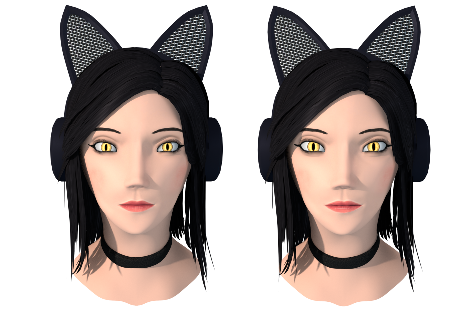
According to my reference material this is suppose to be “right”, still it feels so off. I am confused, normally if my brain sees something as right i see it as good, but not with this model. What am i supposed to do now, go with that what is technically right or what is good in my eyes?
-
AuthorPosts


- The topic ‘Finished my first Character, critique needed’ is closed to new replies.