
BC4-1810 Homework, Omar Domenech
Forum Archive › BC4-1810 Homework, Omar Domenech
- This topic has 49 replies, 17 voices, and was last updated 7 years, 10 months ago by
Omar Domenech.
-
AuthorPosts
-
October 15, 2018 at 6:23 pm #43082
@theluthier Alright, then I guess I pulled a Neo and revived after taking several bullets in the hallway. Thanks for the cool honor of having a spot in the Pinterest Hall Of Fame.
October 21, 2018 at 3:11 pm #43083Homework #3
Lighting Arnie:
Made a couple of attempts, didn’t know which one to post, so I posted them all.


Also tried to light Vincent, some time has passed so I made him age a bit.
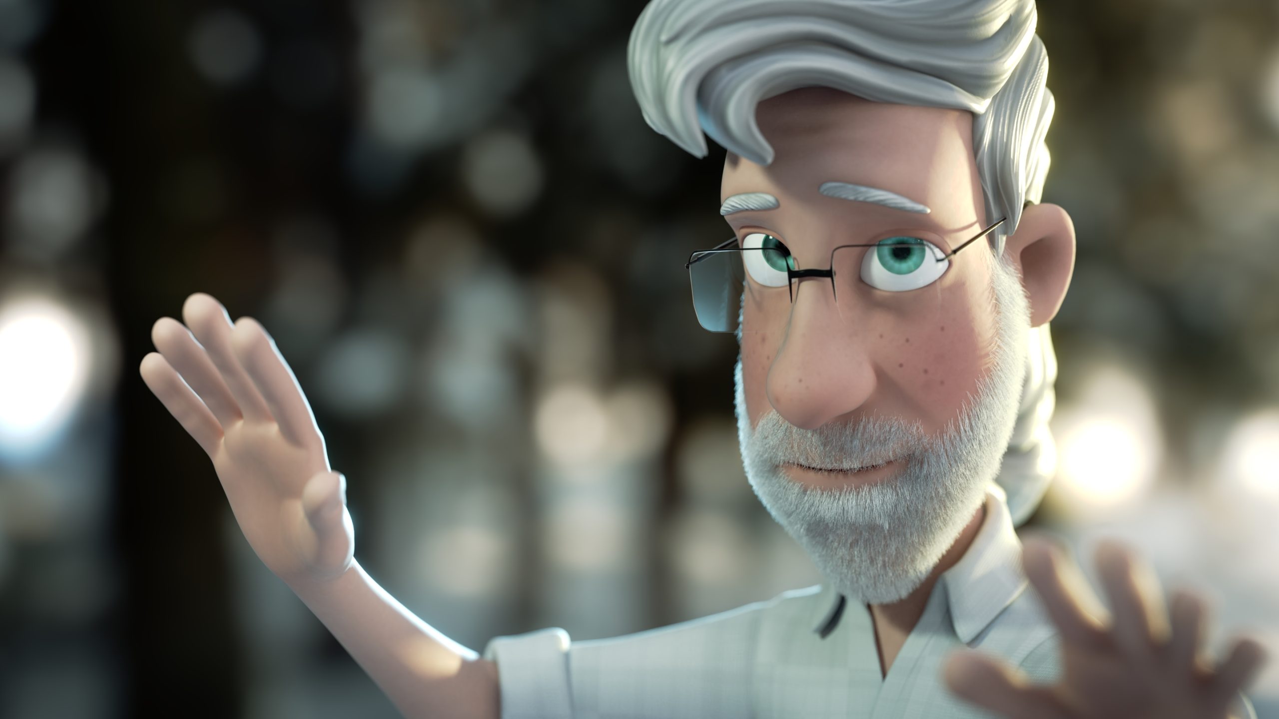
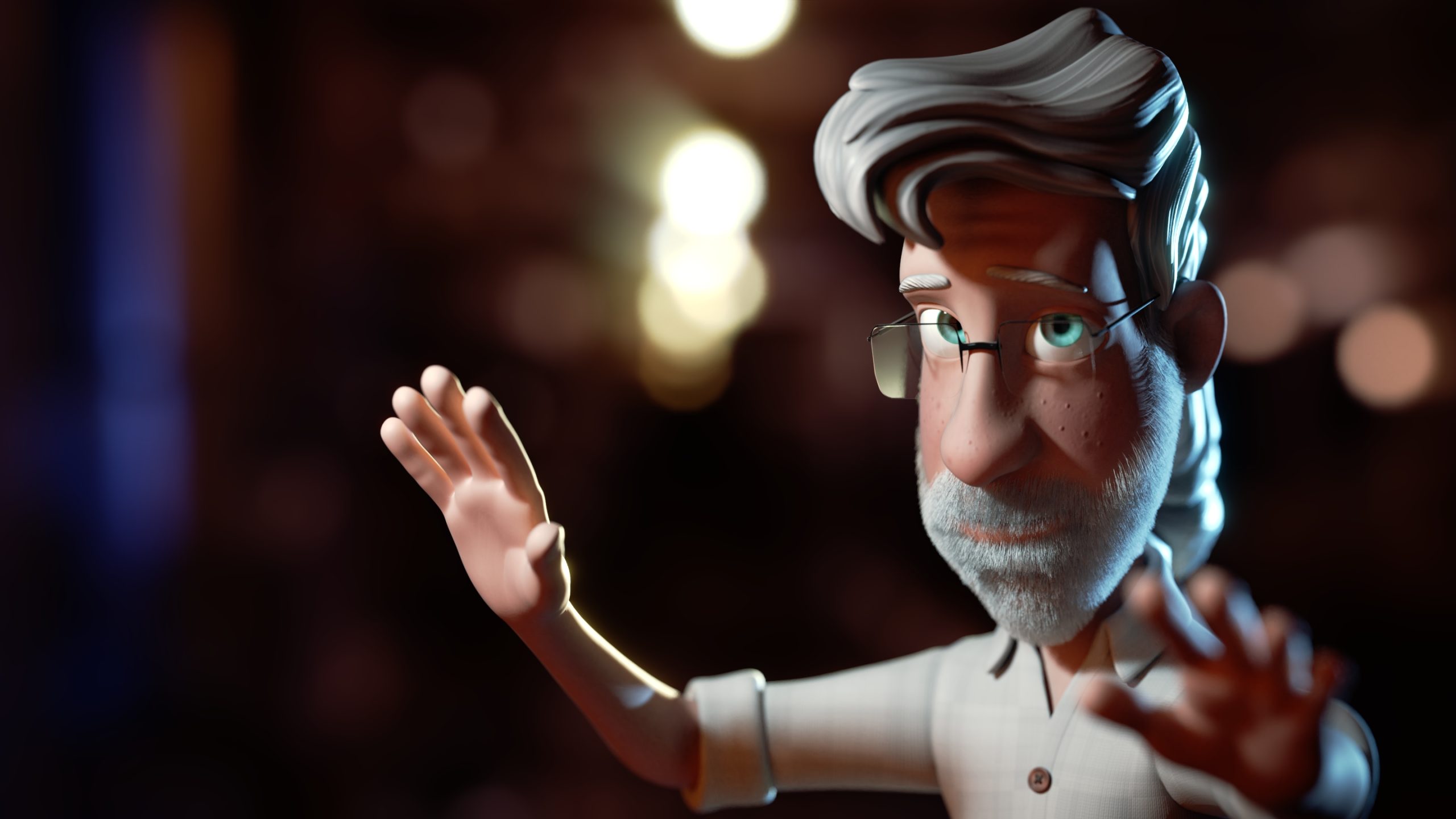
And I learned from last time that you can’t re-post lighting matches you’ve already done, but I ran out of time so I have no choice but to post one from before and loose the XP. I’m like Batman, I can take it.

@theluthier I followed your advice on the rim light, getting that blow out all the way the edge, looks sweeeeet. Plus I learned not to be afraid of the shadows and high contrast. Something clicked on that last live stream and during the homework, I feel like I got a level up.
October 21, 2018 at 4:08 pm #43084@dostovel You’re stuff is next level, these look amazing! Very inspiring
October 21, 2018 at 5:26 pm #43085@dostovel your works are always inspiring. Just great.
October 21, 2018 at 7:39 pm #43086@dostovel Those eyes! Inspirational lighting results. But those eyes!
October 22, 2018 at 10:08 am #43087Omar, Omar…the talented but defiant student. You take the easy route for one half of the assignment but go above and beyond for the other half of the assignment! The most important thing: It’s evident that lighting is clicking with you. Your’e getting it and it’s showing in your work. Awesome job, sir 👏
Another A in my gradebook.
October 22, 2018 at 11:19 am #43088October 22, 2018 at 3:20 pm #43089@dostovel Good work as always.
October 22, 2018 at 3:35 pm #43090@dostovel I think i Like the red lit goblin myself, but all look great. And nice to see I wasn’t the only one taking a turn at Vincent this week. I like how you made an older version of him. As for your light match… very well done! I think the sun is a bit brighter and yellower in yours, but as I found this week, that can really be hard to dial in. Great work this week!
October 22, 2018 at 10:48 pm #43091@dostovel These renders popped in my Instagram and all I could think was “Damn Omar nailed it again” lol. Incredible work and at first I didn’t even realize the low-polyness of that lighting match truck because the background looks so good.
October 28, 2018 at 6:09 pm #43092Homework week 4: Interiors
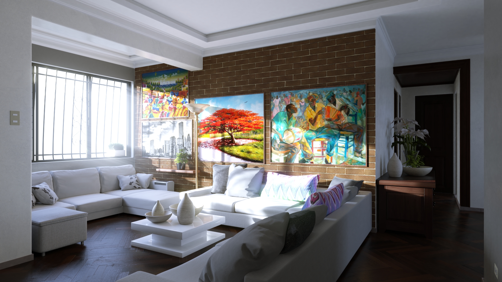
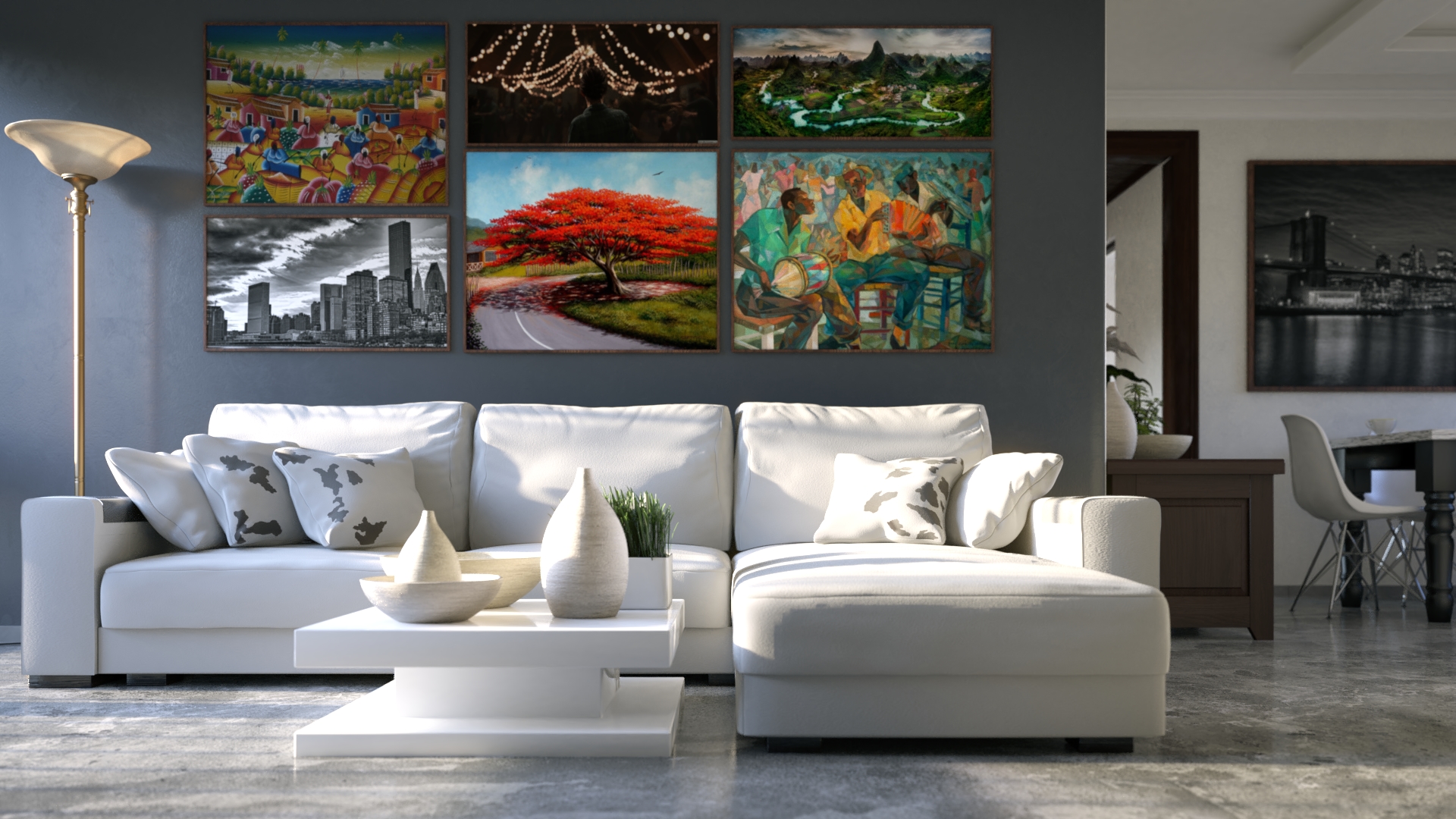
Sorry but I’m not that happy with the results, again they look kinda cartoony to me, not that clean realistic feel I want to achieve with those amazing renders you see online.
Made a couple of attempts, I’ll post them all. I rendered a lot and they were taking at least 2 hours so I couldn’t try everything I wanted or fix the mistakes they have. Also sorry I can only drop by and post the homework, my entire free time goes into trying to make these assignments. Totally worth it thought, it’s with practice like this and having the community and teacher motivation that you level up bit by bit.
And as per usual, I’ll take the hit with the lighting match. 🙁

 October 28, 2018 at 10:04 pm #43093
@dostovel It’s hard for me to see where your dissatisfaction is, or what quality it is that you are going for that you don’t have. These look well within the vein of realism to me. They really are very good. I don’t know what renders you are comparing too, but I don’t think I’ve seen many do better.
October 28, 2018 at 10:04 pm #43094Omar. I’m gonna grill you on Tuesday during the stream because I gotta know what in these renders is qualifying as “cartoony”. These are beautifully rendered arch viz scenes. I love the variety and exploration of materials. You’re thinking like an interior designer and that does so much for your final results.
The only note I have is that the brick wall in the first render seems too big. I’d shrink the pattern down to 50-60% of the current scale. Beyond that I’m just enjoying these lovely renders 👏
It’s the usual dance of an A+ getting downgraded to an A since you’re reusing prior light matches 😅
October 29, 2018 at 12:28 am #43095@dostovel you are way to hard on yourself, these are the kind of renders I use as inspiration, hoping I can achieve this level someday. Amazing and inspiring work this week!
October 29, 2018 at 7:30 am #43096@theluthier What does to grill mean? sounds bad.
Thanks for the kind words all, @smurfmier1985 cool new photo, but it’s hard to point the finger at what I feel I see. I don’t know, I think it has to do with the dynamic range and textures, other interior renders have that HDRI feel, textures are more tangible, things are less clean. Also maybe lighting is less dramatic most of the time. I wanted to dig into the materials and textures of the assets I got to populate the scene, but there wasn’t enough time. Now that I think about it, I forgot to desaturate colors a bit, I think that’s the cartoony part I’m getting, colors might be too pastel.
I’d say I got 80% of the way to where I’d like to get, just got to keep practicing and studying other renders and watching more tutorials.
-
AuthorPosts


- The topic ‘BC4-1810 Homework, Omar Domenech’ is closed to new replies.