
BC4-1810 Homework Mjans
Forum Archive › BC4-1810 Homework Mjans
- This topic has 42 replies, 8 voices, and was last updated 7 years, 10 months ago by
silentheart00.
-
AuthorPosts
-
October 22, 2018 at 6:52 am #42389
@gradyp Thanks for the tips on the light match. After looking at the same model for a while I get tunnel vision on what it needs. I will look at it and play on my time to make it sharper. Thanks
October 22, 2018 at 9:26 am #42390@gradyp , I took your background tip for showcasing my model. Is this more what you were thinking of as a more interesting background to display my model? I def think it looks more interesting.
 October 22, 2018 at 2:58 pm #42391
@mjans I think it does help 😀
October 22, 2018 at 3:01 pm #42392@mjans The LM is definitely getting closer. The second goblin looks more interesting, too. I kind of wish there were shadows to help ground the character, but it’s more interesting visually than the black background. Good work.
October 22, 2018 at 3:09 pm #42393@mjans Silent gave you some good advice. Dialing down your material’s value brings your render much closer to the source. My one note is that I’d like to see a slight amount of glossy reflection on the model. I mean real subtle, like 0.4 on the roughness and 0.1 or 0.2 for the amount of specular (assuming your using the principled shader). B+ from me.
As for your character, it was a good choice – like your light match – to darken your material from white to more of a mid grey. It avoids blowing out much better. Great job on the strong rim light; The purple and orange work well together too. The background is definitely more interesting than black but it’s also kinda random. Almost like it’s some sort of log that’s been highly blurred. I’m finding myself slightly distracted by it..I’d recommend a simpler gradient: Dark on the outside corners and fading to a slightly brighter purple in the middle.
Another B+ from me.
October 25, 2018 at 9:22 am #42394@theluthier This weeks Work in progress. Anyone have tips on what I should work on?
Thanks
 October 25, 2018 at 10:57 am #42395
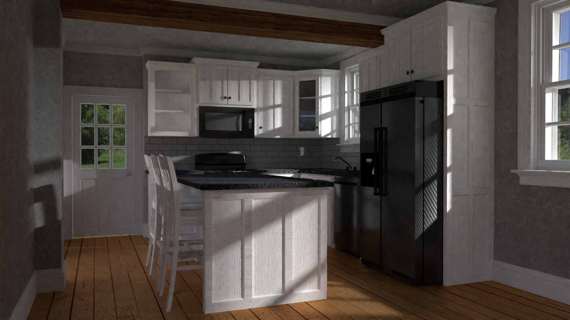
@mjans I’d say the main thing is just to crank up the lights. That will help you see what is going on. They can always be dialed back down later if you’re going for a crepuscular feel. Other than that, a few of the textures you have look worn and ragged (particularly the island; looks like plywood that only got a single coat of paint). I’m not sure “old and beat up” suits the model, but at least that look isn’t consistent with the rest of the textures. You will want to commit your texturing to a specific direction eventually, but first I would make the whole scene brighter.
October 25, 2018 at 3:20 pm #42396@procyonlotor here is a brighter render
 October 28, 2018 at 12:43 pm #42397
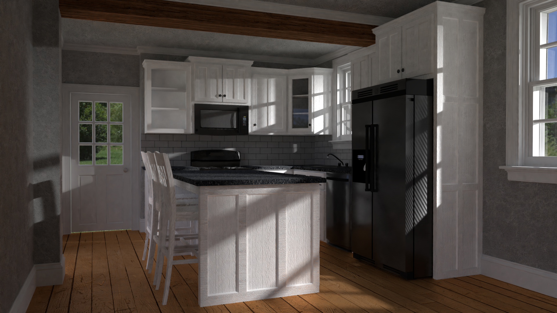
Homework submission week 2
Pic 1 Light match source photo
Pic 2 My attempt at light matching it (model from blendswap)
Pic 3 my arch viz


Pic 3
 October 28, 2018 at 12:52 pm #42398
@mjans the arch viz looks really great. The light match I think you have more of a yellow brons tint in you’re art while it’s more light Grey with a blue tint. Also you have harsh shadows while in the reference this isn’t happening. The background should also be a bit darker. Still great work done
October 29, 2018 at 7:19 am #42399@yukinoh1989 Thanks Yukino, I def spent more time on the arch vix, and good notes on the light match
October 29, 2018 at 3:44 pm #42400@mjans Congrats on finishing submitting homework all 4 weeks! Your light match is close although yours seems to have more yellow in it than the source. Also our background gradient is more contrasted than than the source. Could be distracting. That’s my only 2 note though. B+ from me.
Your arch viz is a solid effort though I have some notes there too:
- While I like the dramatic sun light casting interesting shadows on the kitchen, the extreme angle suggests a sunrise or sunset. In which case the sun needs to be tinted more toward orange. Also the fanning angle of the shadows seem like you’re using an area light instead of a sunlight. Since the sun is so far away, the shadows tend to be straight without a noticeable fanning of shadow angles.
- The wooden floor is in desperate need of reflectivity. Maybe raw wood floor exist in someone’s house, but I’ve only ever seen finished floors, meaning polyurethaned. A) for looks but also B) for durability. That’s to make a case that ALL wood floors should be reflective therefore. Even if it’s subtle, I highly recommend adding some reflection to the wood floor and the ceiling beam.
- The wallpaper / pattern on the walls look like denoising artifacts. Is the pattern also used on the cabinets? They’re a little splotchy too. I’d recommend going with a solid color or a more artificial pattern rather than a “textured” wall look, just to avoid the confusion.
Another B+ from me 👍
October 29, 2018 at 4:10 pm #42401@mjans I agree with the other critiques. It also looks like some ambient occlusion is missing in certain places in your archviz, like the feet of the chairs meeting the floor.
-
AuthorPosts


- The topic ‘BC4-1810 Homework Mjans’ is closed to new replies.