
BC4-1810 homework, John Monterone
Forum Archive › BC4-1810 homework, John Monterone
- This topic has 28 replies, 7 voices, and was last updated 7 years, 10 months ago by
Kent Trammell.
-
AuthorPosts
-
October 15, 2018 at 2:47 pm #43116
@arev Thank you! I totally agree about the color difference.
October 15, 2018 at 4:17 pm #43117@jm3d John I had the first impression is that the car rendering is maybe too shiny, but then the second is that it is finally harmonizing with the colors.
So just let’s forget all the theories and let’s enjoy it, really nice one
October 15, 2018 at 10:07 pm #43118@csehz Thanks 🙂
October 16, 2018 at 12:09 pm #43119@jm3d Late to the party. The gold paint is really nice, but I agree the rest feels less polished than the paint. I agree with the lighting match critiques, as well.
October 22, 2018 at 5:42 am #43120Week 3 Homework: Lighting Characters with Blender
 October 22, 2018 at 5:46 am #43121
Lighting Match #2
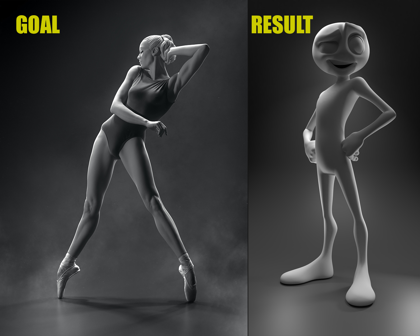
I chose to light match this model by Sergey Zinovjev and Andrius Balciunas from artstation.com https://www.artstation.com/artwork/gJJwqE
October 22, 2018 at 6:42 am #43122@jm3d I love the goblin, looks great!
October 22, 2018 at 9:06 am #43123@jm3d Wow, you even textured / added various materials to the goblin – nice! Way to go all out. Also kudos for not being afraid of color. No one can say you’re guilty of boring desaturated colors here.
That said, my one critique is that the color scheme is a bit all over the place; kinda rainbowy and lacking complimentarian color choices. The green and purple lights themselves go great together but it clashes with the various colors of the model. I went and desaturated the image and found that the lighting values are great!

So I suppose the practical advice is: Be aware that colorful lights and colorful models can be too much of a good thing. If you’re lighting a grey or single-colored model, lean on more colorful lights to make the image more interesting. If your model is textured colorfully, perhaps go easier on the color of the lights to avoid clashing.
Good stuff though: It’s an A in my book.
You light match is really nice as well. Great choice of a source. Light positions feel on-point. One note though: The contrast is higher in the source render. In the comparison below, the shadow that on the front of the model (specifically looking at the thighs) is a higher grey value in your render, darker in the source.
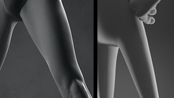
The only other thing I’d like to have seen is you overlaying the smoky effect as well. Still good stuff: B+ in my book.
October 22, 2018 at 1:26 pm #43124@smurfmier1985 Thank you!
October 22, 2018 at 1:27 pm #43125@theluthier Thank you!
October 22, 2018 at 3:09 pm #43126@jm3d That’s a very shiny piece of candy corn, if that was your intention. The pants are a bit too similar to the candy corn; maybe a really dark blue would’ve helped the candy corn pop more. Nice lighting. I also agree with the critiques.
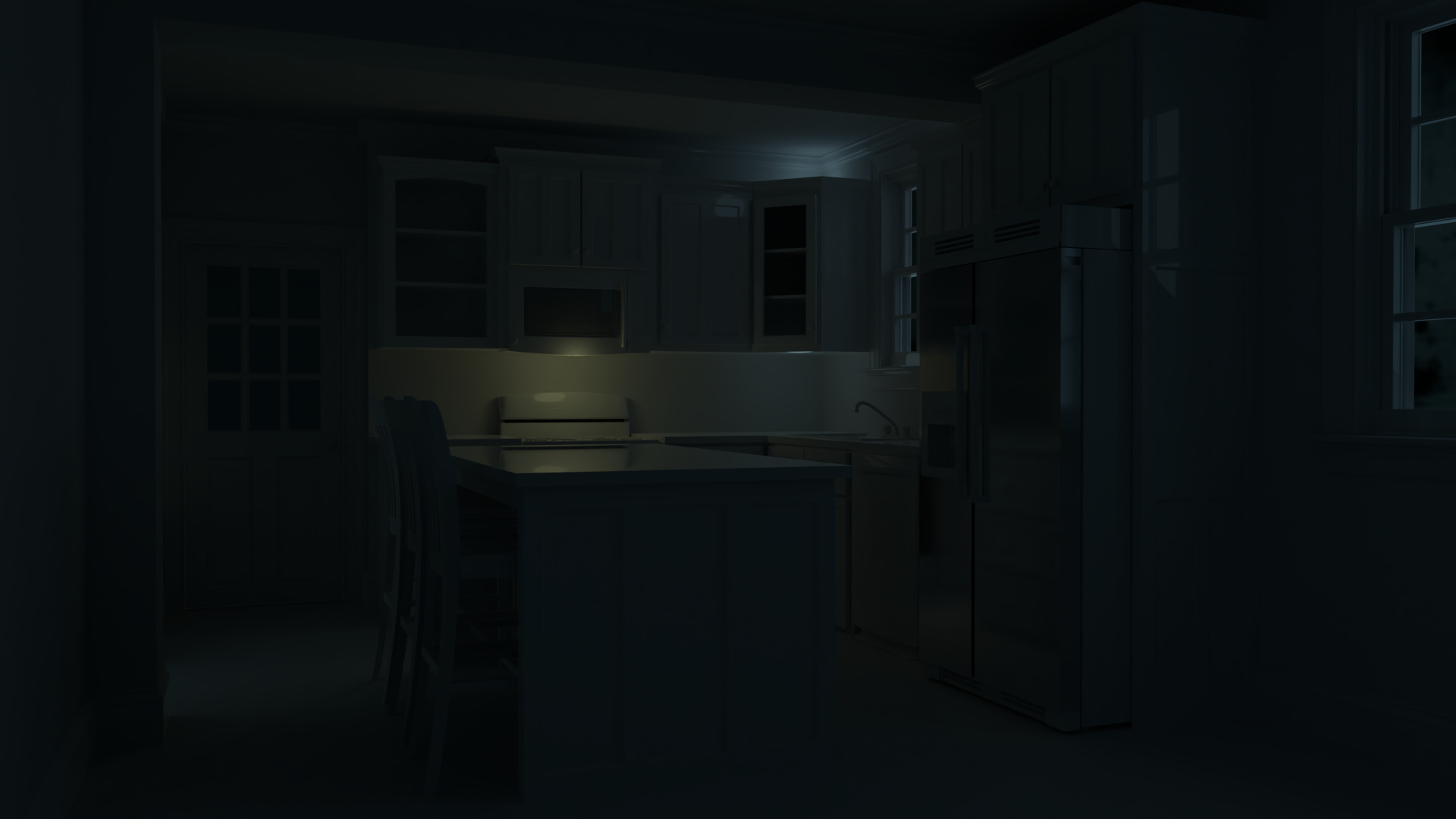
October 28, 2018 at 11:25 pm #43127Week 4 Homework: Shading & Lighting an Arch Viz Scene
 October 28, 2018 at 11:28 pm #43128
Lighting Match #3

I chose to light match this model by Rodion Vlasov from artstation.com
October 29, 2018 at 9:10 am #43129Submitted homework all 4 weeks! Nice job @jm3d. The overwhelming note for your arch viz is that it’s extremely dark and very difficult to make out the contents of the render. I strongly recommend that you always render bright enough to distinguish the visual contents of the image. “Darkness” is fine and can be achieved without getting too close to black. Here’s a brightened version that still feels dark like night time but is illuminated enough to distinguish the visual contents:
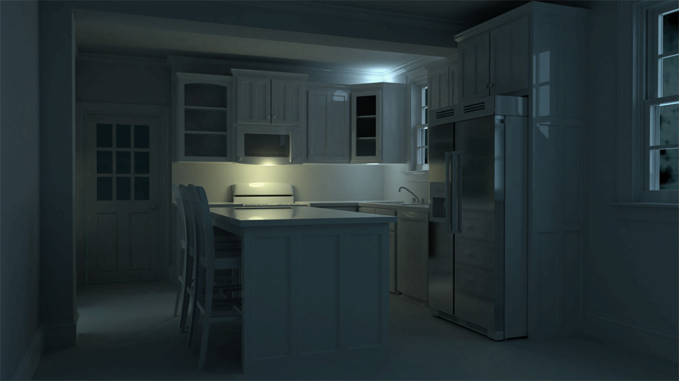
Also the light under the microwave makes perfect sense but the blue light above the cabinet is a bit mysterious. Once brightened the scene is fairly believable as a night time render but I would have liked to see you do a bit more. This kind of lighting is how we leave our kitchen ambiently lit when we go to bed. It’s a lot more interesting when we’re awake and more lights are turned on in other words. It’s a C+ from me.
Your light match looks good by itself but there are notable differences compared to the source. Primarily the fill color is not blue-ish-green enough:
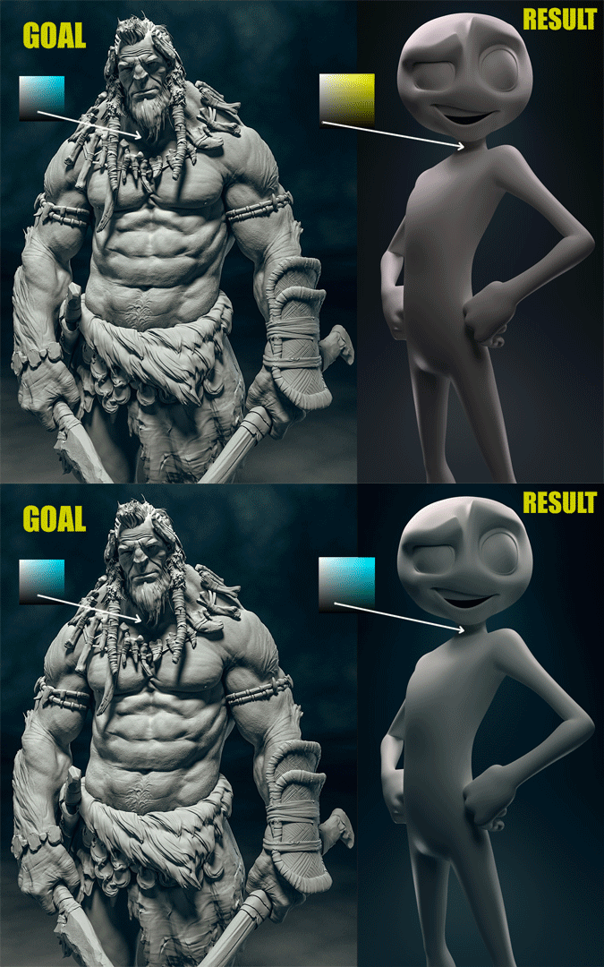
Secondarily I would have liked to see you match the background noise pattern along with the floor for maximum matching potential. Still it’s a solid result: A B from me.
-
AuthorPosts


- The topic ‘BC4-1810 homework, John Monterone’ is closed to new replies.