
BC4-1810 Homework, Jere Haapaharju
Forum Archive › BC4-1810 Homework, Jere Haapaharju
- This topic has 33 replies, 9 voices, and was last updated 7 years, 10 months ago by
Jere Haapaharju.
-
AuthorPosts
-
October 15, 2018 at 4:08 pm #43282
@swikni Jere reading your comment I started to feel lucky that Eevee runs so fast on my oldie computer from 2011.
Being not sure what is that OpenGL 3.3 support and so just being satisfied that not having issue like that
October 16, 2018 at 12:56 pm #43283@swikni Little late to the party. You did what you could with what you had and you persevered. Looks good to me. Maybe the orange light in the lighting exercise is a bit too much, but it looks good otherwise.
October 18, 2018 at 10:37 am #43284@theluthier @silentheart00 @csehz Thanks for the notes!
Yes that sounds like a good to try out some EEVEE renders in the character lighting homework. I might give it a go and definitely play around with it more in the future
October 21, 2018 at 1:28 pm #43285Week 3 Homework submission
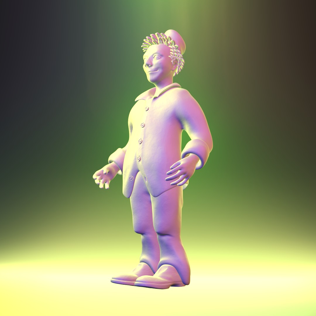
I tried few different lighting set ups. It felt pretty free and fun to add lamps and just try out what worked. I don’t have any newer character models at the moment and wanted to use something own so I used Cuthbert from character creation class.
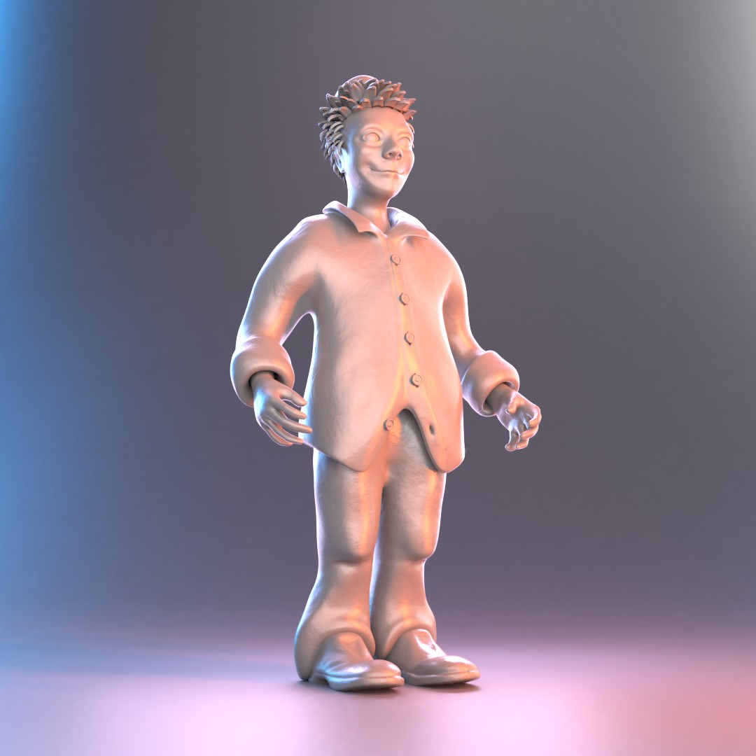 First I just wanted to lit it brightly and just make it sure that it’s not too dark and added noise shaders. After that I wanted it to look like a lit statue.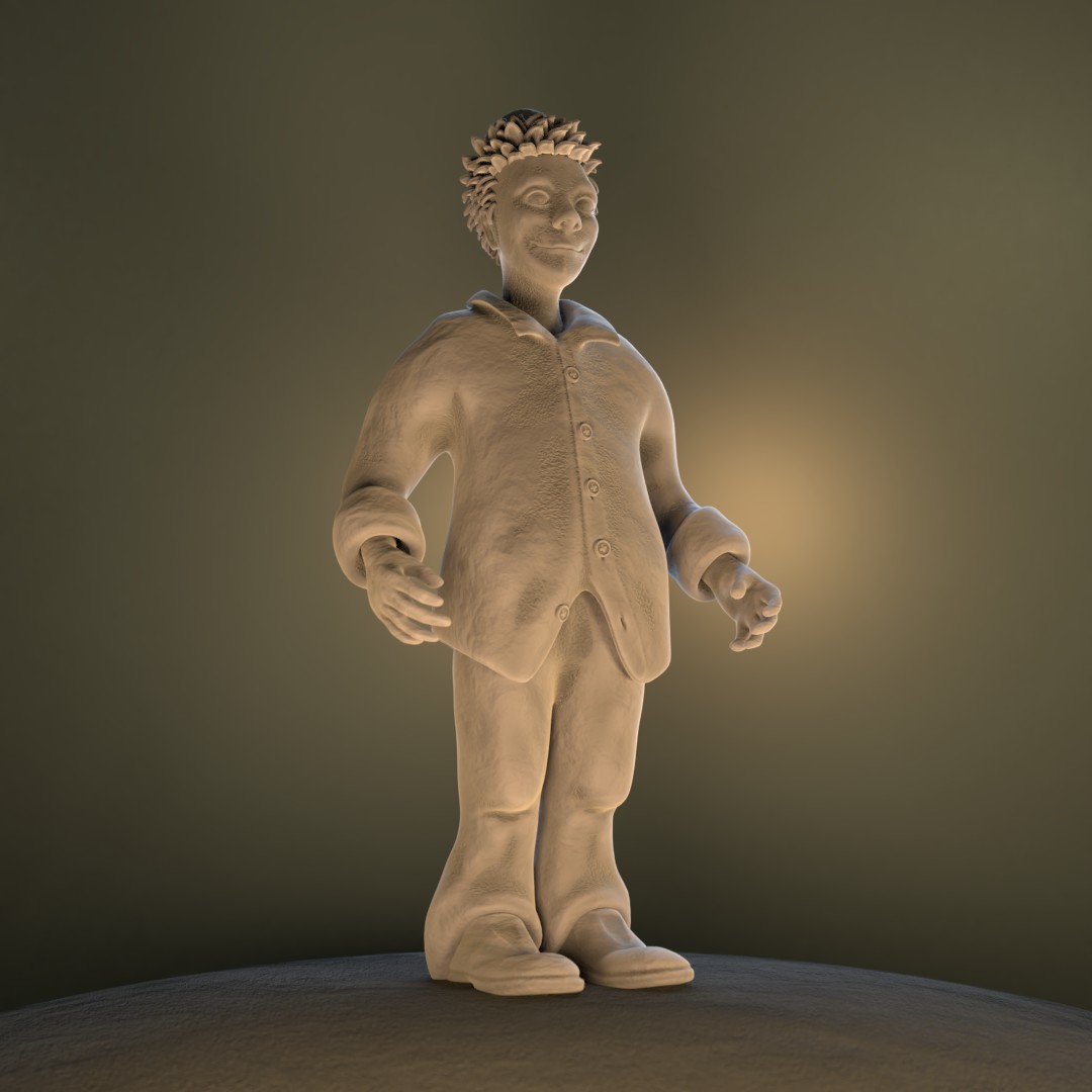
Then I made some test runs with EEVEE since I couldn’t use it last week. The lights do work very differently with it so I found it pretty difficult.
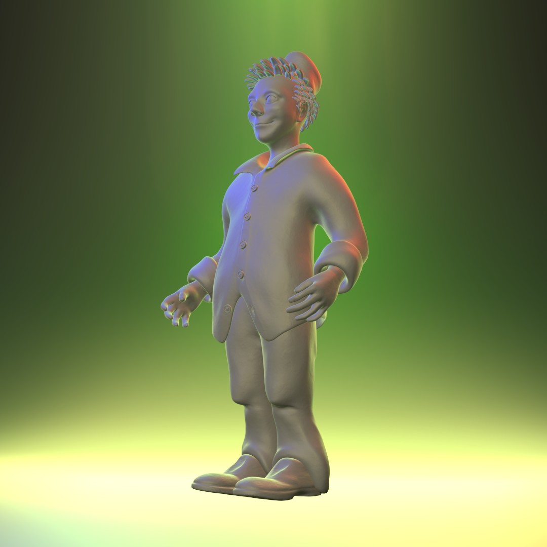
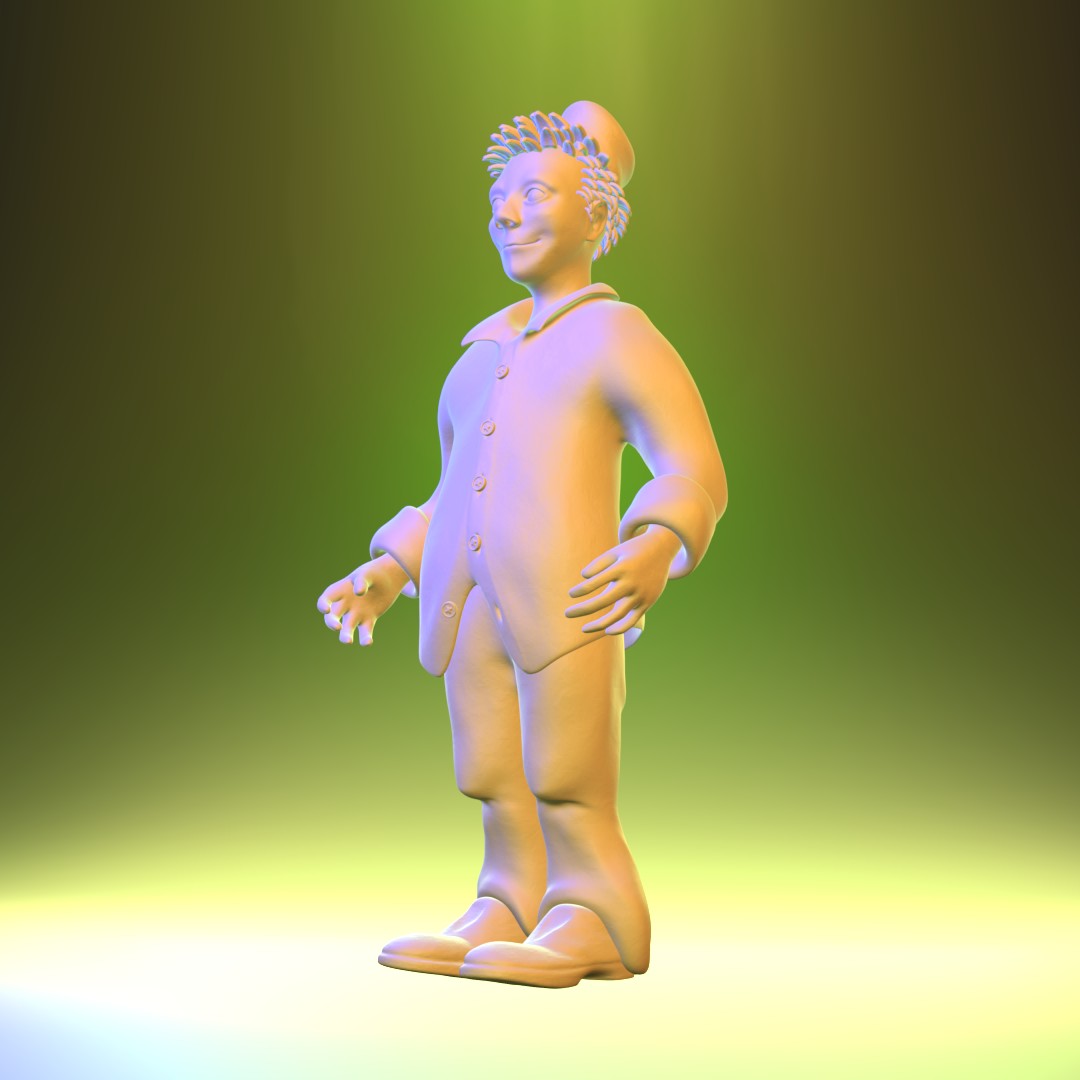
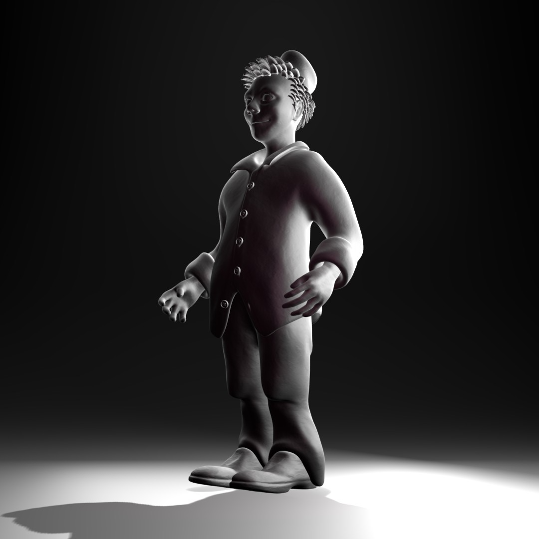
For lighting match I chose again quite simple reference. A pirate and his rat by David Ostman. Maybe too much of Cuthbert at this point so maybe the old clown head can work as a model for this

Reference:

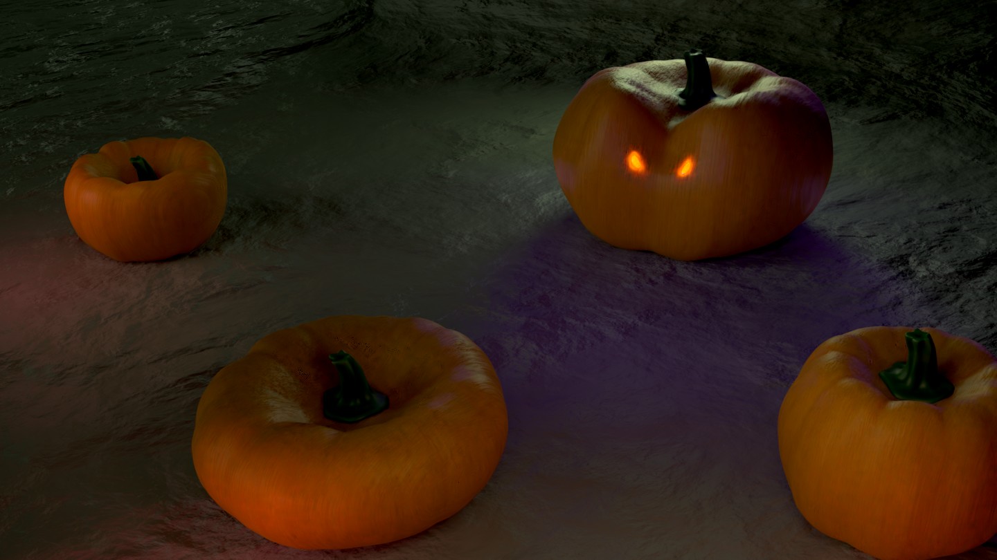
And as a bonus, here is my lighting testing for the Epic Pumpkin Contest scene. Trying to figure it out now for couple days before next homework. Vector curves and mixing noise textures worked out beautifully on the ground. That pattern looks very cool and non uniform to me.
 October 21, 2018 at 1:30 pm #43286October 22, 2018 at 10:22 am #43287
@swikni Really cool to see you try so many different setups! Your experiments were all over the place, in a good way; from moderate to wacky color schemes. I really like to see that level of exploration.
These are my faves:

The Eevee ones are pretty noticeable. It definitely takes more effort to get them on a comparable level to Cycles. One thing to look out for is too much blow out in the highlights. It can be too bright for taste. The 3rd from the left in that row (green/purple/pink) gets a little too blown out imo.
Overall an A+ for me in quality and effort.
With your light match I think you’re quite close but difference in the model’s detail level is a quick disconnect. Yours is also perhaps a little too blown out by comparison, though that could be due to details too. While the source is definitely blown out in the highlights, the blowout isn’t quite so broad. It’s B+ from me 👍
October 22, 2018 at 10:40 pm #43288@malhomsi Thanks and nice to see you again!
October 22, 2018 at 10:41 pm #43289@theluthier Thanks Kent. I appreciate the notes
October 28, 2018 at 3:18 pm #43290Week 4 Homework submission
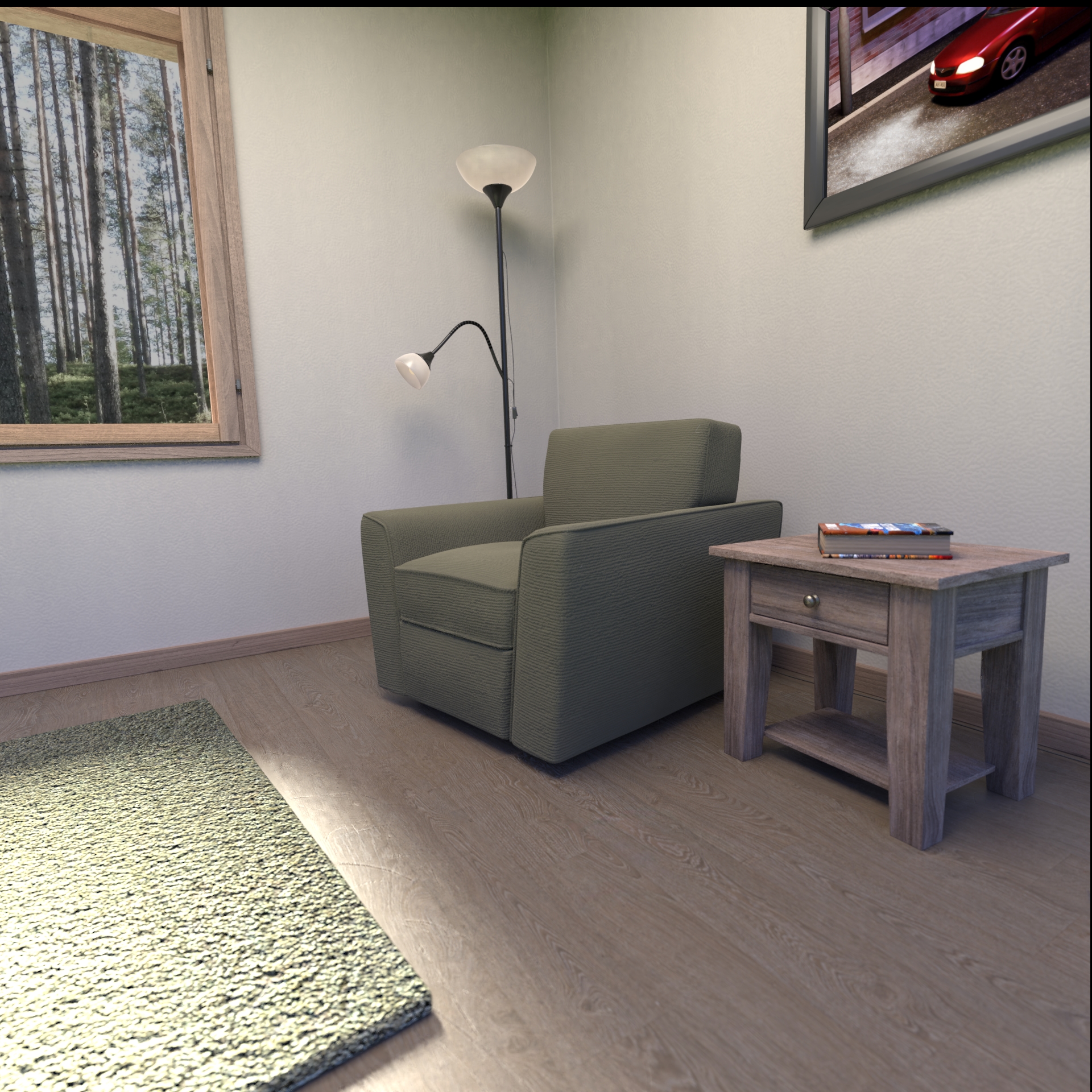
I wanted took it as a challenge to make the interior scene by myself. The plan was to create a simple set with few objects and a window and that was just the right amount of work for this deadline. Few things were left to adjust like the image behind the window still looks wrong for some reason and I want to try out some different camera angles.
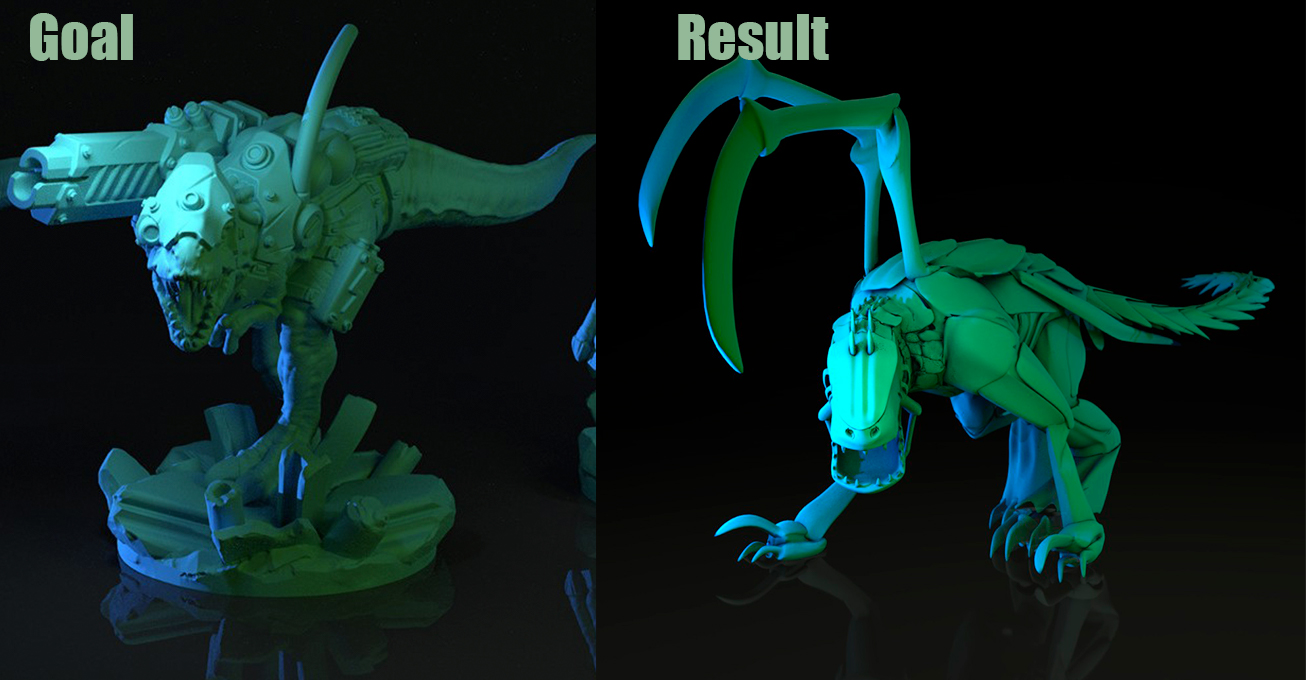
For lighting match I found this sweet simple zergling model from Blend Swap and as a goal image is “Dino with laser !” by Maciej Powarunas. I don’t know how it’s done in the goal image but I had to render the background in different scene and compose the renders to get that ground reflection without light reflections.
 October 28, 2018 at 3:25 pm #43291
@swikni I had already seen the sneak peek of your Arch Viz on Instagram, great work!! Maybe the image behind the window should be blown out to look better? That’s what usually happens when you take a photo inside. Good stuff though, great work!
Love the light match, good goal image and great result 😄👍🏻
October 28, 2018 at 3:50 pm #43292@swikni good work my friend , and Kudos for modeling the scene ! for me it s a good result , the exterieur image feels off ,maybe its a resolution problem !
i love the light match ! keep the good job
October 29, 2018 at 2:09 am #43293@smurfmier1985 @malhomsi Thanks! The background image is definitely a problem. I wanted to make it nature theme and damn, I have like a million forest photos on my hard drive but it was so difficult to find one that even fits! That’s the first thing to do after pumpkin contest. Hopefully I get it done in time
October 29, 2018 at 3:19 am #43294@swikni The rug feels off to me… seeming more like a foam pad. But otherwise, great job on the interior!
Light match looks really good as well!
October 29, 2018 at 4:16 am #43295@gradyp Thanks! I’ll add fixing the carpet in the to do list 😁
October 29, 2018 at 9:54 am #43296Homework submitted all 4 weeks – good stuff @swikni! There’s a lot of good about your arch viz scene. All your wood textures look spot on; entirely realistic. Your lighting looks very realistic as well. I love the lamp shades. Maybe my favorite single element of the scene.
One thing that doesn’t read realistically to me is the rug. It reads more like a sponge and unfortunately we’re closer to the rug than anything else which exacerbates the negative effect. You should be able to get away with this kind of textured rug geometry approach if it was thinner and further from camera.
Another thing is the environment texture in the window, as you mentioned. I think there’s a few things wrong with it:
- Brightness is off. We can see the sky through the trees which is much brighter than interior lights would be yet it’s strange grey color:
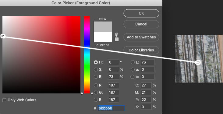 Additionally cameras and human eyes can’t fully normalize the dynamic range of daylight and indoor light. Both of them adjust to one or the other, whichever is focused. Camera’s are less advanced than the human eye and they normalize the dynamic ranges poorly which usually results in a blown out exterior. That’s why so often you see blown out windows or pure white windows in photos and renders.
 - It feels more like a photo on the wall than a dimensional outdoor space. This is a very common problem with arch viz renders. The issue is not necessarily as simple using a texture. That approach makes too much sense to not employ. However a dimensional space would be affected by depth of field in the camera lens. In other words blurring the background is important to conveying dimension.
Overall though you’re very close to realism. It’s an B+ in my book.
Your light match is great! I love the extreme greens and blues. They certainly add interest to an already cool but grey model 👍 A from me.
- Brightness is off. We can see the sky through the trees which is much brighter than interior lights would be yet it’s strange grey color:
-
AuthorPosts


- The topic ‘BC4-1810 Homework, Jere Haapaharju’ is closed to new replies.