
BC4-1810 Homework, Cthulusan
Forum Archive › BC4-1810 Homework, Cthulusan
- This topic has 37 replies, 10 voices, and was last updated 7 years, 10 months ago by
John Fluet.
-
AuthorPosts
-
October 14, 2018 at 5:02 pm #43017
@cthulusan Nice car. Lighting match is a good start, but it looks like in the original there’s a general light lighting the whole of the scene and then a very harsh rim light lighting the face and then a very small amount of fill on the right so the shadows aren’t so harsh. I could be wrong though, but I think that’s what’s happening in the scene. You’ve got the spirit of it, if not an exact match. Good work.
October 14, 2018 at 6:11 pm #43018@silentheart00 thanks for the critique. That fill light on the right has me flummoxed. I seems like bounce light but the ear and her shoulder make it seem like a rim light from behind. Maybe it’s both.
October 14, 2018 at 6:52 pm #43019@cthulusan I love how you textured the dashboard, that’s a lovely touch!
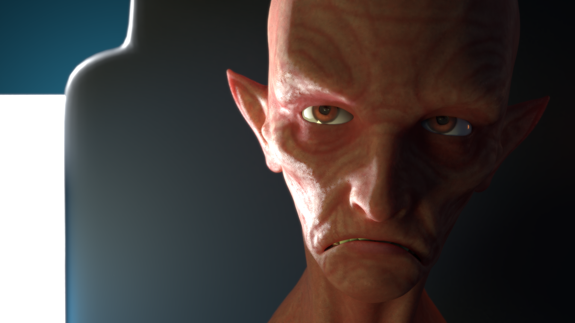
October 14, 2018 at 7:28 pm #43020One last shot at matching. Brightened the world light and added not one but two lights to add fill light on the right with just a touch of added rim light.
 October 16, 2018 at 4:22 pm #43021
@cthulusan Fantastic work on the Eevee vehicle this week – it was among my faves. You really seem to have put a lot of effort into it and it shows. Most detailed interior I’ve seen. A+
Cool progression with your light match too. You’re really close and I like the detail you put into your character’s face over time. My only note is that the visible light in the background is brighter (whiter) and not defocused / blurred like the source. Small note and it’s not the focus of the image. But still 🙂
A for the week overall 👍
October 16, 2018 at 7:53 pm #43022@theluthier Thanks Kent. I had a lot fun with the car and I learned a ton. Eevee was both fun and frustrating to work with. Can’t wait to see it stabilize. I had to stop myself from continuing to tweak details.
The lighting exercise was challenging but very educational. That background light is actually pure white which is off from the warmer color in the original. Unfortunately, warming it up would also warm up the background wall (the blue behind it) and it would turn green. I should have modeled the background more like a window which is what I think it is in reality. Enjoying the class. Wish I could make the livestreams but work gets in the way. Recordings are good though.
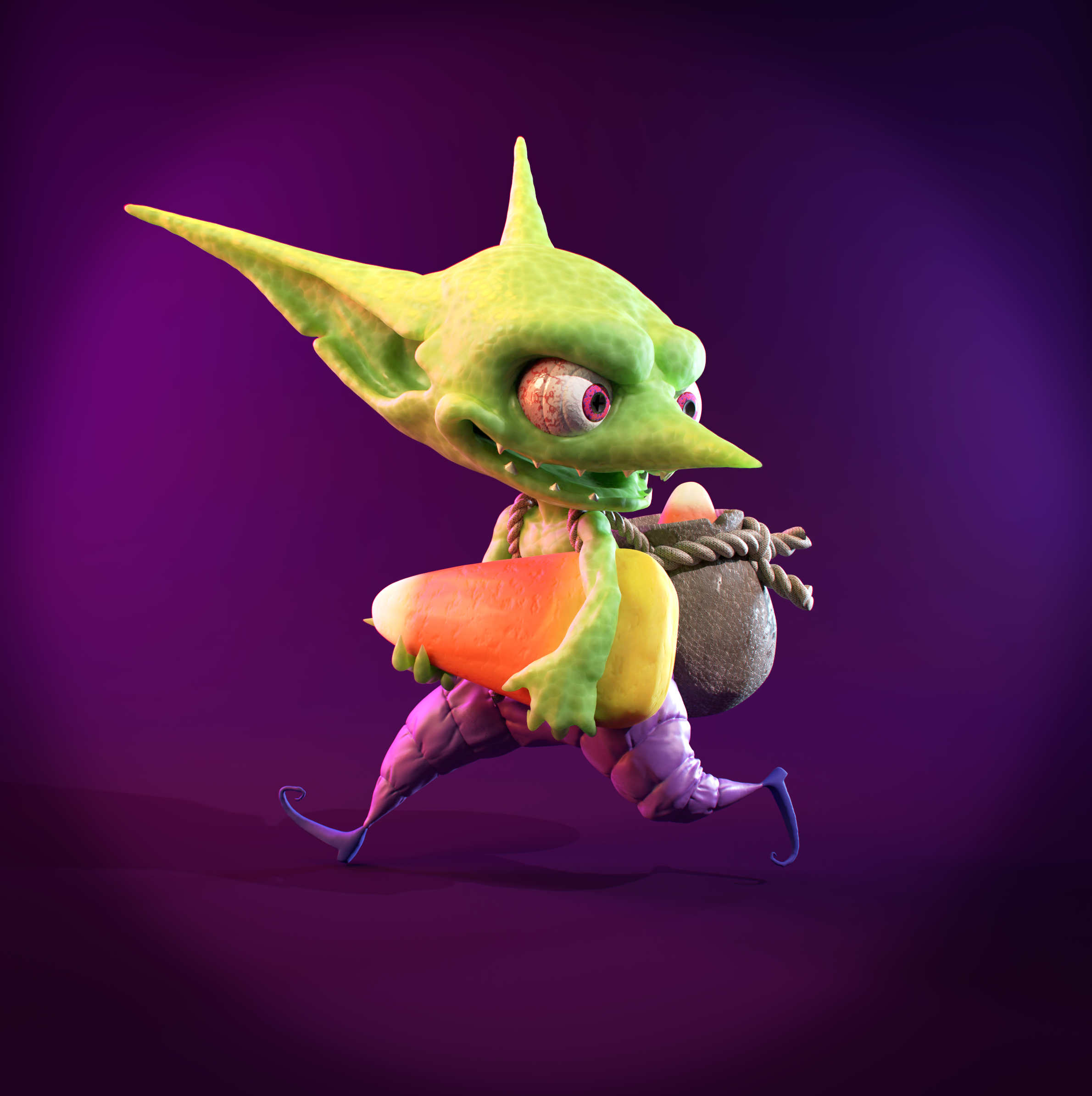
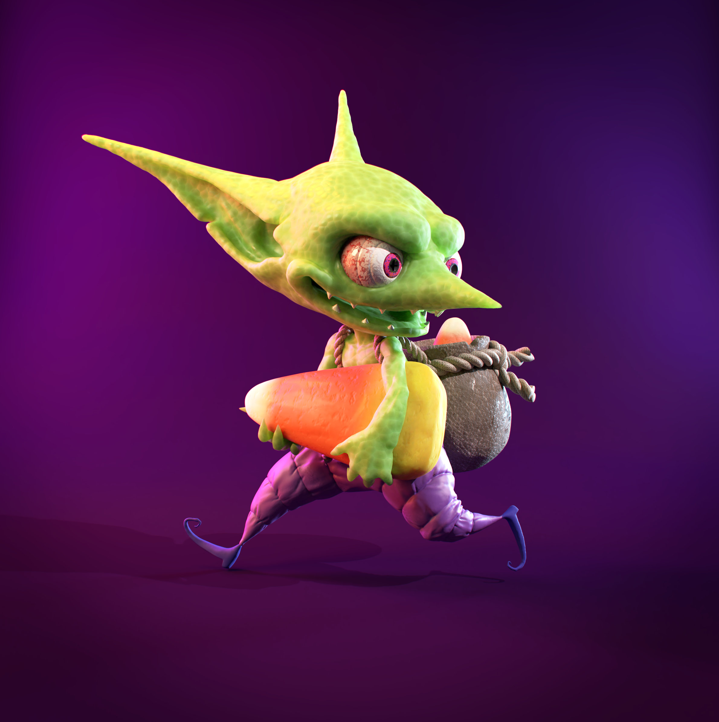
October 20, 2018 at 11:20 pm #43023First of my assignments for this week. Working on the “dress to impress” portion. Chose the Goblin model (love this character so much). Mostly procedural with a couple of textures thrown in. Redid mats several times but learned tons along the way. Embarrassed to say how long I spent on that candy corn material. Working with a high poly mesh is difficult. I wanted to apply a different material to the interior of the mouth but couldn’t get a smooth transitions. And I’m still trying to get the teeth right. I’ve given them separate mats but since they are triangulated they don’t mesh well (no pun intended). Would it make more sense to separate them into their own meshes?
 October 21, 2018 at 4:51 am #43024
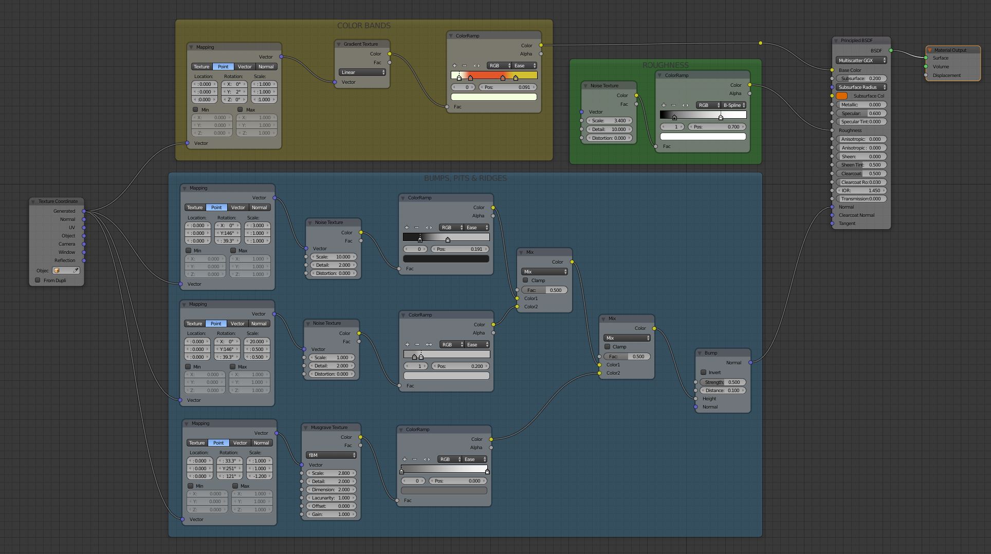
@cthulusan Just curious.. how did you do the candy corn? hand panted texture? procedural? some other?
October 21, 2018 at 10:41 am #43025@gradyp All procedural. It turned out to be pretty simple in the end but didn’t start that way. I initially tried using the wave texture to color the bands and ended up with a ridiculous amount of nodes to try and control the colors. Combining procedural textures can be a little complicated but I think I’m finally understanding how to do it. At least I feel 50% in control. Here’s the final node network.
 October 21, 2018 at 1:40 pm #43026
@cthulusan I know precisely how simple procedural stripes are. 😀 The only difference between your set up here and the simple stripes I used on 2 of my characters is that I used a wave texture set to Saw instead of the gradient to get the interpolation and used constant interpolation because we were going to be far enough back that you wouldn’t really notice the color bleed edges 😀
In fact, when I did Herbie last week… I used nearly the same setup for his stripe decal as what you have here, except I used constant interpolation for the stripes (same reason as on the one above)
It’s such a simple way to produce stripes, yet can’t tell you how rarely you see stripes — even on things that are supposed to be “modern” or “futuristic” — and yet, they’re everywhere in real life (stripes and stripe based patterns like plaids, checks, ripples, argyles, and more). When I do see it, they’ve used an image texture, which is a valid way to do it, but far harder to make a simple change if you want to.
Glad to see you found that 😀
I think the white to orange flags could be a little further right and maybe slightly tighter on the color blends, but it still looks great!
October 21, 2018 at 2:36 pm #43027@cthulusan I like the how bright and colorful he is! Also love the voronoi pattern on his skin. The vignette could maybe be a bit blurred so the transition is more smooth, it’s s very harsh circle now. Great work! 😄
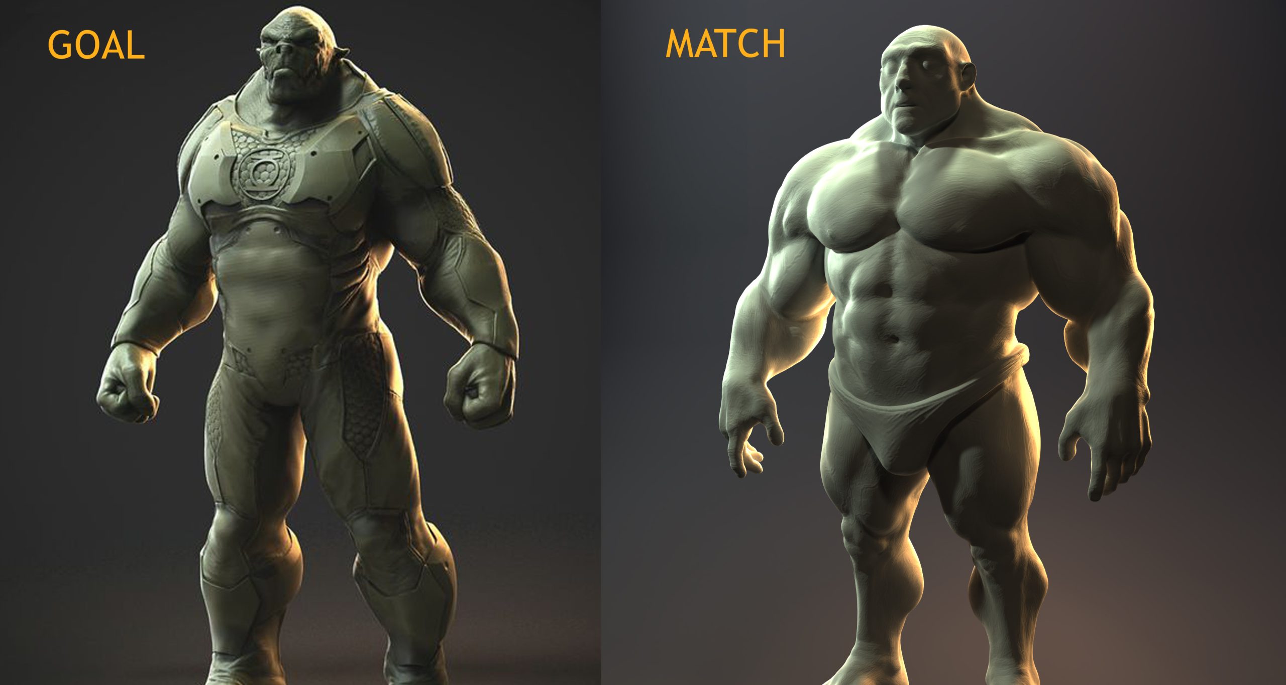
October 21, 2018 at 7:07 pm #43028Match lighting exercise for this week. I’m finding these to be really challenging. Sometimes I feel like I’m just slapping lights all over the place. I had to change models part-way through as I had a super thin model which made it really difficult to match. Ended up using SuperHuman by David Vidiger from SketchFab. Not an exact match. Getting close but I’ve run out of time.
 October 21, 2018 at 7:29 pm #43029
@smurfmier1985 Thanks for the feedback. Definitely challenging to keep the colors punchy when using colored lights. I reduced the vignette on the image as you suggested.
 October 22, 2018 at 6:12 am #43030
@cthulusan Much better! 😄
October 24, 2018 at 8:37 am #43031@cthulusan Good stuff this week! I can tell you put a lot of work into procedural material materials/textures for your goblin. Love that and I know it’s tricky stuff. Your candy corn looks brilliant – spot on! Really nice leather on the back pouch too.
As I mentioned in yesterday’s stream, the big critique from me is that the material colors are a bit too vibrant. The end result produces a rainbow-y color palette which is difficult to make look nice. I think if you desaturated the pants, skin, and boots it woul de step in the right direction. Also dial down the SSS radius since it’s blowing out the details.
Overall I gotta give you an A because I can tell you put a lot of work in 👍
Your light match is super close! Like reaaaal close. Just 2 notes:
- The blueish/white key light on the left is blowing out your model where it’s not on the source. So I’d dial that one down a little bit.
- The background color is a shade lighter than in the source.
Pretty minor notes though. Another A from me.
-
AuthorPosts


- The topic ‘BC4-1810 Homework, Cthulusan’ is closed to new replies.