
BC4-1810 Homework, Ben Reichel
Forum Archive › BC4-1810 Homework, Ben Reichel
- This topic has 22 replies, 9 voices, and was last updated 7 years, 10 months ago by
Kent Trammell.
-
AuthorPosts
-
October 19, 2018 at 12:23 pm #43348
I don’t have a ton of time this week but I wanted to at least give the goblin a go. I wanted to give the image a little more sinister feel so I have him looking directly into the camera and tried to do more lighting from the bottom. I can’t remember where I heard it but in film the purple background indicates that someone is going to die.
I am feeling more confident working with the shaders and basic texturing. Understanding how the light effects them is making it all click into place.
 October 19, 2018 at 4:22 pm #43349
@notcastanza Good start. Maybe the camera angle could be a little higher, but I think there’s a weird mesh issue with the pointing up ear, so doing the best you can. The materials look nice so far. Maybe there could be a ground plane; looks like he’s floating.
October 22, 2018 at 2:18 pm #43350@notcastanza Kudos for injecting color symbology into your render. That’s an excellent tool for conveying undertones of meaning. I’m trying to remember back to college when we studied the various meanings of color..as I remember, purple represented “royalty” or ‘nobility” which is why Jesus was often depicted with a purple sash or robe in renaissance paintings. That’s not to say that purple doesn’t mean also mean “sinister” in other contexts. Colors mean different things to different cultures. Still the effort is a big step in the right direction!
I have a few notes:
- Rim light confusion: I see a distinct rim light effect on the black (skin) shader, which I think its primarily being achieved with the fresnel trick. However I don’t see it so much on the other materials. For believability I recommend being consistent with rim light both in lighting and shader tricks.
- Color variety too random: The material colors range from brown, yellow, black, purple, orange, with a navy blue-ish-purple for a background. They tend to clash together more than they compliment each other. I would recommend leaving the model grey or a single color and concentrating the fill light to be purple, to emphasize the sinister undertone you were going for.
- Character looks cut and pasted over the background: I’d like to see more interaction between the character and the background. Rendering them together is the best way to do this. Right now it looks like you lit+rendered the goblin separately and composited it over a background color.
Overall it’s a B from me 👍
October 23, 2018 at 8:04 am #43351@notcastanza great work this week!
Also did you just enter the pumpkin contest with a here lies Kent gravestone? Love that! 😂 well done on your first complete scene 😊👍🏻
October 23, 2018 at 12:42 pm #43352@smurfmier1985 Yes I did. Thanks!
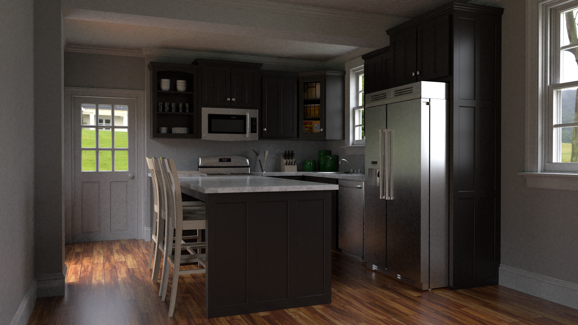
October 28, 2018 at 4:04 pm #43353Homework Week 4
I hope I got this in on time.
 October 28, 2018 at 4:29 pm #43354
@notcastanza You even got a couple of hours early 😉 Nice job!
October 29, 2018 at 1:38 pm #43355@notcastanza You submitted in time. Here’s a secret: I’ve yet to not grade someone based on time submitted. I just strongly encourage timely submissions to make my grading life easier 🙂
Nice work on your arch viz this week! One thing I want to commend but may seem like an obvious thing to do: You picked colors and materials that are appropriate based on reality. I’ve seen many kitchens like this in my life and because of that I’m immediately invited to believe your render. Good color and material choices, Ben.
I have a few critique points:
- The wood floor has no bump. The reflection strength and roughness look great! But no wood floor is perfectly smooth. Using the texture as a subtle bump goes a long way.
- The outside environment texture is too clear. Dimensionally, I would like to see the environment A) blurred out to represent depth of field in the camera and B) blown out in terms of exposure. Camera’s do this because the dynamic light range outside vs inside is drastically different and modern technology has a hard time normalizing them together. Blowing out the windows to white or almost white is more relatable as a photorealistic aesthetic.
- Lighting is realistic but could be more interesting. This one is something I’m seeing a lot this week and will discuss in depth during tomorrow’s live stream. In short it looks like a snapshot of a realistic kitchen on a normal random day. The only issue with that is it can be common and forgettable. However a more *designed* lighting scenario can look more interesting; like it belongs in a magazine.
All things considered it’s an A from me.
-
AuthorPosts


- The topic ‘BC4-1810 Homework, Ben Reichel’ is closed to new replies.