
BC4-1810 Homework, Aaron Rudderham
Forum Archive › BC4-1810 Homework, Aaron Rudderham
- This topic has 185 replies, 17 voices, and was last updated 7 years, 10 months ago by
Kent Trammell.
-
AuthorPosts
-
October 4, 2018 at 12:33 am #42097
@thecabbagedetective grrrr chrome! Good”night” Aaron, we will hear about it later 😊
October 4, 2018 at 9:11 pm #42098Day 2 done for realsies!
Right, this is what I had to say yesterday:
Okay, first thing’s first, right after the stream this is the first ad I get on the first video I watch. Coincidence? I’ll let you be the judge…
Didn’t get much update worthy stuff done today, though I did tweak my teaser, with both a combination of advice and my own curiosity so here’s what I got now, an improvement I feel:
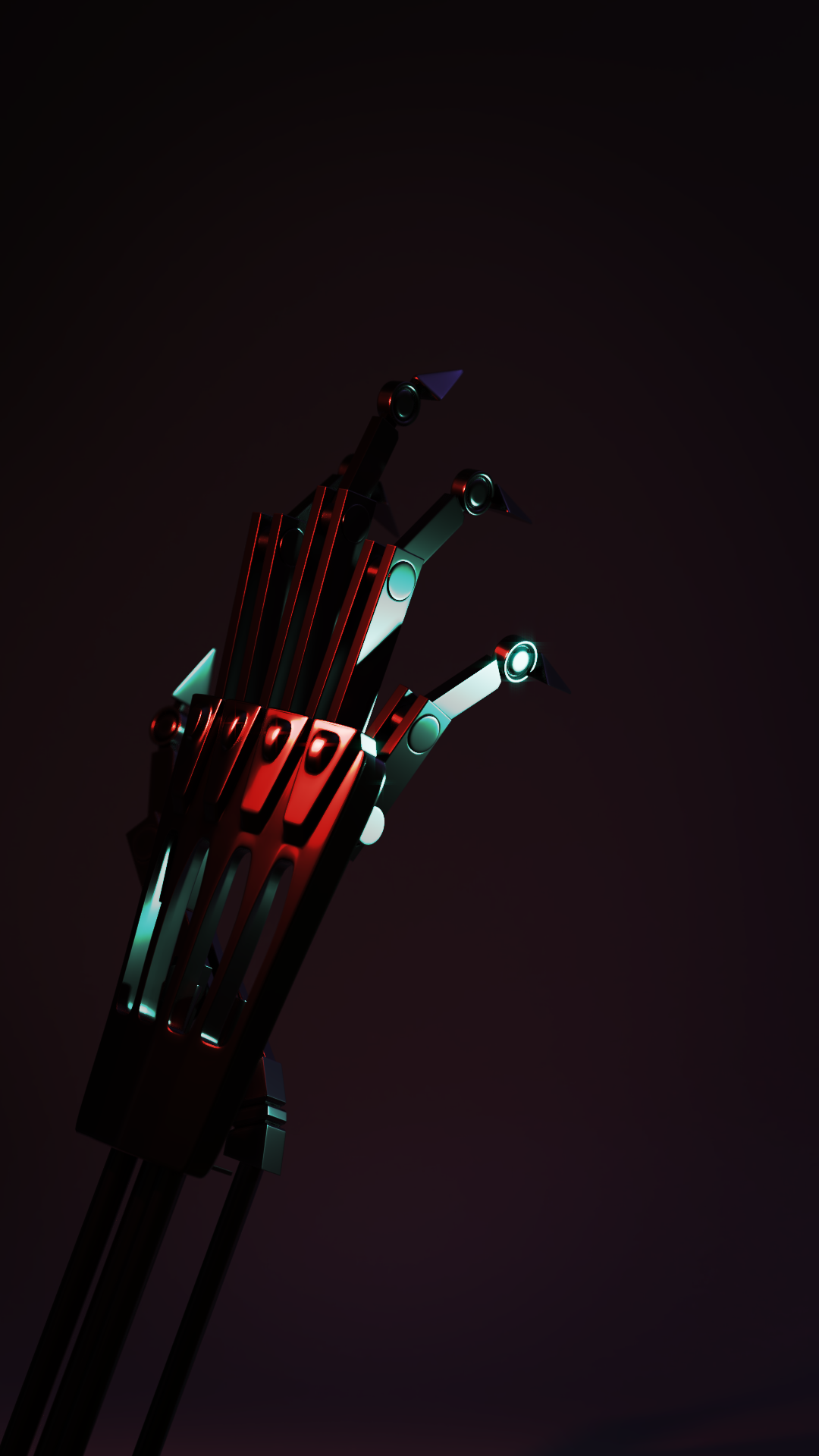
Though now I feel it blends a bit too much into the background, hmm… I’ll allow you guys to be the judge on that one. With that being said a good day to you all and happy blending!
I’ll have to give my third day update in the morning due to rendering. I won’t lie though, with this class, the contest, and some paid projects… I’m gonna be busy…
October 4, 2018 at 11:52 pm #42099@thecabbagedetective Hi Aaron, I love the colors and the mood but indeed you can’t see the subject anymore it’s wayyy too dark.. so I think you have too compromise the mood a bit and lighten things up so we can see the main subject, ’cause would be a shame if we can’t see all the hard work you put into it 😊 You could alternatively try a harsh rim light behind the whole hand? Maybe that would help it stand out so you can keep things darker, though you should lighten it up anyway imo so we at least can see all the details/parts of the model like the fingertips, arm and the left side of the hand. But maybe a rim would make it so that you have to lighten it up less than without, so you can keep the mood you’re after.
October 5, 2018 at 12:00 am #42100@smurfmier1985 Cheers for that! Welp, back to the .blend file it seems. Atleast I know what I’m doing now. Thanks again!
October 5, 2018 at 12:21 am #42101@thecabbagedetective I agree with some of Miranda’s critiques. Some areas are a touch dark and kind of losing some details there.
October 5, 2018 at 4:34 am #42102@thecabbagedetective it looks really good but maybe add a real soft light in front and what sure could help is the rim light I think that might let it stand out more
October 5, 2018 at 10:42 am #42103Day 3 done!
So I started on my “Remastered” series, with my first ever non-tutorial based render, “Childhood Memory”. You can check it out here, but it’s quite simple, no story to tell. Right lets have a look then, doesn’t seem too bad so just add shaders and ligh- OH GOD WHAT IS THAT
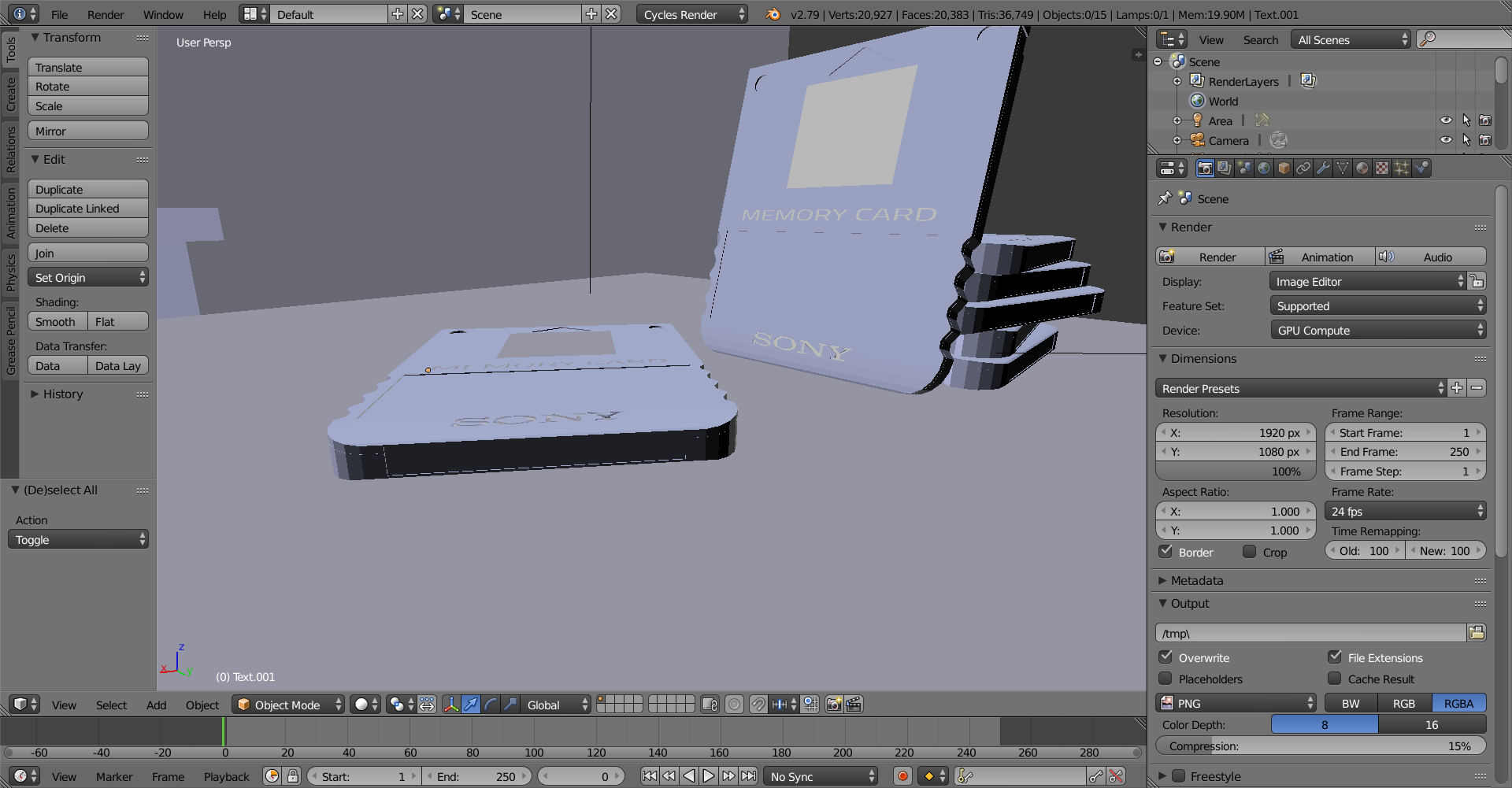
WHY ARE THE NORMALS INVERTED?! WHY IS IT USING FLAT SHADING?! WHY ARE THE WORDS JUST FLOATING?!
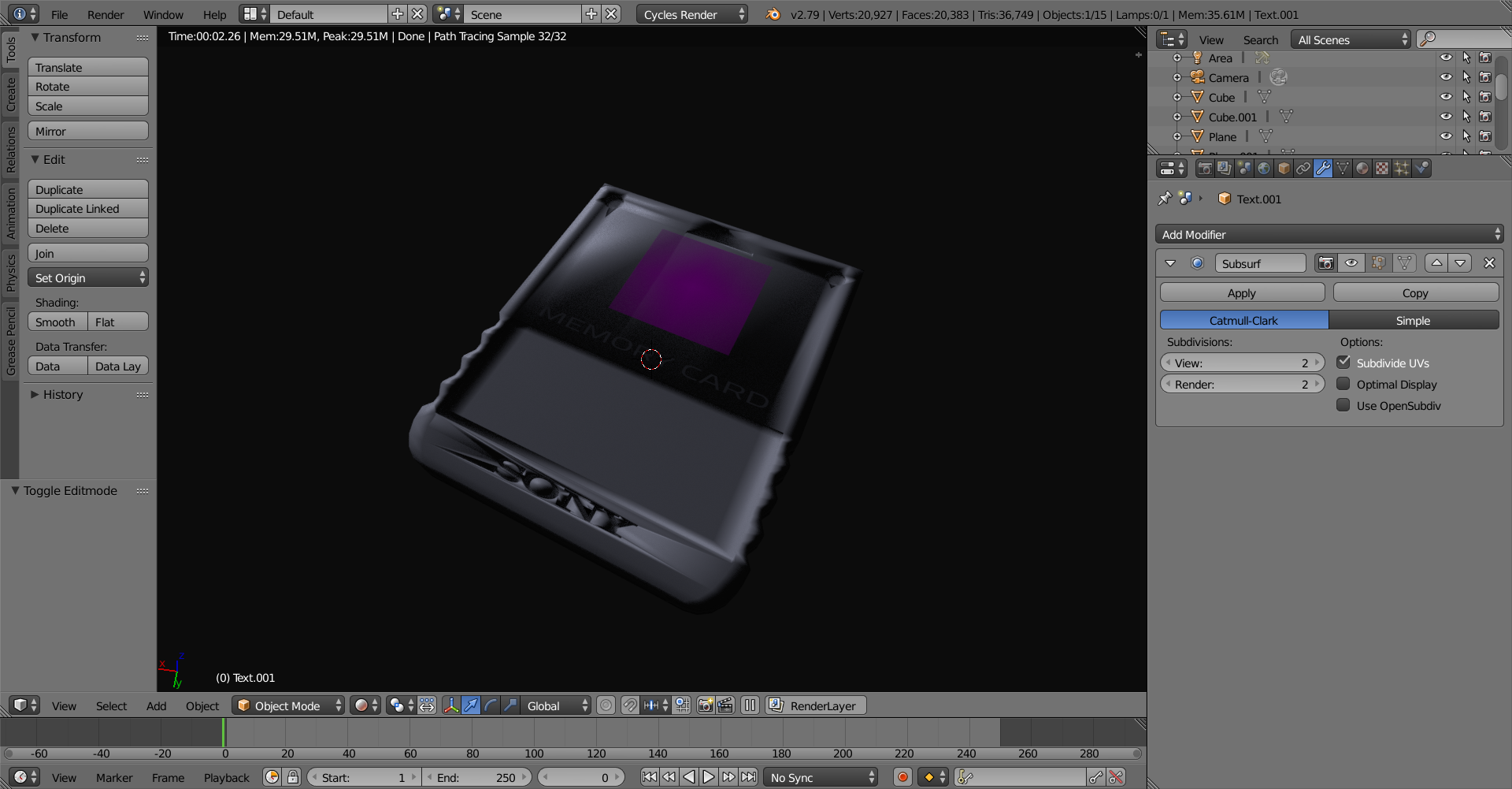
OH GOD WHAT IS THAT?!
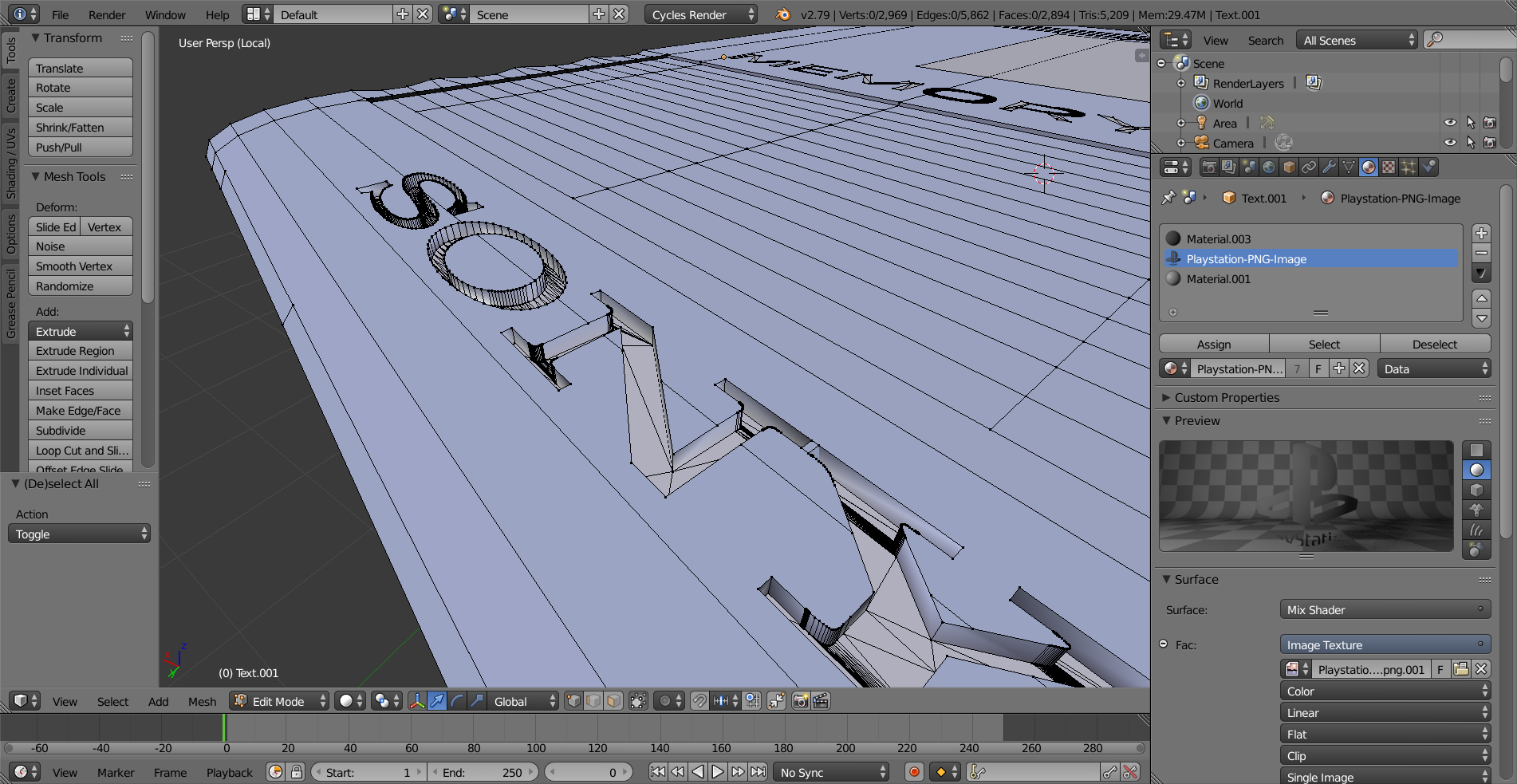
AAAAAAAAAAAAAAAAAAAAAAAAAAAAAAAAAAAAAAAAAAAAAAAAAAAAA-
Okay, maybe this is a bit more than a simple re-shading and re-lighting, guess this week is “Aaron Rudderham: The Remake” instead. Except I’m not gonna cut it up into three pieces and expect you to wait 10 years for the full experience *cough* Square Enix *cough* FFVII *cough*.
Well I modeled most of it yesterday, with the exception of the “Sony” carving. I’m not really sure how I’m gonna go about this whilst looking nice and not taking 4 hours to fix the topology, and of you guys got any pointers? I’d really appreciate it!
Now it’s time for a long time fan favorite to return, the turntable! Comparing both my original and new memory card (which isn’t finished, still have more details to add). It’s amazing what a ton of practice will do.

Didn’t bother modeling the top or back because you won’t seem them in the render, but I like what I got so far and if anyone could point me in the right direction towards the letter carving I’d appreciate that. Well that’s me done for now, have a good one guys!
October 5, 2018 at 12:23 pm #42104@thecabbagedetective Why not control the “Sony” with textures? Like with displacement or something?
October 5, 2018 at 1:14 pm #42105@silentheart00 I think I understand but just to be certain you mind giving me an example?
October 5, 2018 at 2:07 pm #42106@thecabbagedetective Yeah, sure. Wikipedia has a good entry on displacement maps. Displacement maps will actually change the mesh, so you’ll need more mesh density to support the letters. If I remember correctly, a value of 0 or black will push the mesh in, 1 or white will push out, and .5 or grey will not change at all. I’ll see if I can find some examples on Artstation. I know I’ve seen some examples on there.
October 5, 2018 at 5:50 pm #42107@silentheart00 Thanks! I’ll be sure to look out for additional examples.
October 5, 2018 at 5:57 pm #42108Day 4 done!
Thought I’d post this early ’cause I don’t have many more impressive things to show you in the coming hours. Tweaked my teaser image for approximately the 7,000th time and I think I’ve finally come across a render I properly like.
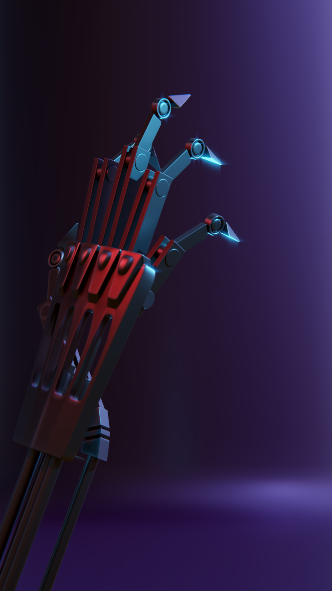
Looking forward to looking at this again and finding a small issue like the hand being 0.04% too glossy and spending the afternoon trying to rectify, but so far I think this is the best one so far, finding a balance between mood and lighting. Critique away!
I also got started on the course homework. Y’know, the thing I’m actually supposed to do, and decided to start on the truck first:
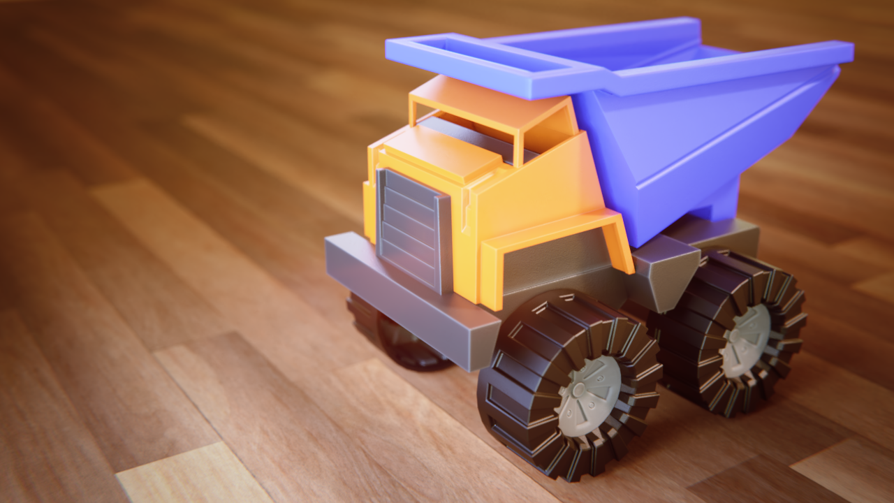
I tinkered around with the pointiness values and think I came to something I like. The white on the grey body is a bit strong but I kinda like it, makes it look cheap. I also placed a noise texture on most of the body thanks to @jakeblended‘s tip from last class but it appears I may have made the size too big? Or maybe the normal height is too weak? Not really sure. I intend to hopefully put some imperfections on it tomorrow or Sunday but I just wanted to know if I was going in the right direction.
With that done I’m off back to Blender, good day all and happy Blending!
October 5, 2018 at 10:26 pm #42109@thecabbagedetective Lol the story-telling approach to your childhood memories remaster had me snickering pretty good 😅
The sony logo isn’t bothering me too bad in the turntable render. Silent is right that a displacement might do the job. Only potential issue there is your geometry will need to be subdivided heavily to compensate for a sony texture to displace cleanly. I think a cleaner boolean should be fine though.
Your latest robot arm is definitely the best. Way to process the feedback and level up the final result.
Also the toy truck is excellent. There’s a softness to it that reminds of Toy Story 3’s aesthetic. Did you apply some subtle glow via compositing nodes?
You’ve done a lot of great work this week. But then again that’s kind of your thing! A+ my guy
October 6, 2018 at 11:13 am #42110@theluthier Why thank you for the feedback, but I should say that I’m not quite done yet, as I’d like to redo the bedroom lighting as well, so hopefully you’ll take a look at that when it’s done!
I’m not too bothered by some dense geometry, I’ll just let it render whilst I sleep lol. Also, I intended to composite the truck but turns out the file comes pre-composited! I did tweak the distortion node though, but the glow is probably due to me changing the lights in the scene along with changing it to Filmic (which FYI guys can massively improve your renders, definitely do that) which made the already present glow node show differently.
Overall I’m glad you like it and hopefully you’ll think the same of what’s left to come this week. Thanks again!
October 6, 2018 at 1:03 pm #42111@thecabbagedetective Hey hey! That hand is looking sweet! Depending on what you want to do, maybe now’s the time to add subtle defects. Truck looks good, too. The white on the grey edges kind of pushes it more towards metal for me, though. Otherwise, good work.
-
AuthorPosts


- The topic ‘BC4-1810 Homework, Aaron Rudderham’ is closed to new replies.