
BC1-1908 Homework, Philipp Bauer
Forum Archive › BC1-1908 Homework, Philipp Bauer
- This topic has 43 replies, 12 voices, and was last updated 7 years ago by
Philipp Bauer.
-
AuthorPosts
-
August 4, 2019 at 11:14 am #48957
@thecabbagedetective thank you!
Is this better:
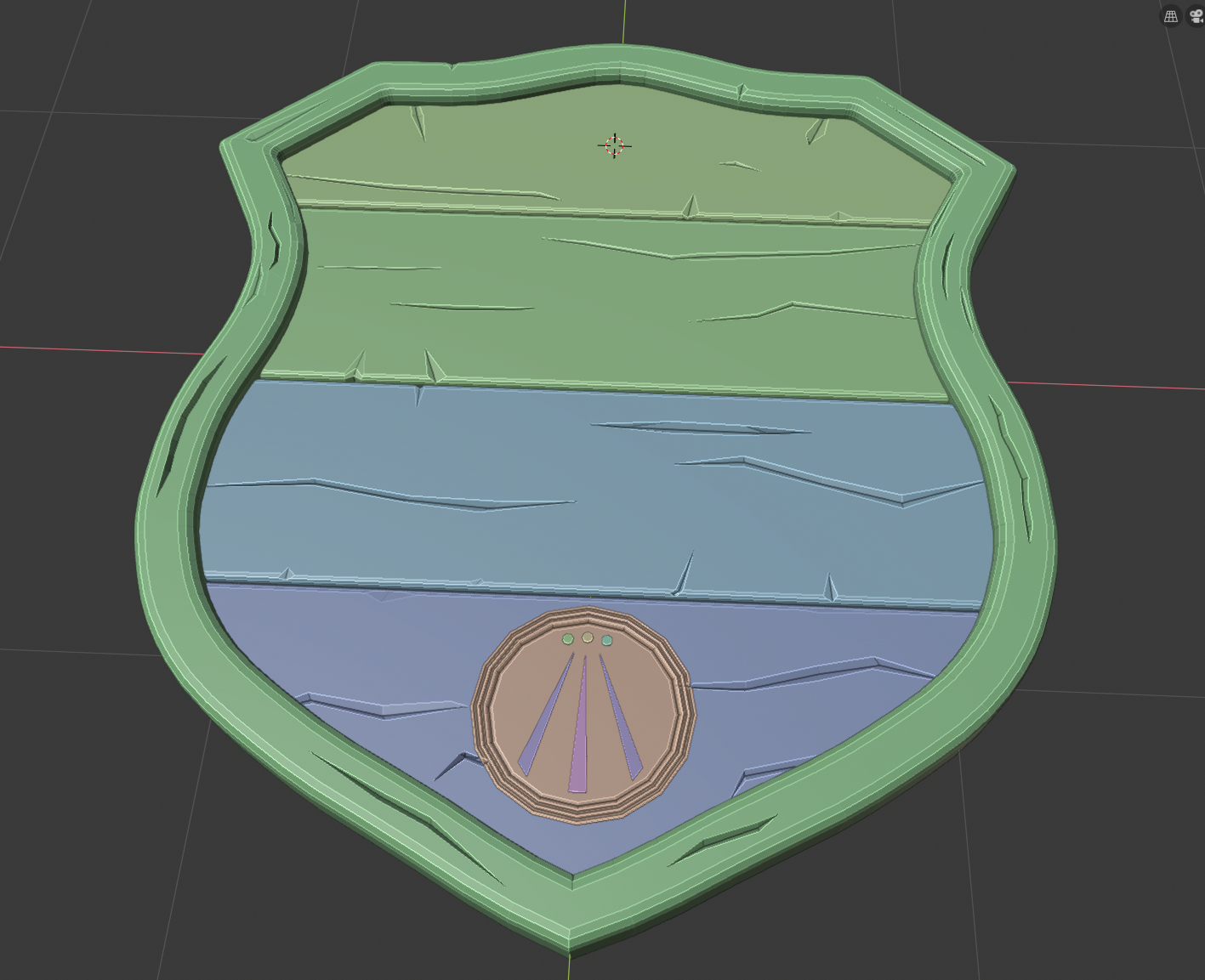
I like the sign with names and tree more but I think it is meaningful in case of texturing and shading to keep it simple and all this things are done by my self 🙂
August 4, 2019 at 1:34 pm #48958Homework Week 1 Submission
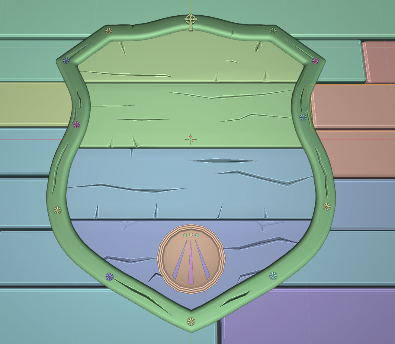
I hope all is ok:)

I like the Celtic cross 😉
And 1 shot in color:
 August 5, 2019 at 1:19 pm #48959
@cruento Great effort! Nice details on that shield.
August 5, 2019 at 1:42 pm #48960This turned out to be such a cool project @cruento! I love the family sign / crest theme. And I honestly really like the text and tree insignia at the top. I’m fine with you importing the vector information for the tree. You’d finish modeling that thing by hand this time next year ha! And since it’s relatively a small detail compared to what you’ve built from scratch, I’m OK with you adding that.
( @thecabbagedetective I also see where you were coming from about importing vector data 👌)
My only suggestion is that the text be subtractive instead of additive. Meaning the words would look better imo if they were carved into the wood planks. That could make this more complex than you intended, in which case you can ignore the suggestion. But currently the text doesn’t match the rest of the sign. Perhaps because it’s too perfect. If you opted not to carve, adding some damage and irregularity to the text would be a step in the right direction.
Even without the text, it’s an A in my book. With the text (damaged or carved) you’d earn that coveted + 😁
August 6, 2019 at 3:27 am #48961@theluthier @silentheart00 thank you! I will give it a try 🙂 Think it could work with Boolean modifiers. Cut the whole letters with knife tool would be a bit mess? I will tell you my results and what’s the conclusion.
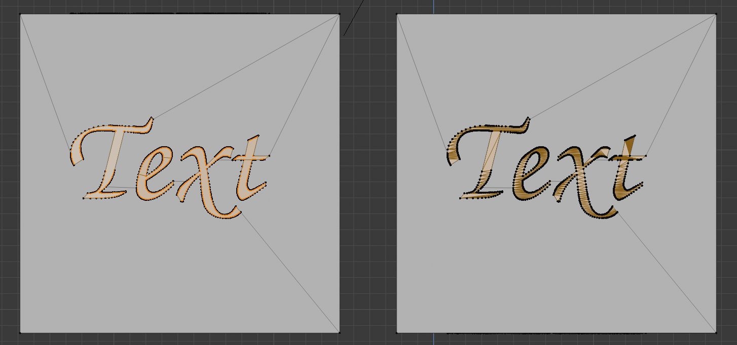
August 6, 2019 at 5:00 am #48962@cruento Alternatively, you could use Knife Project. That creates less geometry than Boolean…
Left: Knife Project, right: Boolean.
 August 6, 2019 at 5:38 am #48963
@spikeyxxx thanks! I also will try this 🙂 It looks much cleaner. Is it necessary to apply the Boolean modifier?
August 6, 2019 at 7:28 am #48964@cruento Well, if you want to give the edges of the carved-in letters some ‘damage’, you’d have to apply the Boolean, or, rough-up the text object (but I cannot recommend that; at least I couldn’t get it to work…)
August 11, 2019 at 1:09 pm #48965Homework Week 2 Submission
Sometimes I thought it would never be finished. To unwrap the boards with the text was horrible and isn’t good but time is gone.
I really learned a lot….I need some more knowledge about different blend types and shortcuts to switch between the tools.
I am very bad at drawing and so the result makes me even happier 🙂
 August 11, 2019 at 1:52 pm #48966
@cruento The carved-in text looks really great!
I think this week was hard on most of us;)
UV Unwrapping and hand-painting textures!
August 11, 2019 at 8:35 pm #48967@cruento I really like how the carved text came out! Nice job.
August 11, 2019 at 8:52 pm #48968@cruento I really like that tree crest, is that from lord of the rings, Minas Tirith?
August 12, 2019 at 12:21 am #48969@dostovel yes it could be 🙂
The meaning of the Celtic symbol:
The Tree of Life commonly represents the interconnections of everything in the universe.
It also represents the connection to one’s family and ancestors. The Tree of Life has an intricate network of branches that represents how a family grows and expands throughout many generations.
@ghujelk , @spikeyxxx I am glad that you like it. The Font was not available in Blender, so I model it by my own. By applying the Boolean I had a lot of shading artifacts but it’s ok now. I think it would work better if I make edges to the vert’s of the text, but then it is a high poly mesh 🙂
August 12, 2019 at 3:48 pm #48970@cruento I’m glad to hear you learned a lot along the way. I definitely see it showing in your results. Overall it’s a good texture but I do have some notes to offer:
- The wood grain looks great on the outter frame and lowest horizontal board (highlighted in pink) but looks odd on the top 3 boards (highlighted in yellow).
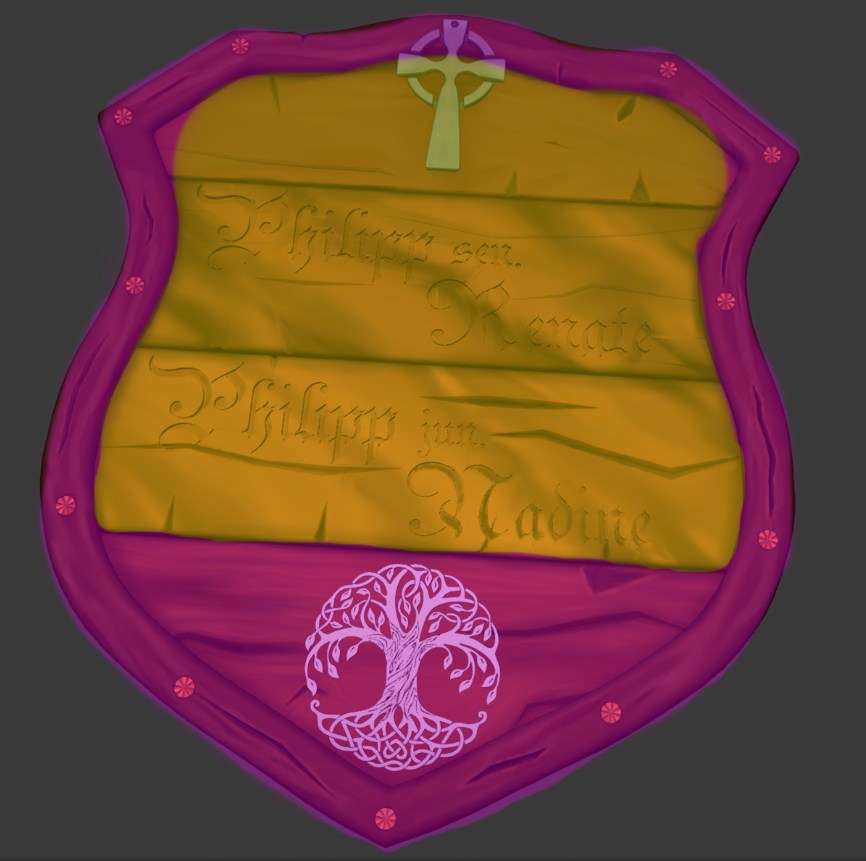 The middle two boards have color stripes that flow diagonally instead of horizontally like the bottom board, which aligns correctly with how wood boards are cut in reality. It feels unnatural and doesn’t align with the wood cracks either.
The top horizontal board appears to have correct directional flow of the grain but it’s notably more subtle than the bottom board.
- The metallic (I think) symbols attached to the crest should have some darkening around the edges, where it meets the surface of the wood:
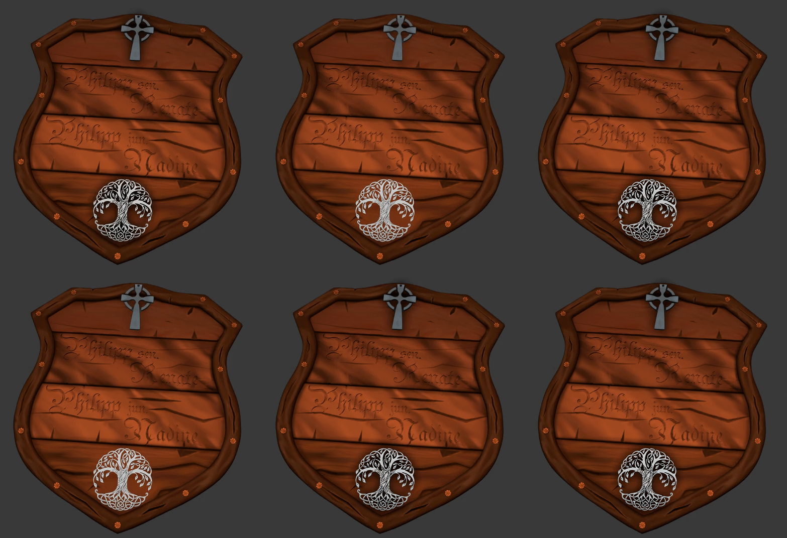
This is definitely where dirt, dust, and grime would gather. It will also help the symbols feel like they’re coming in contact with the wood. Without it the metal appears to float above; disconnected. - The carved letters is another ideal place for dust and grime (darkness) to gather as well as lightening the edges. That will make the letters pop out of the wood whereas currently they blend in and get lost too easily. You can probably achieve this best with the dirty vertex color baking method in the treasure chest course.
August 12, 2019 at 3:55 pm #48971@theluthier no grade?
- The wood grain looks great on the outter frame and lowest horizontal board (highlighted in pink) but looks odd on the top 3 boards (highlighted in yellow).
-
AuthorPosts


- The topic ‘BC1-1908 Homework, Philipp Bauer’ is closed to new replies.