
BC1-1908 Homework, Mona Loren
Forum Archive › BC1-1908 Homework, Mona Loren
- This topic has 37 replies, 7 voices, and was last updated 7 years ago by
Kent Trammell.
-
AuthorPosts
-
August 16, 2019 at 9:40 am #49015
@spikeyxxx Thank you spickey.
Nice idea with the RGB Node and the complemantary.I often use this color wheel for color check/idea. BTW. there is an complementary color on the edges ;)But very slighty.
I used one monochrome and the complementary of my barrel-brown for the Ellipse Mask/Mix Color.
Very subtle. So I will try a stronger version.August 16, 2019 at 10:18 am #49016@monaloren Doesn’t Mixing the complementary color with the original sort of defeats the purpose of using a complementary color? Sorry if I misunderstood what you have been doing;)
August 16, 2019 at 11:03 am #49017@spikeyxxx sorry I did not write it very cleary.
I used my color for the barrel as basecolor to find two other for good matching.
one of these (in die Edges) are the complementary.
The other is much brighter but in the monochrome range.
I want a over all design with warm colors, so I used the same color-monochrome range.
But this can also be very boring for the eyes, so I set the complementary too.
So I wanted to achieve a pleasant color atmosphere -quiet and restfull..if my helpless sentence makes any senseBut as you mentioned, perhaps it can be a good idea to make it more visible (the complementary).
And also there are some areas too brighten I guess.August 16, 2019 at 11:42 am #49018@monaloren O.k. I think I get it now. Good thinking!
Still, I would suggest to give it a try (non-destructively!) to make the background completely the complementary color and then add a vignette (maybe not that strong..). See how that looks. If you don’t like it, just don’t use it, but at least give it a try…
It’s not Sunday yet, so still time to experiment;)
I’m sure you’ll get a great result.
Keep up the good work!
August 18, 2019 at 2:12 am #49019@spikeyxxx Some Render Test I made yesterday
based on your suggestion to use the complementar color. Played around a lot e.g. with Saturation, settings mask ellipse, and for the last one I used two colors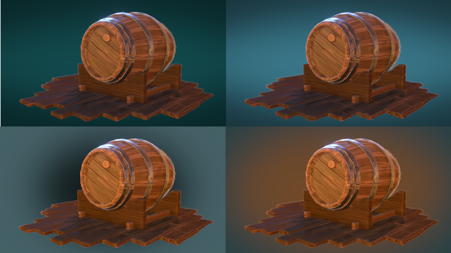
I want to achieve some harmony. For me the complementary ist more like a “bang” 😉
I also want to clean up and tweak some other things.
So up to this point I had not made any deciscion. It was defitely worth a try.
I was curious to see what it will be in the end.August 18, 2019 at 2:16 am #49020BC1-1908 Homework Submission Week 3
the complementary color test looks good, but I wanted to try something else.
Basically I followed the treasure chest course because compositiong is new for me.– Camera Settings:DoF / F-Stop I used an Empty
– Light: HDR Heaven “courtyard / often changed the Rotation to find a good lightning
an additional point lamp for the front part because I guess this should be the focus
and another point lamp at the rear backside of the barrel to support the metallic of the rings ( before it was a little bit too dark comparing to the front)
– Colors: monochromatic based on the warm colot of my textur paint base color
for a kind of harmony, restful, calm impression
Compositing Color Balance: Lift (dark), gamma (midtones) and Grain (highlights) only some very subtle changes to
bring out the more brownish Range oft the dark and midtones and for the highlights a tiny step to blue
HSV Node- reduced the Saturation to 0.4I think this were my settings to played with.
At the end I thougt there is something missing and add the sign with red colors.
Painted in Gimp and import to Blender with ” Images as Planes”. Very easy to do with the Material settings
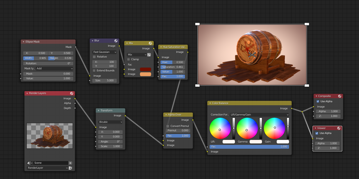
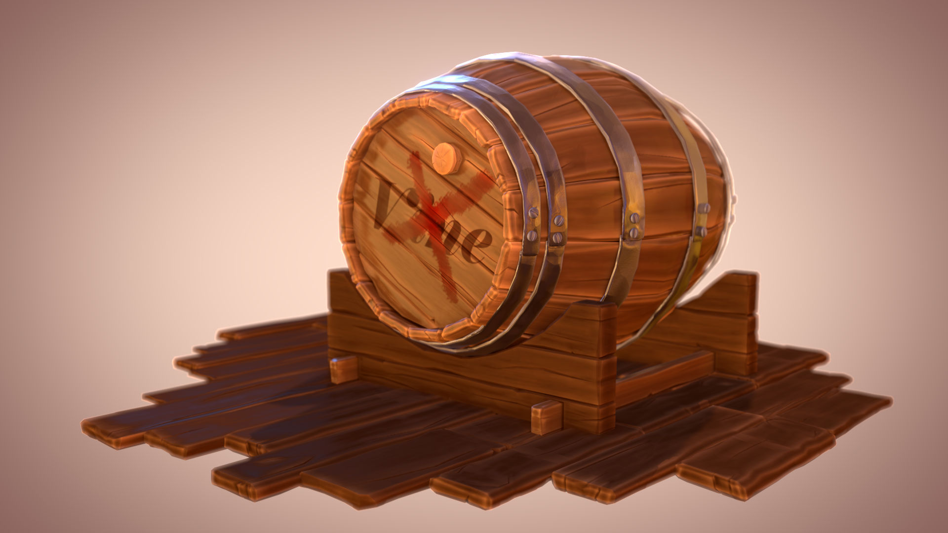
After 3 weeks working on this barrel I am more familar with 2.8 and start to like it;)
Besides I have learnded some more techniques, exspecially a lot about Blender data, very useful.August 18, 2019 at 2:25 am #49021@monaloren Hi Mona, The fourth image is definitely an improvement to what you had before, But I think that you should either go for completely monochromatic or use a complementary color for the background, With the complementary color just on the edges, it distracts from the center of the images. The less contrasty vignette is a good idea!
Maybe you could go for monochromatic and then use a blue-ish backlight to break that up?
Just try some things out…
August 21, 2019 at 1:13 pm #49022@monaloren Your barrel turned out so good. One of my favorite barrels. The wood details look incredible in the shader. Metal is very appealing. I love the warmth of the final composition too and that subtle vingnette 👌
All around a wonder finale. It’s an A+ from me. Great job this month, Mona!
-
AuthorPosts


- The topic ‘BC1-1908 Homework, Mona Loren’ is closed to new replies.