
BC1-1908 Homework – Anna Rudzka
Forum Archive › BC1-1908 Homework – Anna Rudzka
- This topic has 13 replies, 5 voices, and was last updated 7 years ago by
Kent Trammell.
-
AuthorPosts
-
August 4, 2019 at 4:39 pm #10530
Some information about me 🙂
When it comes to 3d design, it is quite a new part of my professional activity. I am a jeweler by education and started designing for the need to create jewelery in the Rhinoceros5. It is very different than Blender because it is design in the NURBS geometry.
Some 2 years ago I got to know basic rendering functions in blender cycles because I needed to visualize projects for clients.
Few months ago I found a CG cookie and started to learn to model in Blender also.
That’s it when it comes to my story.
I hope that I expressed myself understandably. English, unfortunately, is not my strong point.
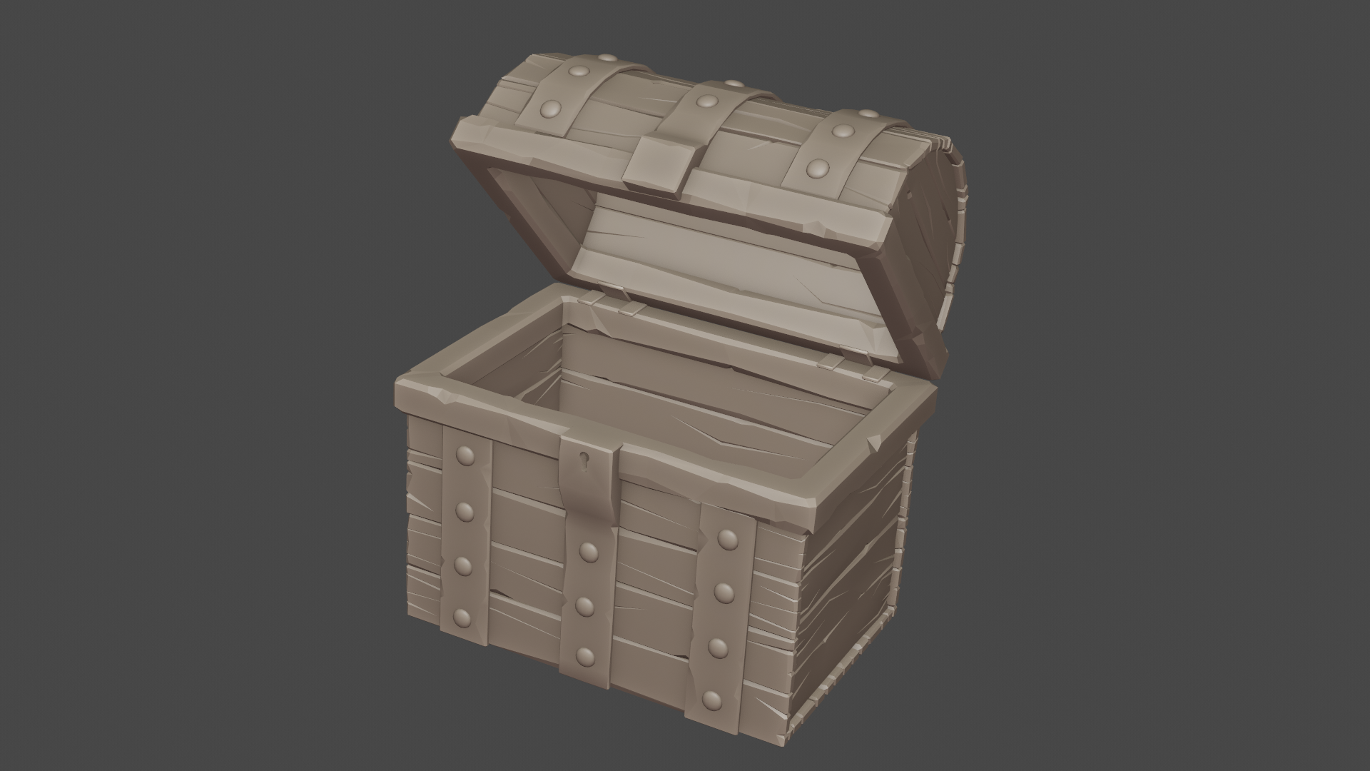
August 4, 2019 at 4:42 pm #49962hi, I’m putting in my treasure chests.
Honestly, I did not expect that it would take me so much time. At the very end of the project I felt like in college during the exam session;)
August 4, 2019 at 4:51 pm #49963 August 4, 2019 at 4:56 pm #49964
 August 4, 2019 at 5:10 pm #49965
@annarudzka Designing jewelry seems like interesting work. Good job with the chest!
August 5, 2019 at 2:33 pm #49966@annarudzka Good effort! There’s a nice balance between the details and not making them look overly repeated. The metal bars could maybe use a little more big dings or scratches across the surface just to help break up the overall smoothness. Other than that, good work!
August 5, 2019 at 4:05 pm #49967Welcome to the class @annarudzka! Thanks for sharing a bit about yourself. I find it very interesting that your jewelers profession led you to Blender. 7 or 8 years ago my best friend asked me to model a custom ring that he was going to get fabricated for his fiance. It was a lot of fun and rewarding using Blender for such a practical reason.
Your treasure chest is excellent! Nearly 100% authentic with the one from the course. The only suggestion from me is to “un-straighten” the straight edges as a whole. In the last video I opted to add a lattice modifier to eliminate the over-abundance of straight edges in the treasure chest. It should really hammer home the fun-loving lo-poly style.
Even still, you’ve earned an A in my book 👍
PS: Your English is entirely understandable 🙂
August 11, 2019 at 2:13 pm #49968Hi,
thank you for your comments 🙂
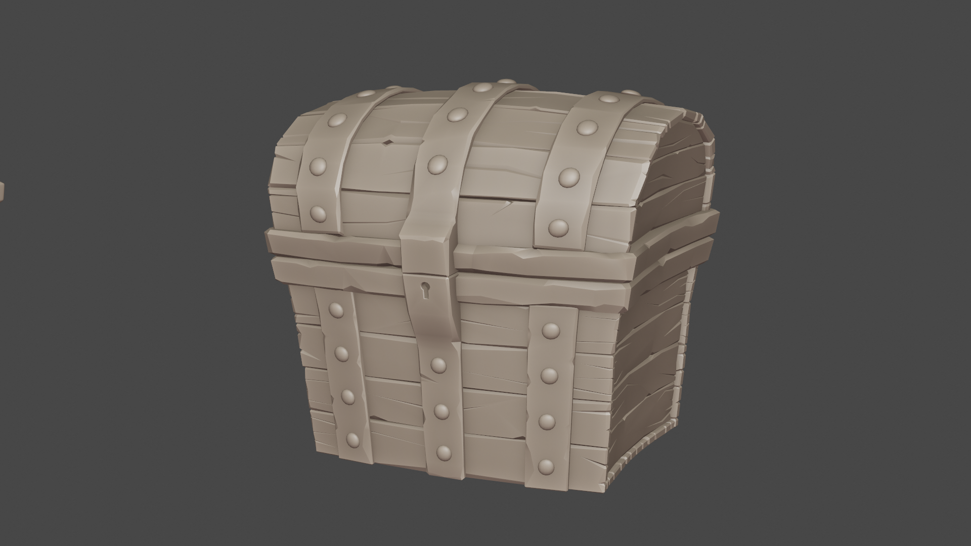
I tried to add some scratches and bumps to the metal, not much, because I prefer a smoother version.
I also used the lattice modifier. I really like this bending of the finished object.
 August 11, 2019 at 2:50 pm #49969
Homework Submission – Week 2
When it comes to homework for the second week, the thought of texturing scared me a bit. I recently did the “Texture Painting an Ax” exercise. It was the most exhausting and demanding exercise for me.
While I really like modeling in 3D, 2D painting is completely unattractive experience for me. Especially if I’m to paint parts such as shadows and highlights
With relief and great pleasure, I learned about the possibility of adding depth to the texture by using dirty vertex color. I just love this option!
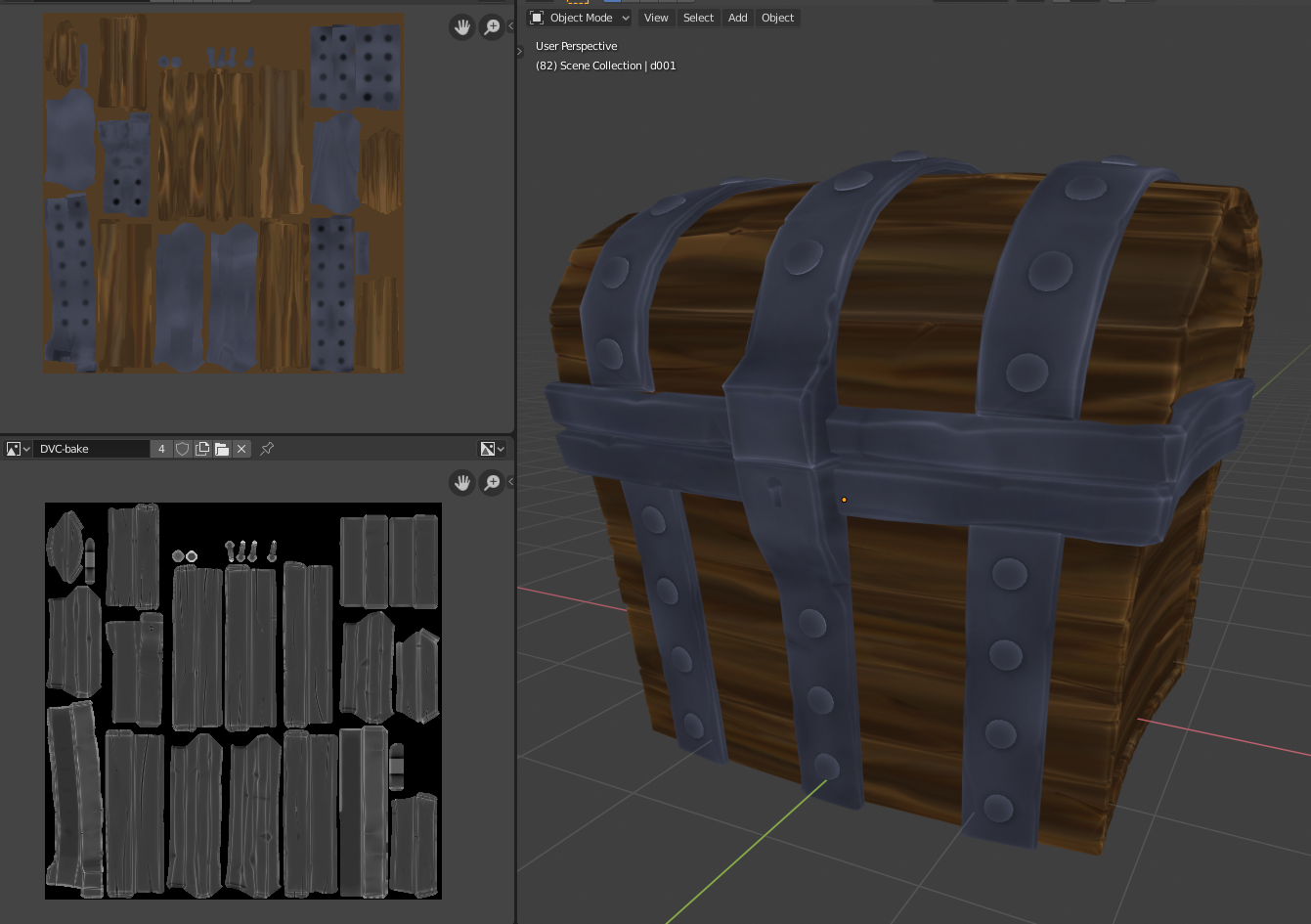
Maybe texturing with such tricks is not so scary;)
August 14, 2019 at 10:16 am #49970@annarudzka Wonderful job, Anna! This is an ample example of the course technique. The only [small] suggestion I offer is to incorporate more broad gradients in the wood boards. Here’s what I mean, courtesy of n647:

Note how one side of the plank is notably darker the the other side. Adding these broad gradients occasionally can be very appealing. Just a small suggestion though, not something to detract from your work this week. It’s an A in my book 👍
Also kudos for adding the lattice deformation. I think it looks that much more interesting now 🙂
August 15, 2019 at 7:52 pm #49971@annarudzka Nice work! Looking forward to the finished product!
August 18, 2019 at 1:40 pm #49972Homework Submission – Week 3
Hey, I’m adding my homework.
On the first renderer before adding gradients in the wood boards.
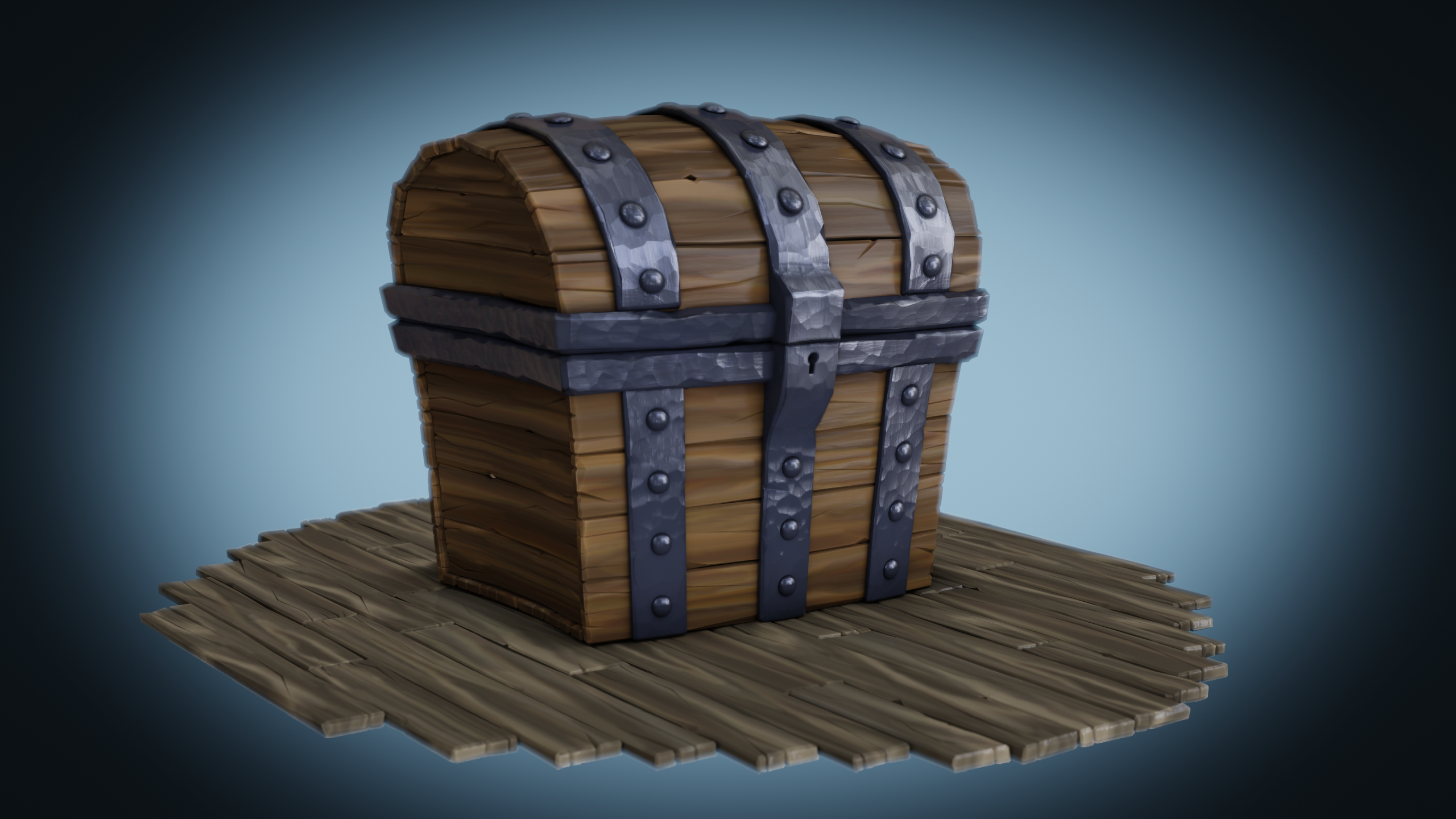
On the second with them. On the second one, I was entertained about how metal should look. I wanted more differentiation between the places where it is smooth and more rough.
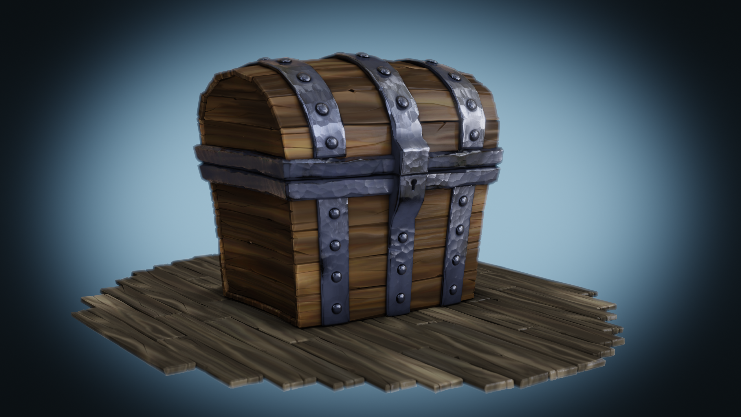 I like the second render more. There is more diversity in it.August 18, 2019 at 4:56 pm #49973
@annarudzka looking very nice, personally I also like the second one a bit better, but both are quite nice
August 21, 2019 at 10:53 am #49974@annarudzka Great job finishing up week 3! Your chest turned out great. I like that your metal parts are obviously metallic. The stylized proportions are really appealing too. I agree with n647 that the second render is my favorite. I like the higher contrast and diversity in the wood floor.
I have very little to offer in terms of criticism. The vignnette feels less like a vignette and more like a spotlight effect. If you were going for a vignette I’d say “too strong” but as a spotlight it’s unique and effective imo.
A+ for this week 👏
-
AuthorPosts


- The topic ‘BC1-1908 Homework – Anna Rudzka’ is closed to new replies.