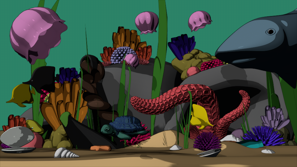
Nice! Feels a bit busy, though, and if the focus is the turtle, it feels like it’s fading a bit into the colors behind it; they’re similar in value. My eye is tending to go everywhere else other than the turtle. I wonder if maybe you reversed some things around; make the turtle bright and happy colors and the dangers darker and fade into the background a little bit. There’s also a lot of stuff in the fore- and mid-ground, not a lot in the background, even if it was a wall of seaweed maybe that would help the background feel less flat? Or a gradient, maybe? Small bubbles floating up to the surface? Something to think about. Overall, I like the style.