
Anthony Becker – Sketchbook
Forum Archive › Anthony Becker – Sketchbook
- This topic has 43 replies, 7 voices, and was last updated 8 years, 5 months ago by
Anthony Becker.
-
AuthorPosts
-
February 12, 2018 at 5:34 pm #34022
thanks and yep I use photoshop
February 13, 2018 at 2:22 am #34023Cool! I’ve got some tips on using PS:
The transfer setting is your best friend. What it does is makes the brush size relative to how hard you press. It also makes the edges fuzzier the harder you press. It’s under Window->Brush, or what looks like a cup with 3 brushes in it on the right side. Then in that menu, it’s Transfer on the left of the box. Give it a whirl.
I like to lower the opacity and flow of my brushes (found near the top under the menu items) so I get a better, more natural buildup of values/colors. It blends things a little better, too.
If there’s a value range you like and want to use, the Alt key (Windows) or Command key (Mac) to color pick the range and then continue laying down, if that makes sense. Using that in tandem with low opacity and flow is a great way to build up your work.
Shortcuts (on Windows, most likely translatable to Mac):
- B – Brush
- Z – Zoom
- E – Eraser
- R – Rotate
- Spacebar – Panning
- X – Switch Foreground and Background colors (useful when using a couple of colors)
- L – Lasso Tool
- M – Marquee Tool (Shift+M to cycle through Rectangular and Elliptical)
- C – Crop
- W – Wand Selection Tool (click and it selects what it thinks you want in the whole scene)
- V – Move Tool
- CTRL+SHIFT+N – New Layer
- CTRL+J – Copy Layer Selected
- CTRL+E – Merge Selected Layer Down
- ALT+Right Click and Hold – Change Brush Size and Hardness (L&R for size, Up&Down for hardness)
- P – Pen Tool
- G – Gradient and Fill Bucket (Shift+G to cycle)
- CTRL+N – New document
- T – Text Tool
- CTRL+U – Hue/Saturation sliders
- CTRL+L – Levels
- CTRL+B – Color Balance
- CTRL+Z – Flip between final action and previous action
- CTRL+ALT+Z – Move back along actions
- CTRL+SHIFT+Z – Move forward along actions
There are plenty more, but these are what I use by pretty much pure instinct, plus a few extra you might find useful. Poke around in the brush settings, too. See what happens.Also, each layer has some settings you can mess around with, and they can be found toward the top of the Layers tab. I don’t really mess with Blend Modes very much because I don’t really understand what they do. I tend to keep the blend layers on Normal. Sometimes I’ll mess with the Opacity next to the Blending Modes. Under the Blend Modes are things I use fairly often. The first thing next to “Lock:” is Alpha Lock. It looks like a checker board. What that does is if there’s anything drawn on that layer and there are transparent pixels, it’ll make it so you can only draw on the nontransparent pixels. Handy for when you want to change the color of something completely without having to redraw it or constraining your brush strokes to one area. Next is a brush icon, and I have no clue what that does; never messed with it. Same for the move icon; never really needed to use it. Next to that looks like a lock, and what that does is it locks that layer from any more editing so you don’t accidentally work on a layer you didn’t mean to work on. Very handy.Now, for the layers themselves, if you right click on them, you’ll see a whole bunch of things pop up. What I like to do is make a layer a clipping mask, which means it’ll constrain the brush strokes to the lower layer, like the Alpha Lock. With this, you can stack a bunch of clipping masks to a “base” layer and not have to worry about going outside the lines. If you do undo the clipping mask, all the strokes you made that look like they were hidden will be visible again, so keep that in mind. Never really had an impact on what I was doing, personally. If you add a new layer between clipping mask layers, it should automatically make it a clipping mask layer. You can select multiple layers and make them into clipping masks if things get messed up.At the bottom of the Layers tab, there are some more settings. First, the one that looks like a chain is Link Layers. If you have multiple layers that you want to move, you know you need them all to move and stay together, you can link them together and move just one layer. Handy if you have a bunch of layers. The fx next to it is Layer Styles, so adding things like drop shadows, glows, bevels, etc. Useful for things like text. If you double click to the right side of a layer, that menu will pop up. Next is a Layer Mask, and this functions a bit differently. What it does is adds a second window next to the layer you applied the Layer Mask to, and anything that is white in that second window is visible, anything that is black is not visible. This is what they call nondestructive editing because it doesn’t delete pixels from the layer, it’s just hiding them. Useful for things like photoediting when you don’t want to lose the data of the image you’re editing. The next one I don’t use, but from the description I’m guessing it’s to add an adjustment layer. Then there’s a folder, for when you want to sort your layers into groups (CTRL+G), so like a group for hair, clothes, skin, etc. Next to that is the New Layer button, then a trash can for Delete if you want to delete layers. You can drag and drop the layers onto the trash can, too.I hope all this makes sense figuring out PS for you. A lot of the hot keys I figured out accidentally, but man, they really do help speed up my workflow. Mess around with the brush settings, see if you can get something you’re a little more comfortable with, too. Let me know if you have any questions about what I explained or PS, too! Good luck!February 17, 2018 at 4:18 pm #34024Just invested in an iPad and decided to break it in with a little master study sketch. Getting the hang of Procreate, which I actually really like. A lot more could be done to touch it up but I’m not too concerned, I’ll probably come back to it to doodle.
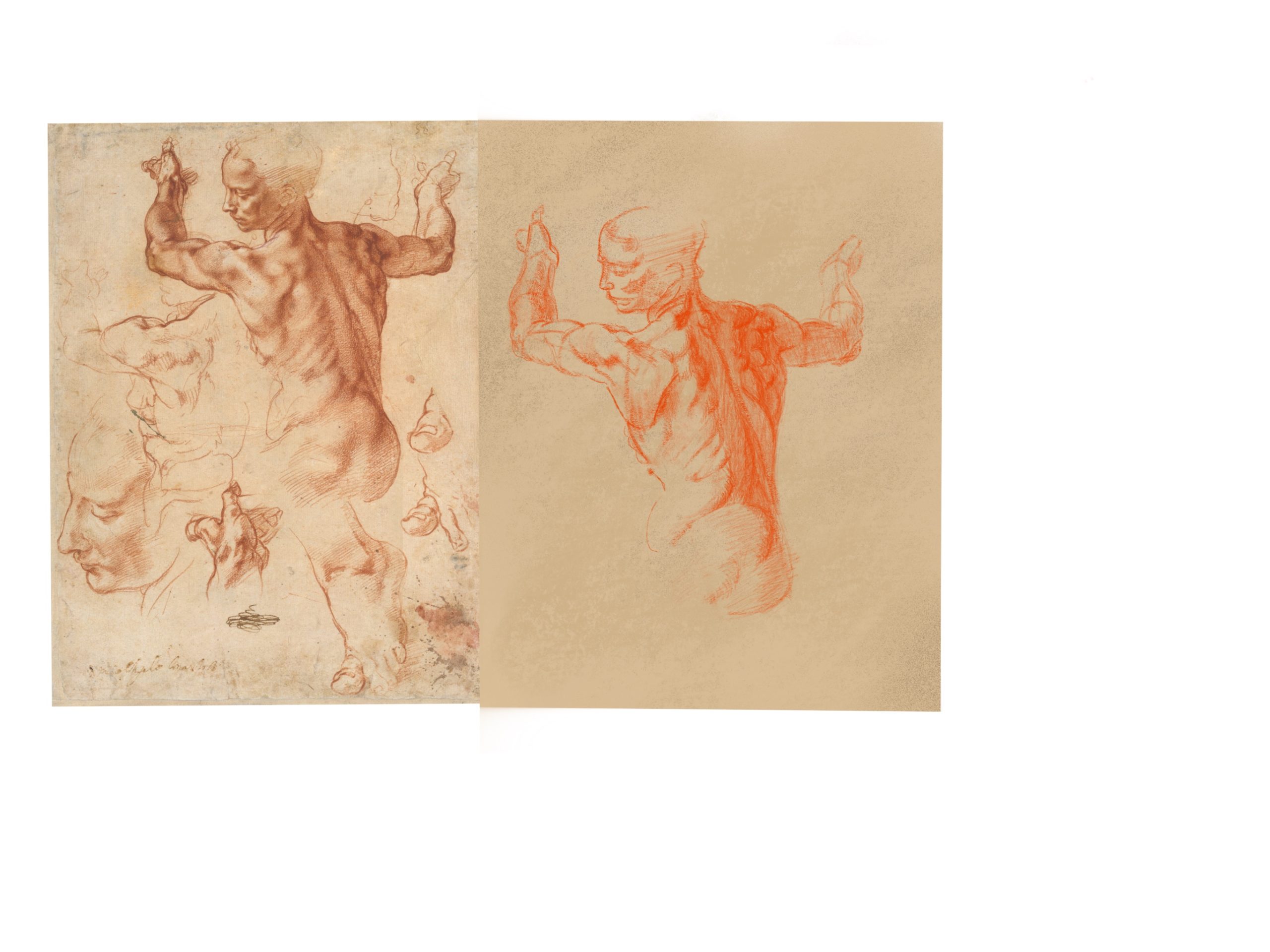
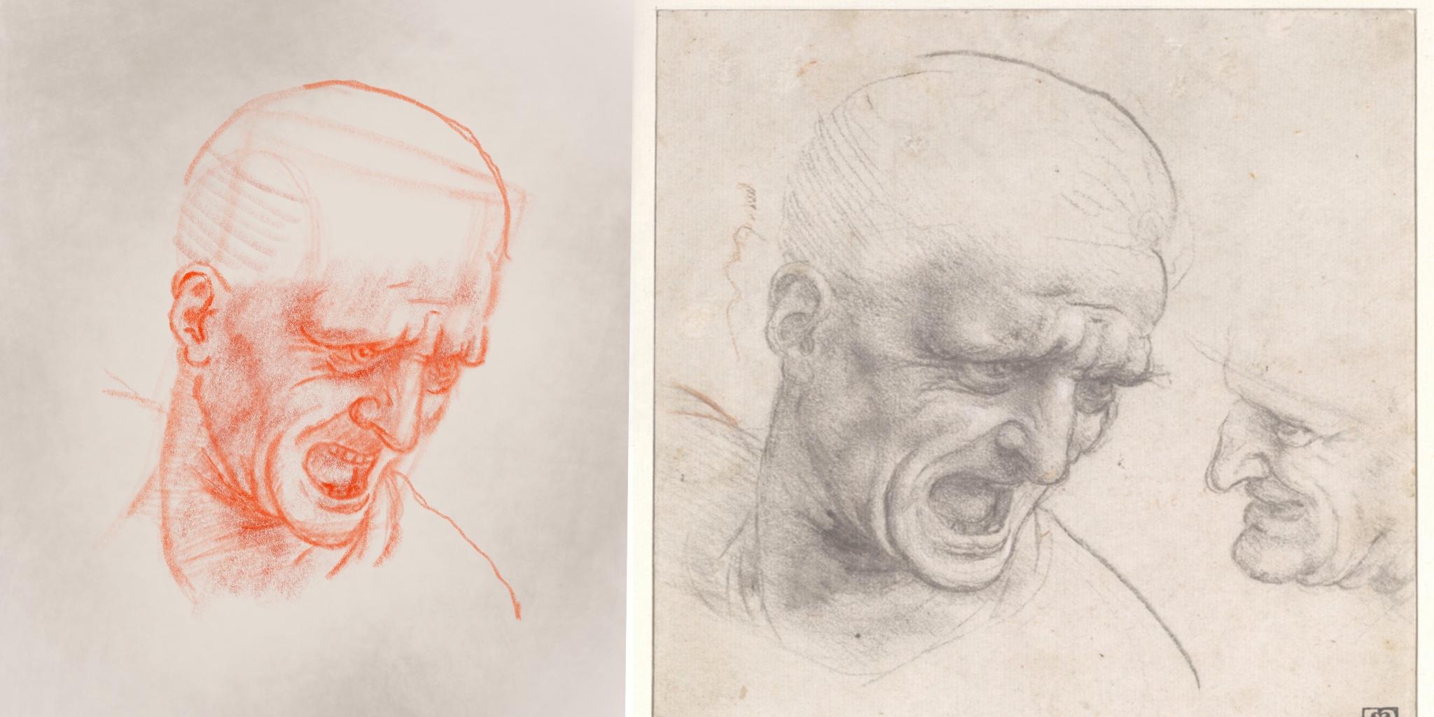
Did another. Accidentally distorted the reference after trying to fill the page. Haven’t figured out if there is a way to scale selections without distorting in Procreate
February 19, 2018 at 4:34 am #34025Great job on the sketches. I personally find the proportions in your sketch pretty good, not 100% photo-like accurate but I don’t think it has to be. Only comment I have is that your contour lines seems a bit too evenly weighted, and most shadows as well, which makes the image just a bit flatter than the examples. Some places where there are no deep crevices or great planes changes the contours are more subtle, so you should use the contrast between the shadows values of the form more than drawing contours there. That said I’m not an expert at this either, this is just my 2 cents.
I’m also wondering, where do you get the figure photo references for your sketches?
February 19, 2018 at 2:16 pm #34026Thanks! I’ll definitley start trying to think about line weight more. As for the photo references, mostly from a site called new masters academy. I have a subscription to their program which includes a video and image library. Good stuff
February 19, 2018 at 7:42 pm #34027Yeah, not bad for fooling around on an iPad. Careful with the values, though. In the woman study, some of the values are a little darker than in the ref, like the lighter values on the back, and not dark enough, like the left forearm. Unfortunately, not all screens are created equal, so maybe that’s where the disconnect is. Some screens are bluer than what you see in life, and don’t have quite the color range that eyes have, but they’re getting better. That being said, the man’s head looks pretty consistent with value, so not bad.
February 20, 2018 at 12:54 pm #34028
Little piece I did yesterday on the iPad in Procreate again. I call it “Light the Brazier” lol. Just trying to digitally paint more and this was fun.
February 21, 2018 at 12:44 pm #34029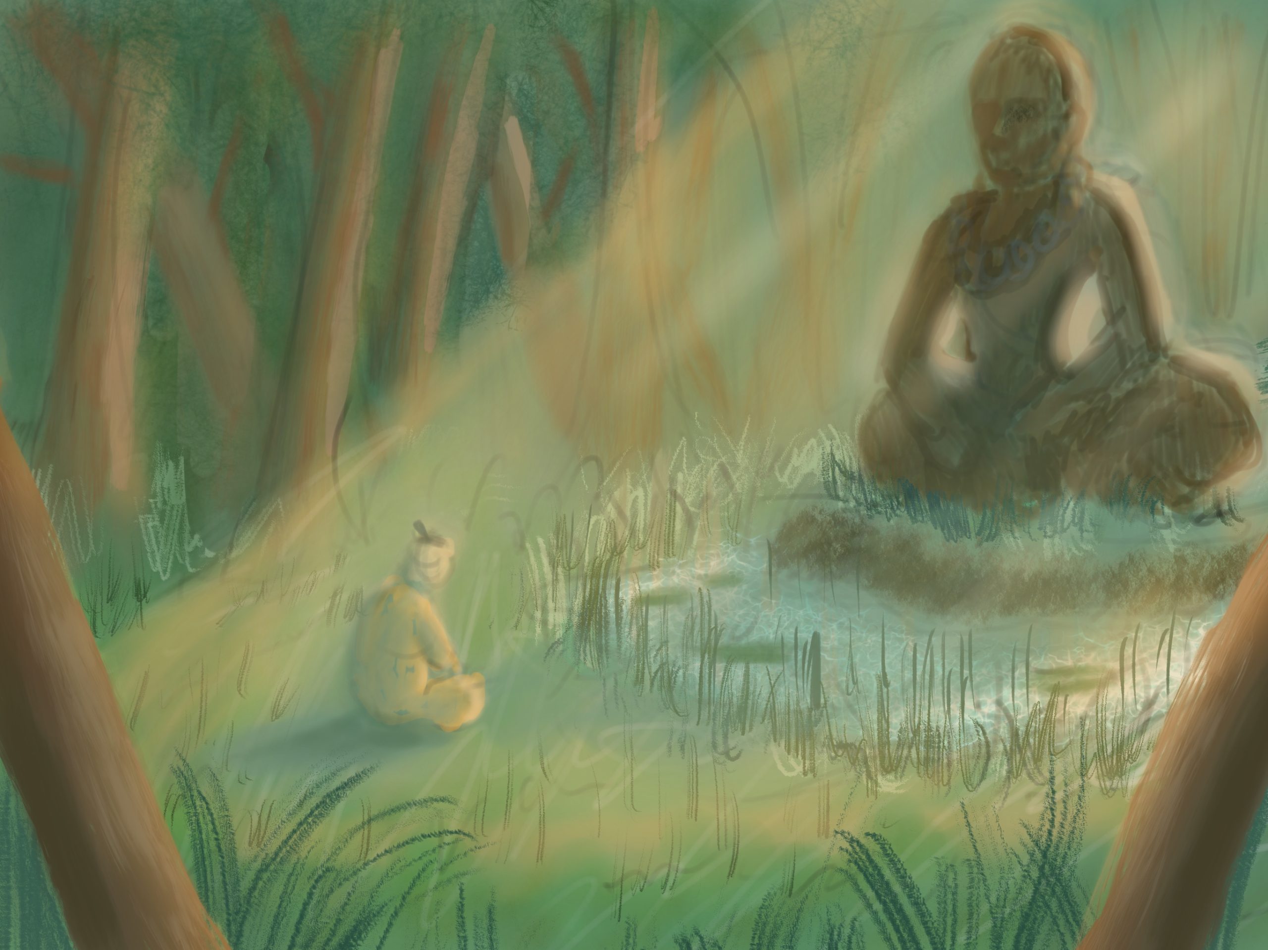
Forest Sage
February 21, 2018 at 5:40 pm #34030Cool! I think the dragon piece has a good use of color. Your vanishing point(s) is(are) kind of close to the image itself, which is causing the foreground block to distort a bit. You can create a big document, place your VPs, and then focus in on the area you want to have your finished image in. Creating an overlaying mask will help you to remember where you’re composing the image, too, if that makes sense. Make a layer, fill it with black, drop the opacity so you can see the VPs, and cut out about where you want the image to be. Also, keep in mind that the castle will have some wear and tear, so perfectly straight lines are strange to see.
For the “Forest Sage,” maybe there could be some more contrast in the background trees not in the light. Everything feels like it’s in a narrow range. so maybe adding a little more contrast around the edges of the piece will help make the lighter, less contrasted area in the middle pop more, kind of like a subtle vignette.
You might want to venture into some material studies. The dragon’s wings are a great opportunity to study subsurface scattering. The Buddha statue would be another one, too, for metallic surfaces. The castle would have some deposits from rain water as well as things growing on it with a rocky surface underneath. Pretty neat doodle ideas, though!
February 28, 2018 at 12:10 pm #34031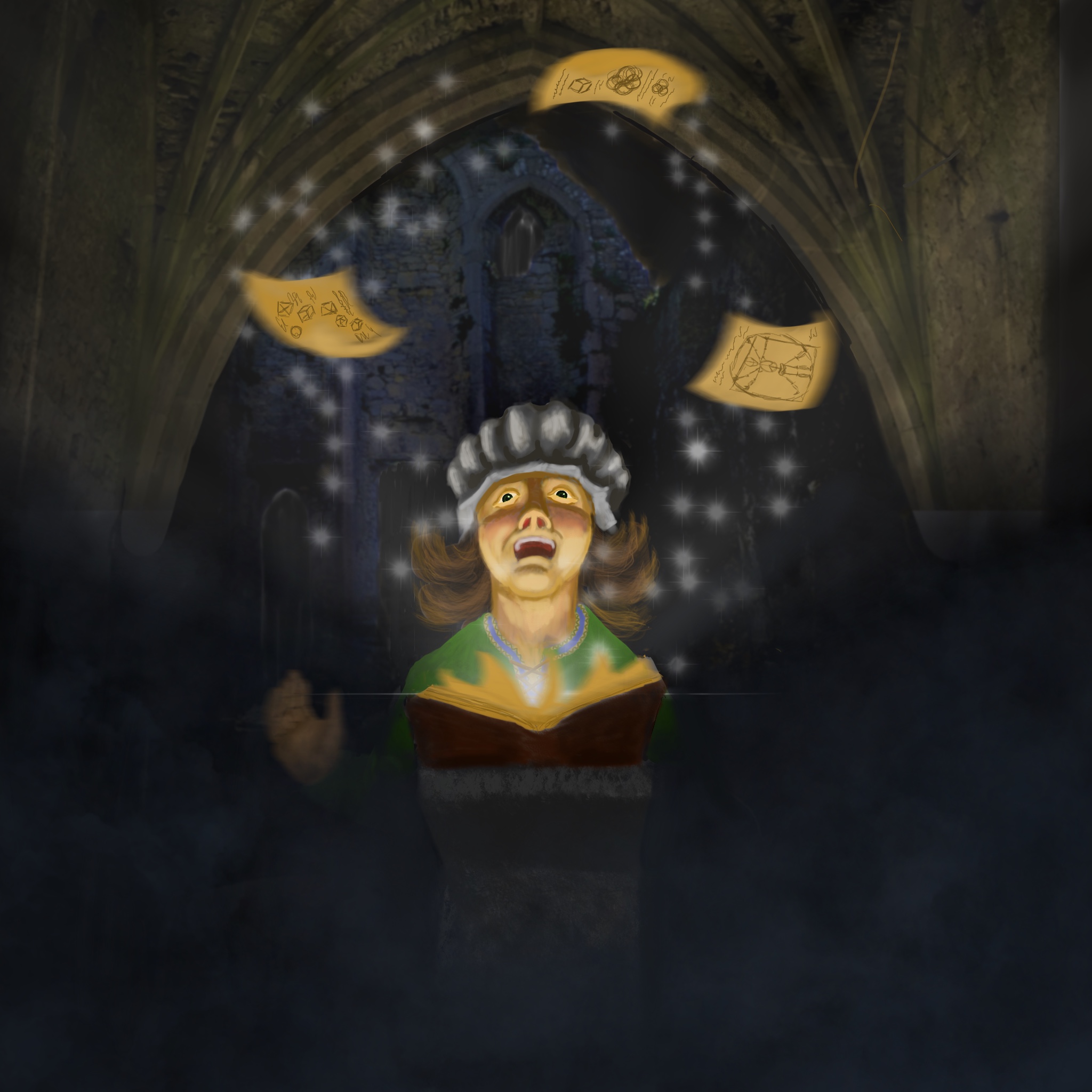
“Enlighten”
March 6, 2018 at 3:12 am #34032Fun concept! I find the colors a bit…. creepy in contrast to the “enlightened” nature of the person, but maybe that’s what you’re going for. The arch is kind of redirecting my eye down towards the dark edge, which in turn pulls my eye toward the book. The light source from the book is white and I was expecting more of a warm orangish kind of light considering the title. I think it would have a nice play if the light was warm/orange against the cooler shadows. The light source also suggests the book is right under the face, but it looks like it’s on a pedestal, which could place the light a little further from the person, so maybe slightly less harsh lighting on the face. I see what you’re going for, but I think you can execute this better. Gradual improvements! Keep pushing!
March 23, 2018 at 6:32 am #34033
Value study I did for a mentorship
March 24, 2018 at 1:31 am #34034Very nice! Good shading, the hand looks great! Proportions look pretty good! Obviously some unfinished parts, and I’m sure you know what they are. Good job!
March 30, 2018 at 6:45 am #34035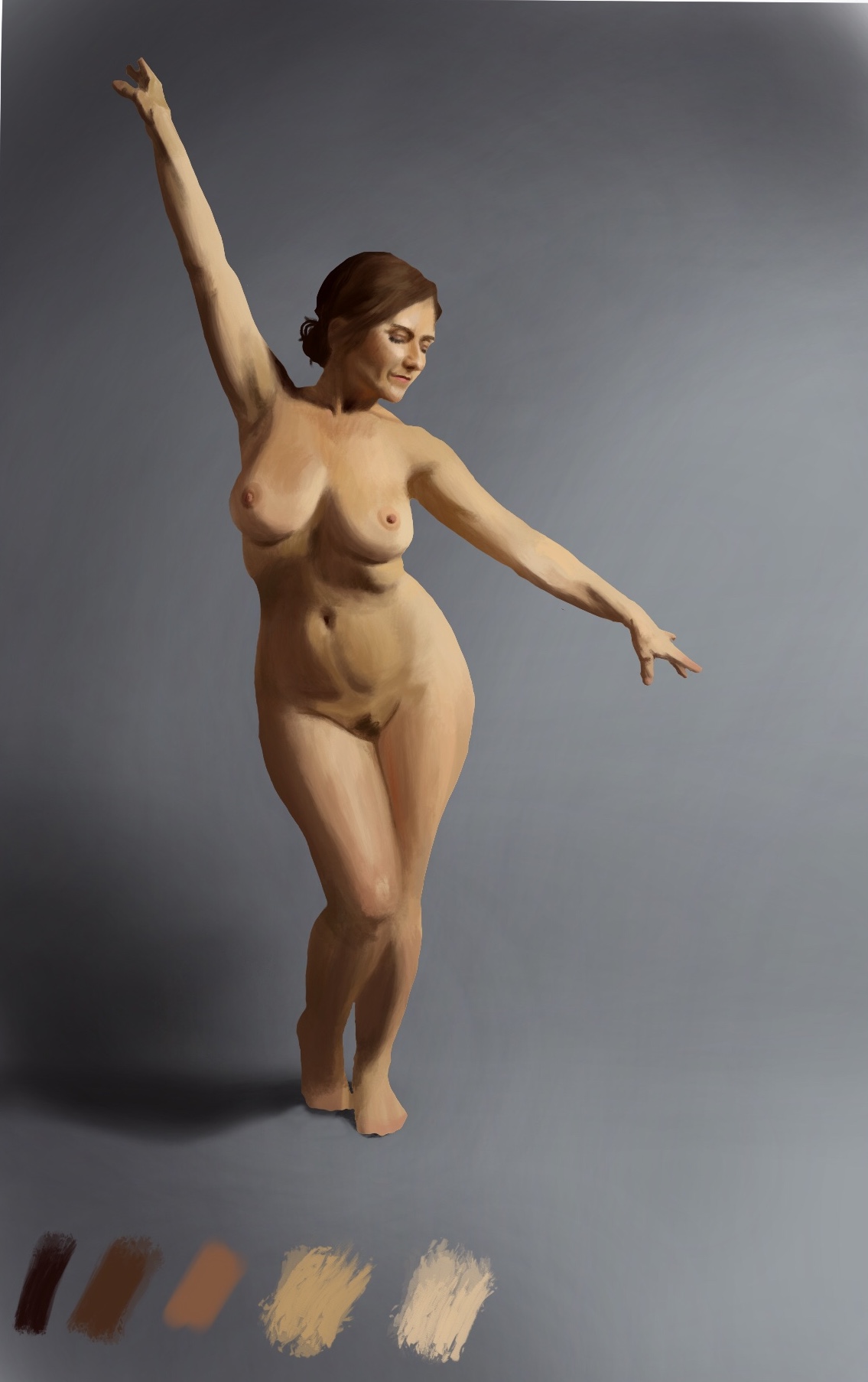
Color study. Also partially a brushwork study. Tried to have a more painterly feel than the last one
@silentheart00 thanks!
-
AuthorPosts


- The topic ‘Anthony Becker – Sketchbook’ is closed to new replies.