
Addyson_H. -Sketchbook
Forum Archive › Addyson_H. -Sketchbook
- This topic has 43 replies, 5 voices, and was last updated 7 years, 7 months ago by
Addyson H..
-
AuthorPosts
-
November 11, 2018 at 11:04 pm #29921
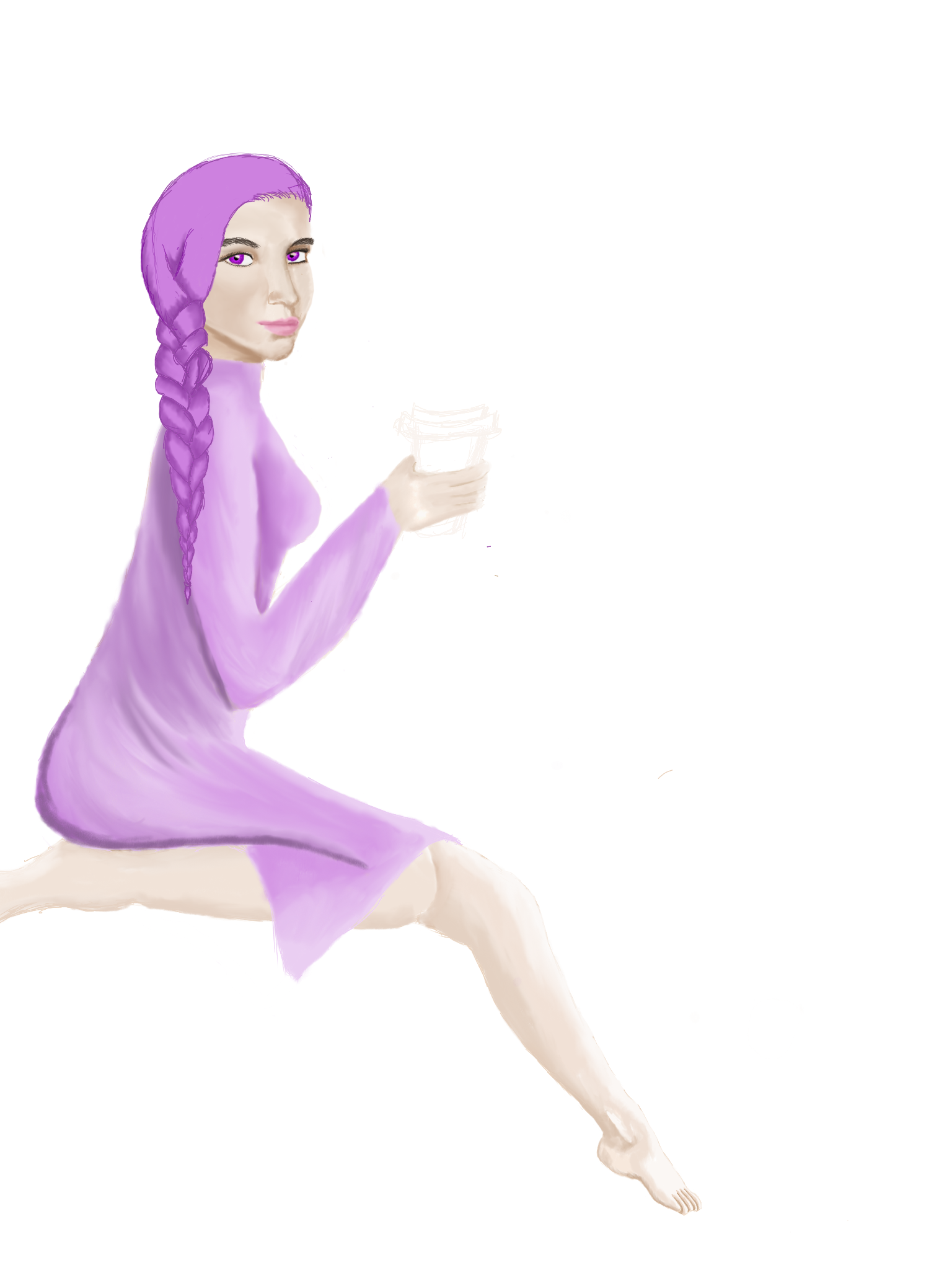
Ok. I wanted to focus on one piece at a time starting with the girl. I would love so feedback on her. I’m still working on the hair which is why it looks like so basic. Her foot is cut off in the back because of the composition of the piece. I’m thinking I will move her forward and shrink her down. I’m not sure.
 November 12, 2018 at 4:14 pm #29922
@addysonh Getting better! The face looks better, too. The back looks strange to me; the arc isn’t quite right in respect to anatomy. There’s the ribcage, which is rigid in this sense, a soft middle part that has your intestines, and then the rigid hip. The spine is also flexible and has an S-curve shape to it, so that should be reflected in the posture, as well. Again, one leg is shorter than the other for how the legs are angled. If the legs are together, the knee of the bent under leg needs to come out a little more. The pointed foot looks a little small, too, in relation to the rest of the body. Nice to see improvements to the braid, but maybe the taper is overexaggerated. Try making it a little more gradual, and there’s still some thickness of hair at the end, so it doesn’t disappear into nothing. God job on experimenting and finding limits, now refine it.
At the side I included an example of hue shifting and an example of value shifting. Which one is more interesting to you?
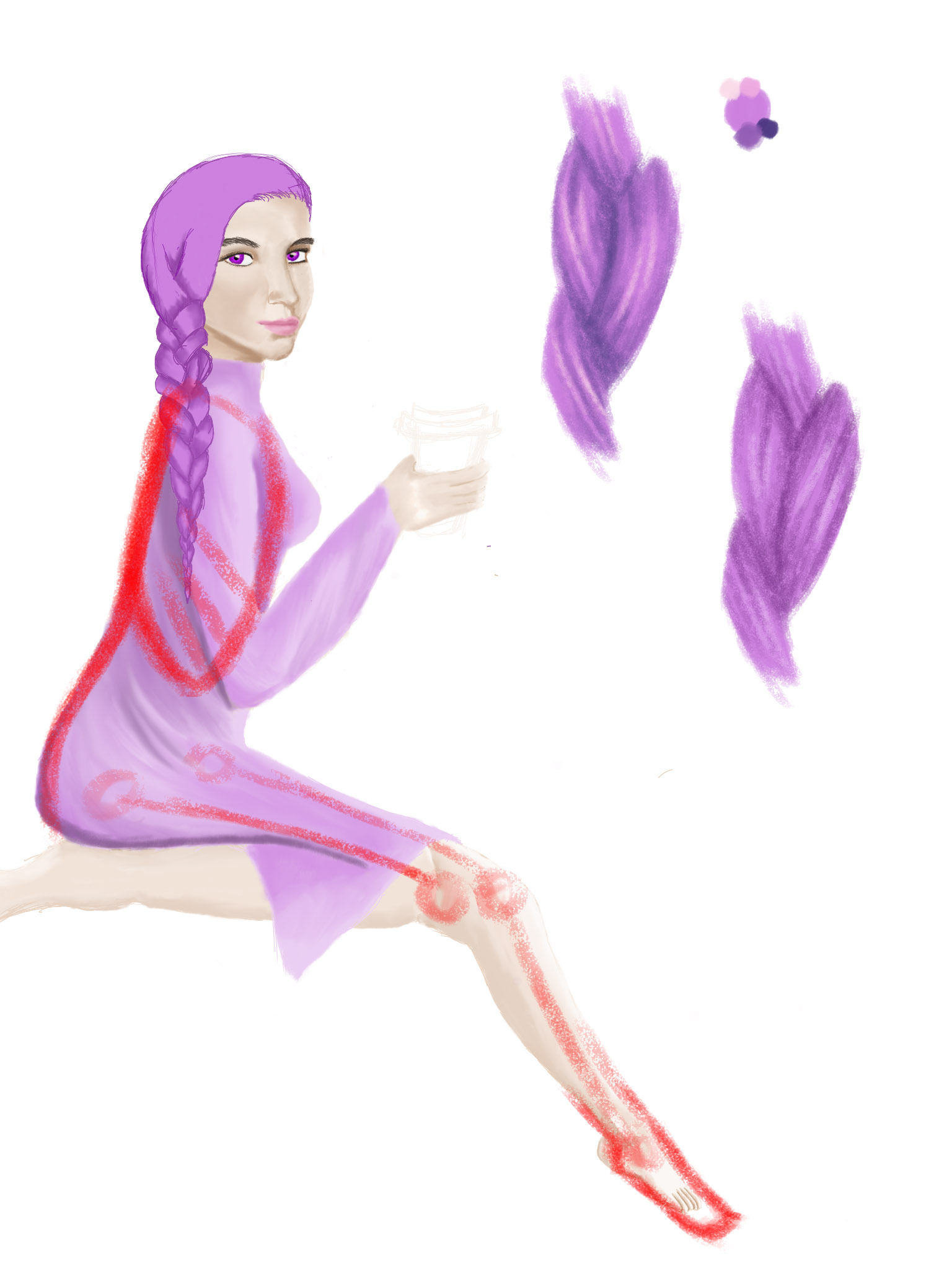
Overall, good improvement! Keep going!
November 12, 2018 at 5:33 pm #29923@silentheart00 Thanks! I will work some more on it. I was also told that I should shrink my focus even further and focus on just the head and then add the body later. I’m going to give that a try too. It will give me an opportunity to focus on that braid and refining the face even further. Back to the drawing board!
I think the value shifting interests m e the most. That is the braid on the right, correct?
November 12, 2018 at 8:37 pm #29924@addysonh Yeah, the braid on the right is value shifting. If you like that more, then alright, that’s your preference. It would be worth experimenting with hue shifting because it tends to make things look a little more interesting and it reflects the natural world more realistically. If you just value shift, things tend to look dull or washed out. I also exaggerated the hue shifting, so something more subtle may work better. Experiment and find what works best for you.
November 13, 2018 at 9:21 am #29925@silentheart00 Ok. Will do. Thanks. I’ll experiment with both of those. It’ll be good to understand the proper time and place to use them both. Like you said. I’ll experiment.
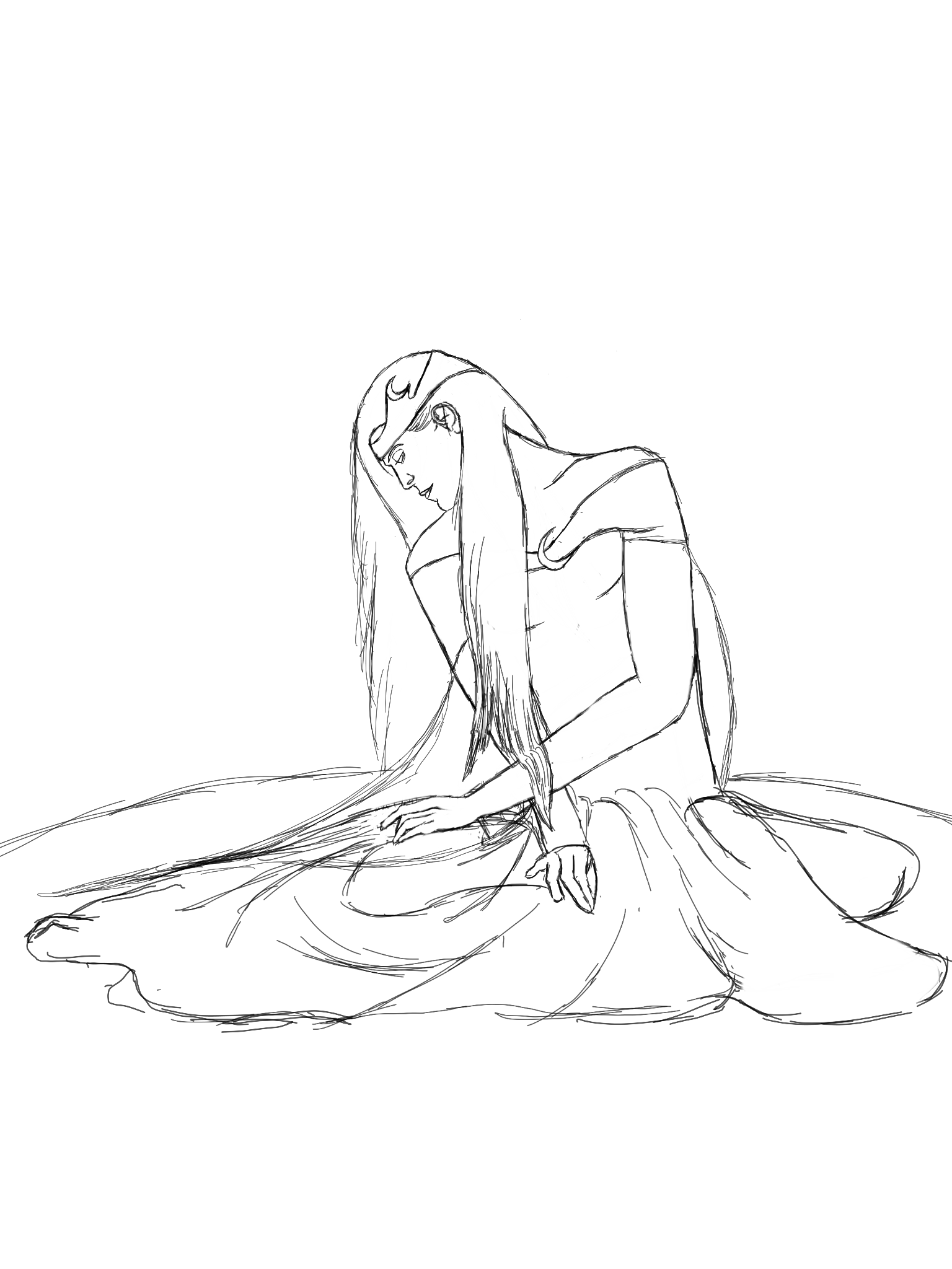
January 6, 2019 at 10:49 pm #29926New concept for Amaris! I have a really good feeling about this one. Any critiques would be great. I haven’t decided on the background yet, but I figured I would just focus on her and let the rest fall into place.
 January 7, 2019 at 7:58 pm #29927
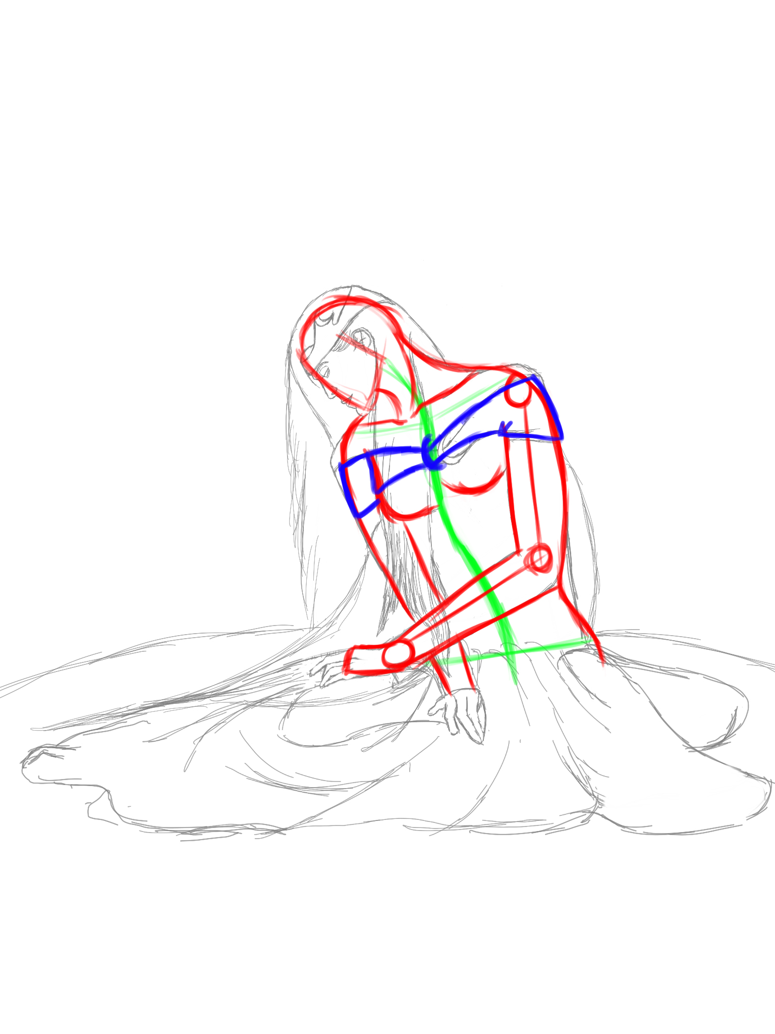
@addysonh Good start! You anatomy has gotten better in regards to proportion, so good work there! The shoulders are a bit wide (in red), and the wrist of the left arm is a touch farther out than it should be, but the rest is looking better. I can see the shoulders being a little wider if she’s more athletic, but that’s up to you if you want to keep them wide or slim them down. Keep in mind the spine (in green) and how it curves so the rest of the body follows that curve, even subtly. I’m not sure where the legs are, and maybe that’ll become more apparent farther down the line. For clothing, give it some thickness, even a little bit, so it doesn’t look like it’s part of her skin. Good improvement. Keep going!
 January 7, 2019 at 9:21 pm #29928
@silentheart00 Great! Thank you! Thanks for pointing out those things. It helps a lot. Her legs are kind of tucked under her. Like when you sit on the ground with your legs to the side.
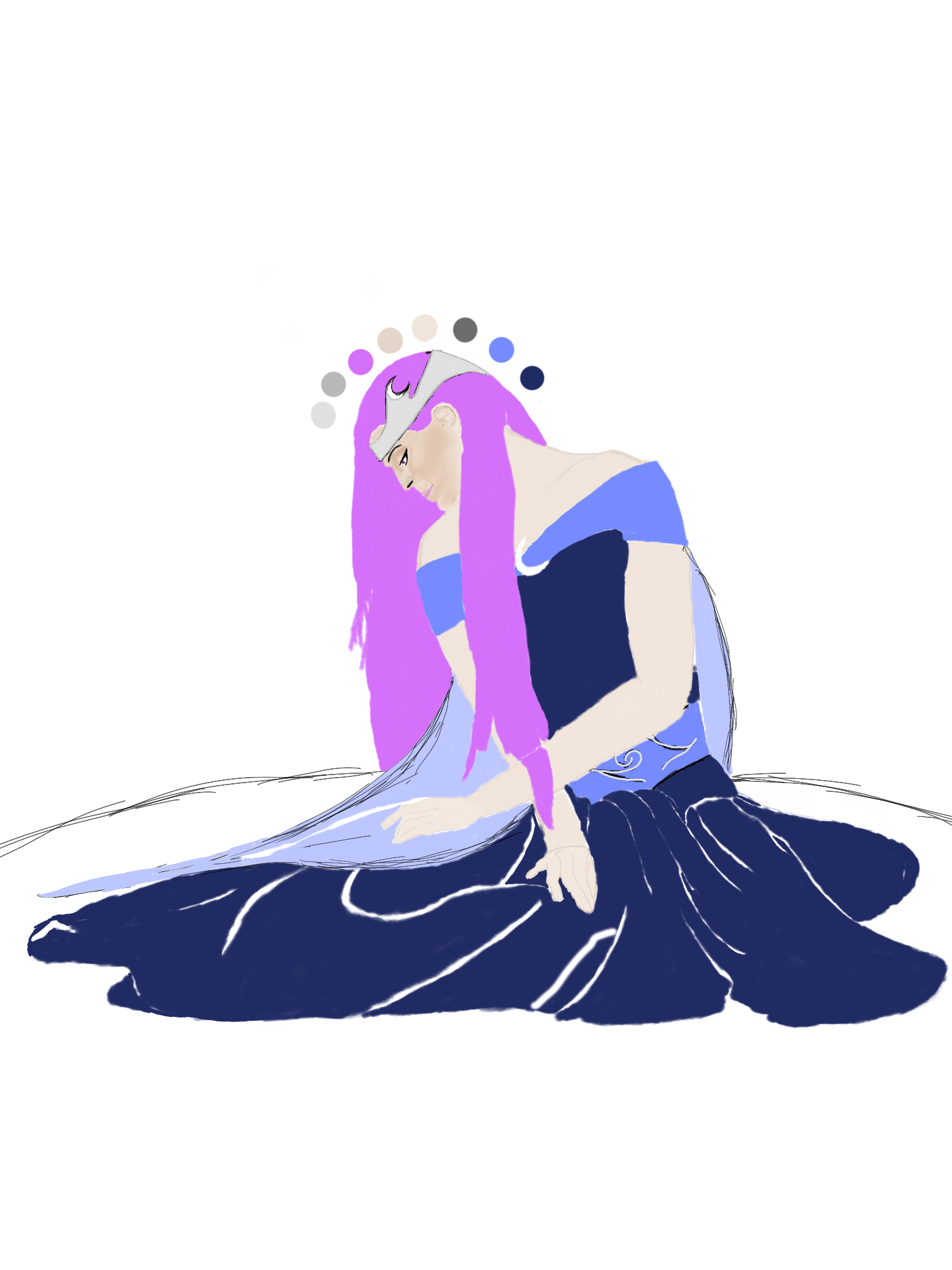
January 8, 2019 at 11:55 pm #29929So I fixed up her figure. I’m still working on the chin area. It still doesn’t look quite right. I went ahead and put in where I wanted the colors. The white lines are a reference to where I think creases in the dress would go. I’ve also started adding more detail to the face.
 January 9, 2019 at 10:08 pm #29930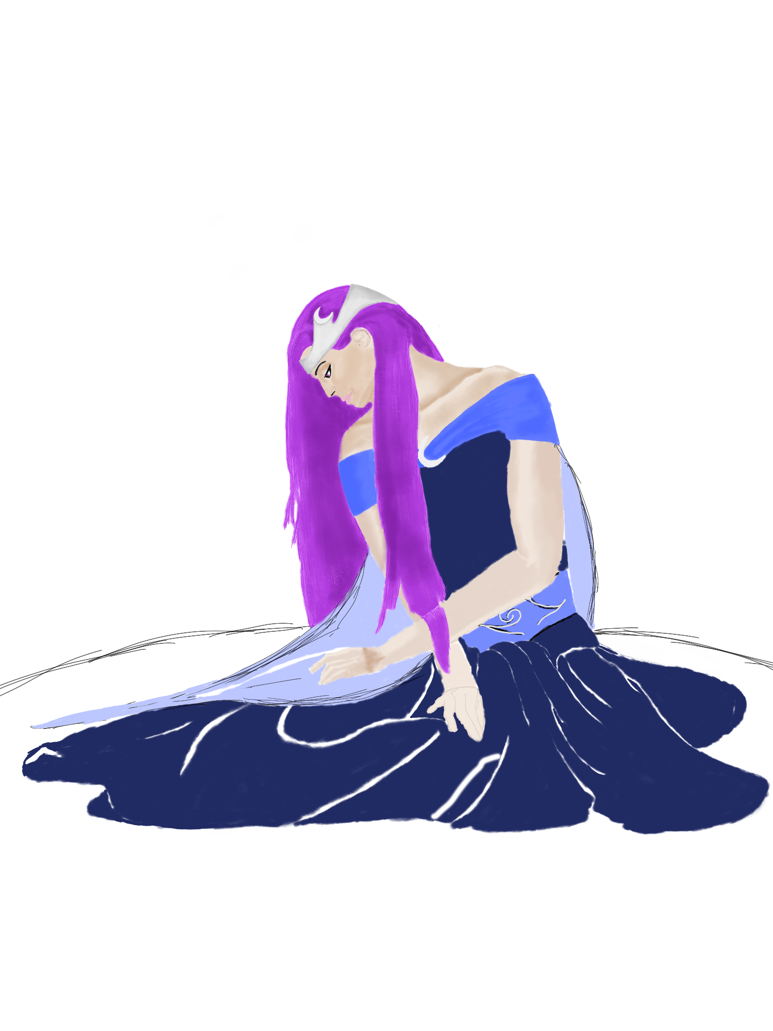
 January 10, 2019 at 10:23 pm #29931
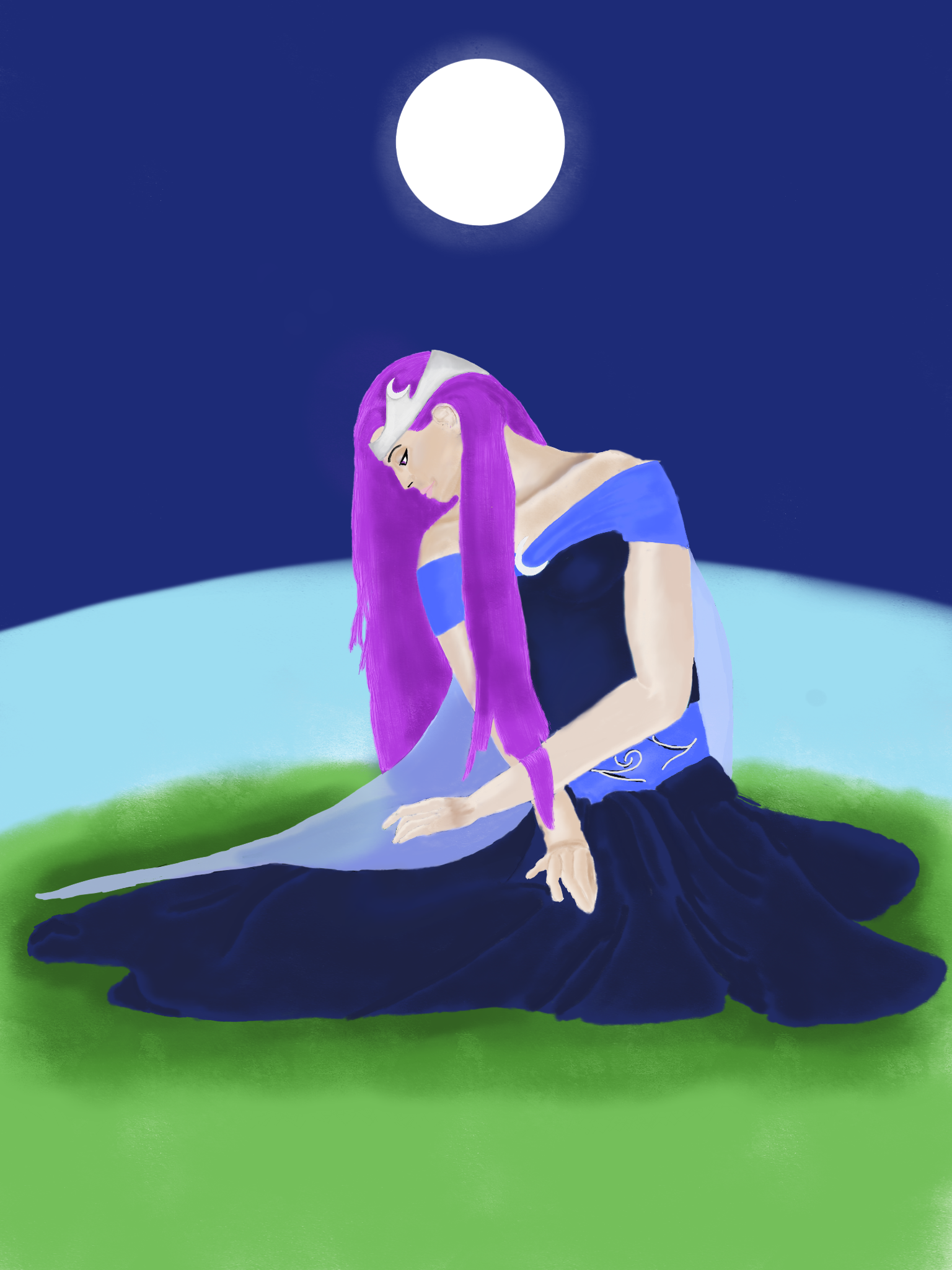
@addysonh Whoops, this kind of slipped through the cracks for me. I think the chin looked weird to you because the lower lip was really big compared to the rest of the face, and you corrected it a little bit in the latest image. The top lip is a little flat; kick out the lip curve a bit for the fleshier lips. Take a picture of yourself from the side if you can and look at your own lips. The brow seems a little high, which is getting thrown off by the crooked eye. Try this: look straight ahead, put your finger on the bridge of your nose (the lowest part) and draw a straight line over your eye (don’t poke yourself). Where does your finger go? Or, back to that side view of yourself, where does the bridge of your nose line up with your eye? A similar idea with the eyebrow, as well. It looks like an eyebrow you would see from the front, so how does it differ in the side view?
For the hair, where’s your hair part? It looks like the hair has no starting point. The part can really influence how you draw the hair. Again, get some references and do some small studies.
The legs outlined in red are what I think you meant by the leg positions, which will influence how the wrinkles fall. Let me know if I’m on the right track.
Also, what is the main light source in this image? That could really affect how you handle the lighting, as well.
There’s improvement, and I think you’re starting to develop your eye. Good effort.
 January 11, 2019 at 12:56 am #29932
@silentheart00 Yes. That is how her legs are. Someone also pointed me to a link for a technique for drawing the face. It looked interesting so I’m doing her face again. You are right. Her face has more masculine features then feminine features so I’m trying to work those out right now. I’m thinking the moon is the main source of lighting.
I have definitely taken a step back which I’m ok with. I’m moving too fast AGAIN!!! Slowing it down. I’m really looking at the line work before I add color this time.
January 11, 2019 at 4:12 pm #29933@addysonh That’s alright. You’re figuring out your process, and that’s perfectly acceptable =] It’ll take lots of practice, but you’ll get faster along the way. You got this.
January 12, 2019 at 2:24 am #29934
-
AuthorPosts


- The topic ‘Addyson_H. -Sketchbook’ is closed to new replies.