
Reply To: Polybook – drgnclw
Forum Archive › Polybook – drgnclw › Reply To: Polybook – drgnclw

@theluthier Thanks! Seeing a lot of different colors together kinda scared me that day because I haven’t textured a character before. The day after that I was more comfortable with my color choice. Now I can see some stuff that I can improve but they are either about design or the base materials I’m using (for example the fabric texture doesn’t look good up close) At this point, I need a time machine to fix them 🙂
I have two specific questions, though.
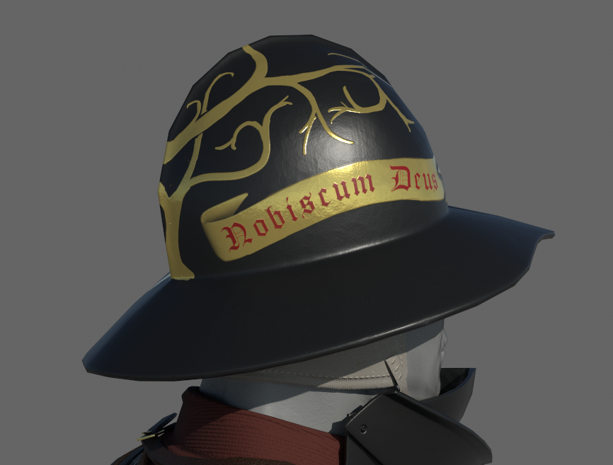
https://i.pinimg.com/originals/68/4e/d5/684ed52be886afdc3a9b553721446a8d.jpg Here’s my main inspiration for the helmet’s painting. The gold paint’s reflection kind of looks metallic to me. I don’t know what kind of a paint/material it is and the only way I can get a similar result is using a metallic value of .6-.7. Would it be acceptable or is there another solution for this?

It’s obviously a WIP. I’m going to refine the lines a lot more and add some leaves like the reference and change the text’s color 🙂
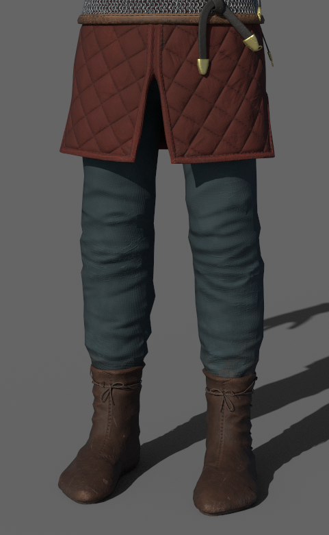
And my second question is about the pants’ color. I used a greenish blue to get some contrast with other colors ( @malhomsi gave me the advice on the Discord server) and I think it looks fine. However, I had the thought of using lighting to get that contrast instead of changing the color scheme. I’m really inexperienced with lighting, though. Would it be worthwhile to try?