@phoenix4690 Thanks for the feedback! I’m kind of torn as well. The second pass versions look cool, but take a lot of messing with to get right. The other thing is, based on size of normal map we’re using, the detail is gonna be wildly low in the end. Furthermore, those details are almost completely lost from far away.
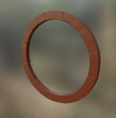
The suggestion to just look at them in a ring to get a feel for the end result was wise.
The simple style is something like this:
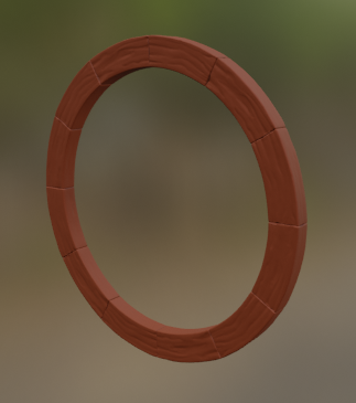
The other 2nd pass version is more like this (Only one side of the wood really looks acceptable to me, but the idea is still visible):
And I think you’re right, the water logged nature of it should make it look less refined. My concern has really been the balancing act between the stylized aesthetic and adding realistic depth.

