@bun-bun Very nice work this week. A few notes on the light match:
- Colors: Here’s some corresponding key colors that are different:
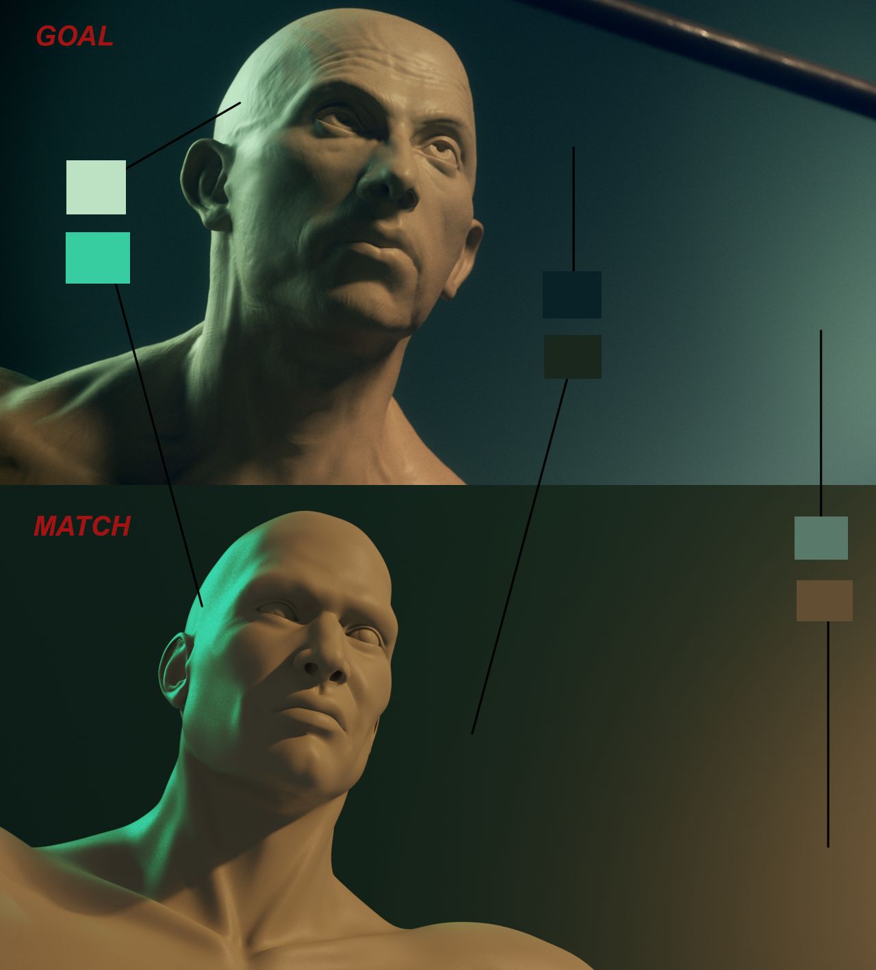
- Shadow contrast: I get a general impression that the shadows are darker in the source, most noticeably below the chin. Also in the same area, the shadows are sharper than in the source.
Still really close: It’s a B on this first part.
Two words come to mind when I see your vehicle render: Sharp and Crisp. Now I mean that both positively but also as a slight criticism. Positively, your sharp render is bold and makes a strong statement. Values are varied and extreme: Dark blacks and bright whites. Critically, the sharpness looks unrealistically too perfect. Though I know with vehicles and product imagery it’s often desirable to be perfect. I personally try to avoid perfection because I see it as an enemy to realism and believability.
Overall it’s a fine render and my criticism is arguably into subjective territory. It’s an A in my book.

