
Reply To: BC1-1908 Homework, Philipp Bauer
Forum Archive › BC1-1908 Homework, Philipp Bauer › Reply To: BC1-1908 Homework, Philipp Bauer
August 12, 2019 at 3:48 pm
#48970

@cruento I’m glad to hear you learned a lot along the way. I definitely see it showing in your results. Overall it’s a good texture but I do have some notes to offer:
- The wood grain looks great on the outter frame and lowest horizontal board (highlighted in pink) but looks odd on the top 3 boards (highlighted in yellow).
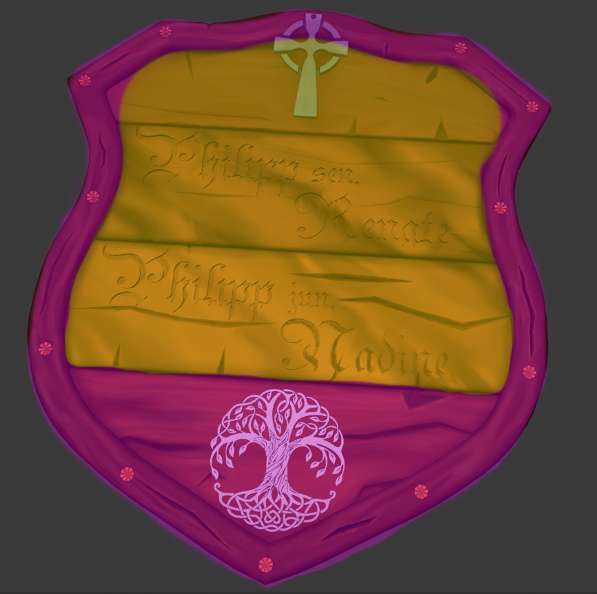 The middle two boards have color stripes that flow diagonally instead of horizontally like the bottom board, which aligns correctly with how wood boards are cut in reality. It feels unnatural and doesn’t align with the wood cracks either.
The top horizontal board appears to have correct directional flow of the grain but it’s notably more subtle than the bottom board.
- The metallic (I think) symbols attached to the crest should have some darkening around the edges, where it meets the surface of the wood:
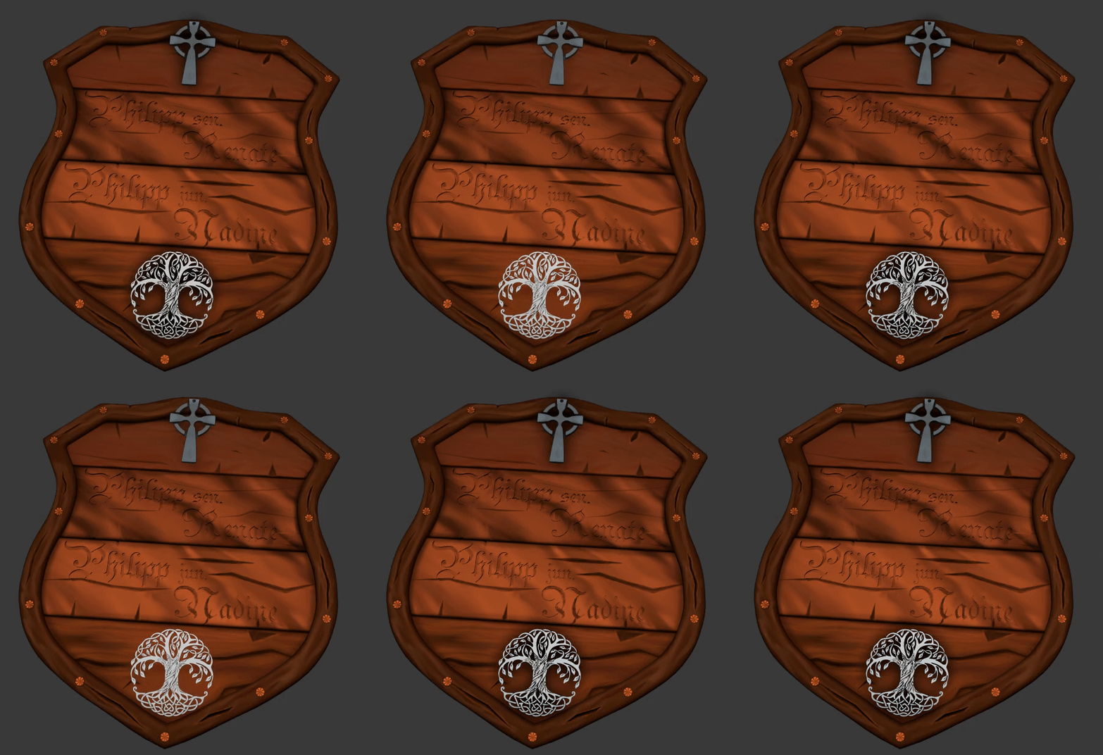
This is definitely where dirt, dust, and grime would gather. It will also help the symbols feel like they’re coming in contact with the wood. Without it the metal appears to float above; disconnected. - The carved letters is another ideal place for dust and grime (darkness) to gather as well as lightening the edges. That will make the letters pop out of the wood whereas currently they blend in and get lost too easily. You can probably achieve this best with the dirty vertex color baking method in the treasure chest course.