
Finished my first Character, critique needed
Forum Archive › Finished my first Character, critique needed
- This topic has 30 replies, 8 voices, and was last updated 8 years, 3 months ago by
silentheart00.
-
AuthorPosts
-
May 23, 2018 at 3:51 pm #9756
Hi,
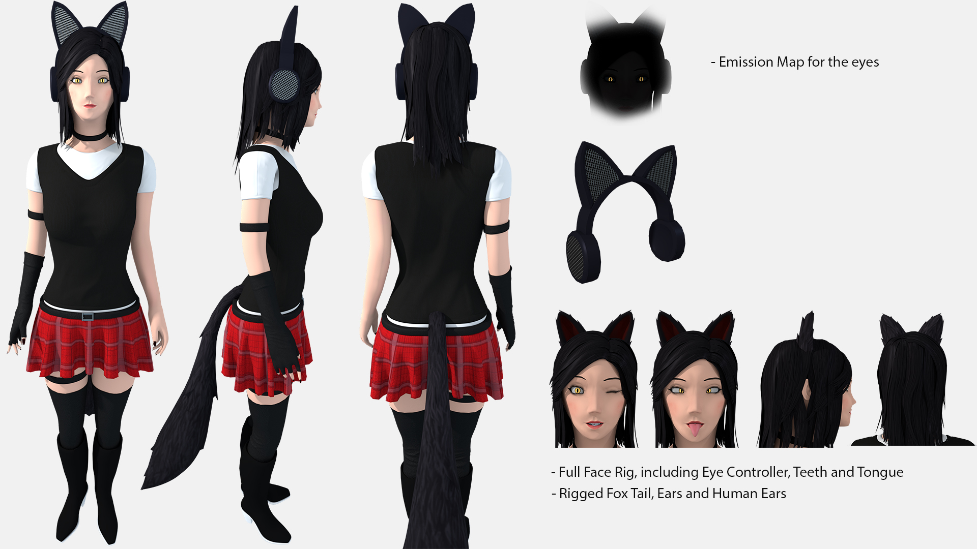
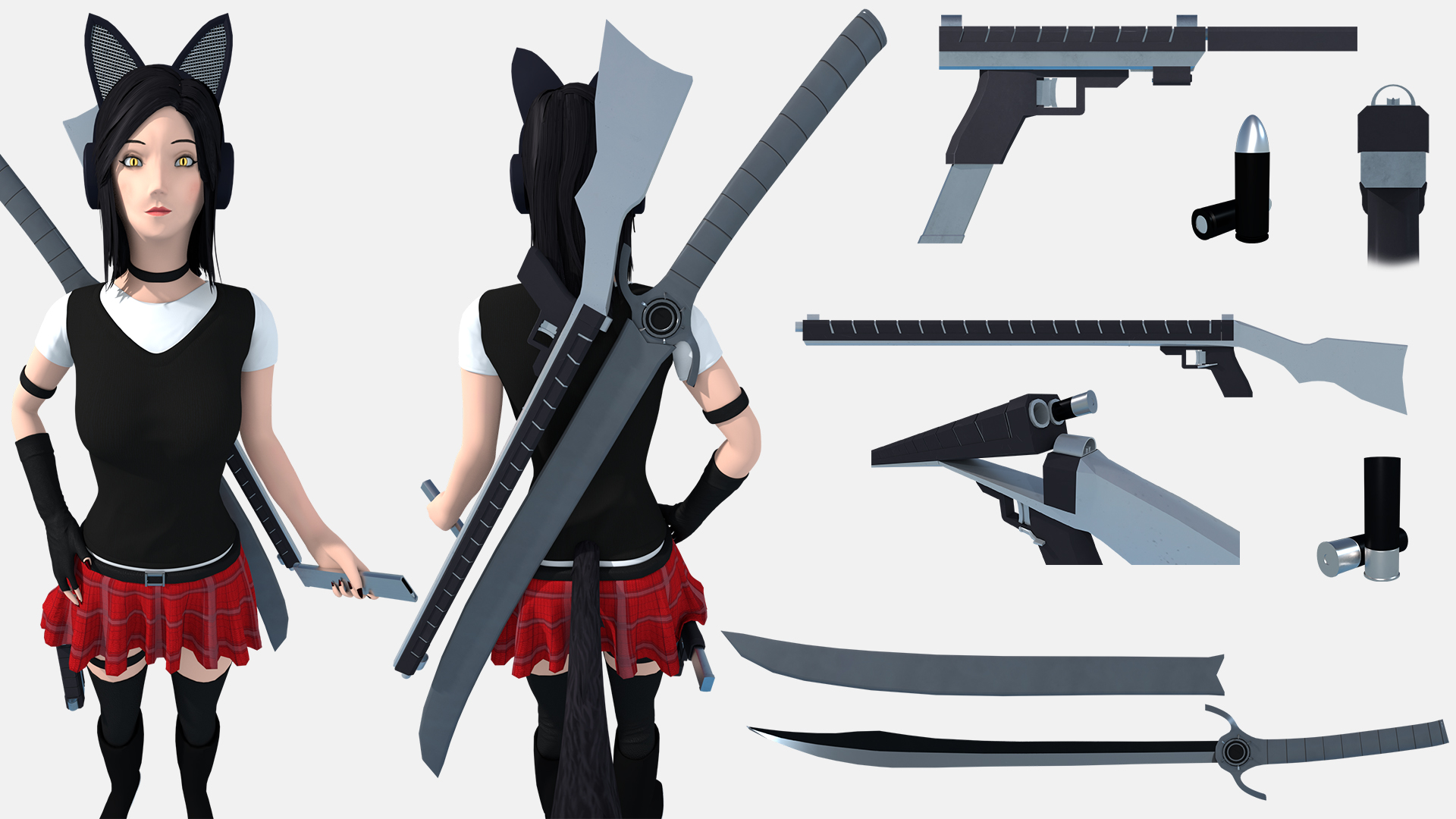
I have just finished my first Character. I mainly look for modeling errors. As style inspirations i used a combination of Oblivion, Skyrim and Overwatch.Everything was modeled to fit into a game engine for a 3rd person perspective. The sheets are a little cramped but i hope it is not too bad. If anything is unclear or you have any questions ask away.
 May 31, 2018 at 11:44 am #36879
Hi, can you check if i made any major modeling errors? I was told to tag you for any creation questions .
May 31, 2018 at 3:00 pm #36880“Error’s” is possessive. “Errors” is plural. That grammatical error is the ones that annoys me the most.
May 31, 2018 at 3:33 pm #36881@williamatics The ones :)?
May 31, 2018 at 3:38 pm #36882@williamatics My sincere apologies for the inconvenience. But do you have anything to say about the given topic, apparently my grammar seems to be worse then the modeling i ask about?
May 31, 2018 at 4:08 pm #36883Dominik the design of your character is pretty interesting. The clothes seem well made. Did you use a special program or did you sculpt those? Unfortunately I don’t have a great eye for things like proportions and such. She seems good to me in that respect. The part that sticks out to me the most is her face. It seems a bit static. For example in the eye winking pose. I half expect there to see the upper cheek to raise slightly and the eye brow to compress down a little bit . Without that kind of facial definition it makes it feel a bit flat. But this is for games so that may be the style you are going for. Cool stuff Dom. Keep at it!
@williamatics respectfully, Dominik asked for a critique on the character above not on his grammar. I’m sure there are screen writer forums that would appreciate your attention to grammatical detail. Here it’s about the art and it’s a disservice to leave such a comment and have no input on the topic at hand. Please keep that in mind.
May 31, 2018 at 4:31 pm #36884Sorry, it’s just that it really, REALLY annoys me when somebody gets a basic element of grammar wrong. (You’re right; I did make a mistake.)
May 31, 2018 at 4:42 pm #36885It depends on what your goal is.
If your goal is to create a comic-like character, you’ve achieved that.
Doesn’t look too bad, especially not for your first character.What I find a little bit weird about her facial structures is that there are barely any “extremities”.
The cheeks are flat, the nose is rather flat, her chin is flat, her lips are flat, her eyebrows are flat. Try to get some more variation in there to imply bones and muscle structure, like maybe inflate the cheeks a bit, or have her eyebrows come forth a little bit more to give the impression of a bonestructure, drag her lips a bit outwards.That kind of stuff.
Other than that, looks good so far. Keep at it! 🙂
(You can google photos of people and observe shapes of their faces and whatnot, that should give you a better idea of what I mean.)
May 31, 2018 at 4:47 pm #36886@phoenix4690 Thank you alot for your feedback, the details of the clothes were sculpted. I was actually not going for that style for the face, i am just really bad with face rigging and weight painting, that is one of the things i really need to improve on.
May 31, 2018 at 4:50 pm #36887@elensanima My goal was a comic-like character. But i agree the face needs more work. Thank you.
May 31, 2018 at 4:53 pm #36888@williamatics It is fine, to be honest i did learn something about grammar today because of you, so there is that.
June 1, 2018 at 6:00 am #36889@projekt154 Dominik you did a good job I think. I also feel there’s something off with the face of your character, maybe her eyes are a little bit too far away from each other. Try to get them clother to the nose and see if it looks better ?
Otherwise I like the character style, quite simple and basic colors yet very effective result.
Also, but maybe you’re working on it as well, the weapons are lacking details in comparison to the character, and could have smoother edges so it better matches the overall style/mood of your character.
June 1, 2018 at 12:05 pm #36890@tbrbn Thank you for the feedback, i tried pulling the eyes closer to the nose and that result felt really awkward to me. About the details, i went out of ideas… and i purposefully made the edges sharp so it would look as durable as possible, is that a “wrong” approach?
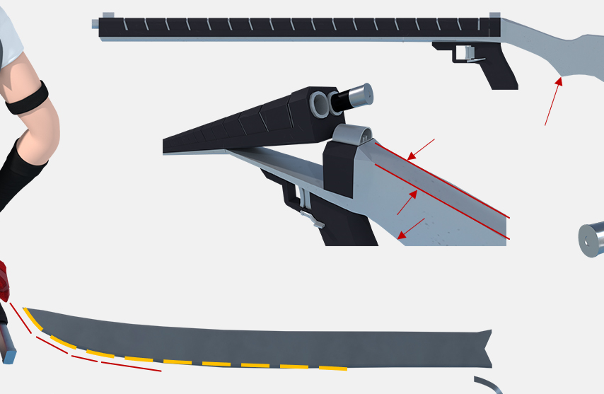
June 2, 2018 at 5:38 am #36891There’s no right or wrong 🙂 It’s also personal preferences. To me the edges seem to sharp, she could cut herself by holding her weapons with bare hand. Small chamfers could help, it doesn’t need to have a big radius either.
On the image bellow I pinpointed some edges that I think are very sharp. Then again, it’s personal preference, don’t feel the urge to change you model just for my sake lol. I really like her equipment, you did a great job with their design!
The blade holder is also very jaggered (red dashes) and I think a smoother curve (orange dash) could look a bit nicer (plus it would match the curvature of the blade).
 June 2, 2018 at 2:32 pm #36892
@tbrbn I see, not only is this preference its more like logical that that should not be sharp. I totally missed that. The Sheath was on purpose like that because of performance reasons if this is going into a game engine. The Blade + Sheath both have a total of only about 4700 Triangles and the sheath has only 286 of them.
-
AuthorPosts


- The topic ‘Finished my first Character, critique needed’ is closed to new replies.