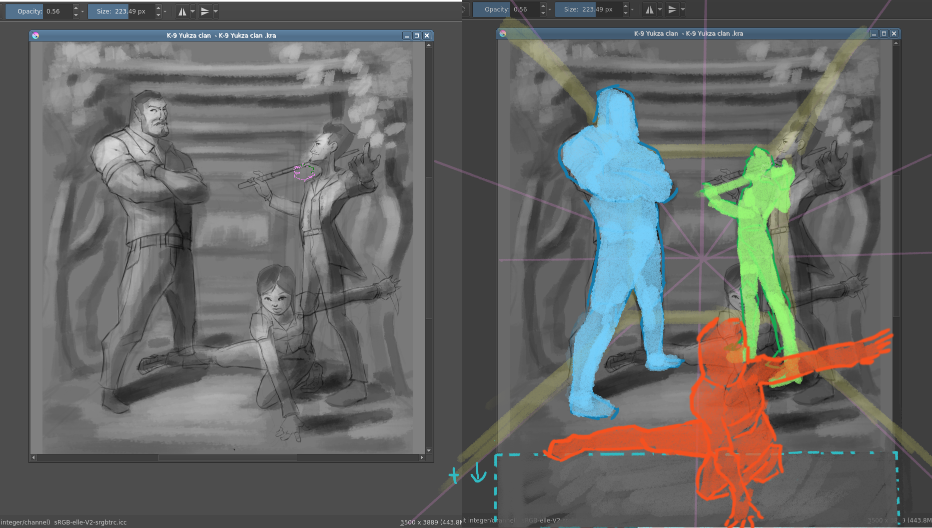
Hi! I would maybe suggest you change up composition for a bit. It seems to me like standard/rectangular format would work better for what (I think) you’re going for.
It would allow you to utilize the depth of space you indicated here better and rearrange character in more dynamic way. When they are like this it seems like they are all crammed in one line like the’re posing awkwardly for a photo xD If you place them more into the space like I put on the right, it’s just seems more dynamic.