If you want to learn about colors, I can recommend the book “Color and Light” by James Gurney. Sadly, I gave my copy away, need to get a new one. But one trick I remember from it was that light is waves bouncing off surfaces, so if you’re having a color somewhere in your scene, chances are that it will jump around and influence other parts. In short, try mixing in some of the colors from other parts of your drawing, and it will all seem more grounded.
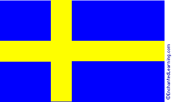
Another easy hack is that some hues are naturally dark, while other hues are naturally bright. For an extreme example, blue is naturally dark, while yellow is naturally bright:
http://www.enchantedlearning.com/europe/sweden/flag/Flag.GIF
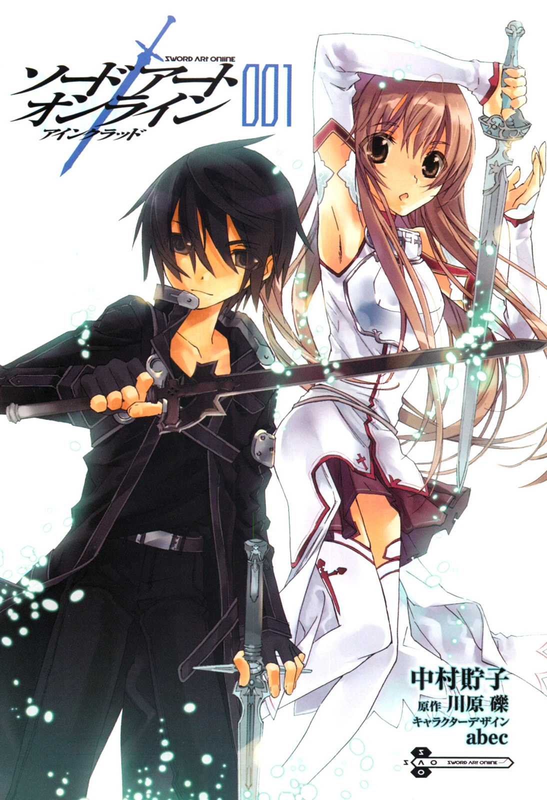
This is VERY useful since darker areas look WAY better if they use hues which are naturally dark. For instance, a lot of manga drawings use a yellowish skin color, but move towards red (a darker hue) for the shadow areas of the skin:
http://vignette4.wikia.nocookie.net/swordartonline/images/e/e1/SAO_manga_cover.jpg/revision/latest?cb=20130520132137
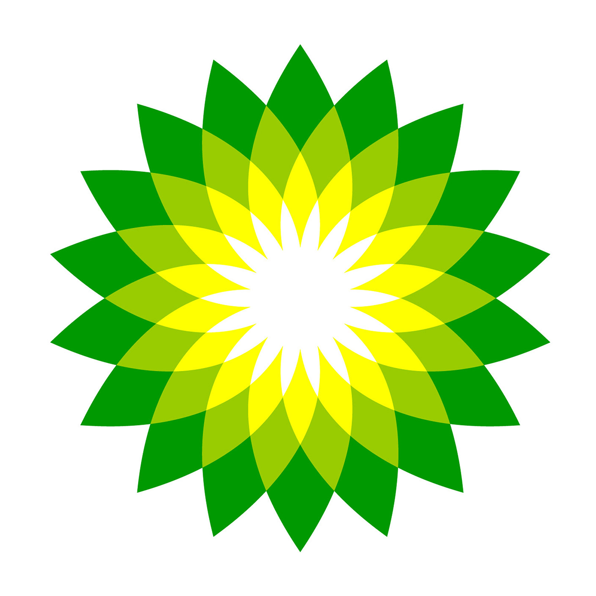
Or this logo, which makes a gradient from green (a dark hue) to yellow (a brighter hue) and then to fully white:
http://brandmark.io/logo-rank/random/bp.png