
Reply To: BC1-1908 Homework, Paul Haynes
Forum Archive › BC1-1908 Homework, Paul Haynes › Reply To: BC1-1908 Homework, Paul Haynes
August 21, 2019 at 10:22 am
#50350

The sword of Gluteus Maximus…
@paulhaynes1955 That backstory though 🤣 Since this thread is behind the others, I imagine most people have missed out on this laughter.
Week 2: Your texture looks good overall. I love the wood grain in the pommel and lower hemisphere of the cross guard. I give it a solid B+. I only have a few notes to offer:
- The center-line of the blade is a bit too perfect and even; computer-generated. I recommend sketching some white highlights down the length to feel more natural.
- The golden top of the cross guard doesn’t have much detail aside from the touch of grime (which is good). I recommend adding some small nicks and scratches with white (overlay blend mode).
- The dark grey handle is also overly simple imo. I recommend also adding some scratches and subtle tonal variations
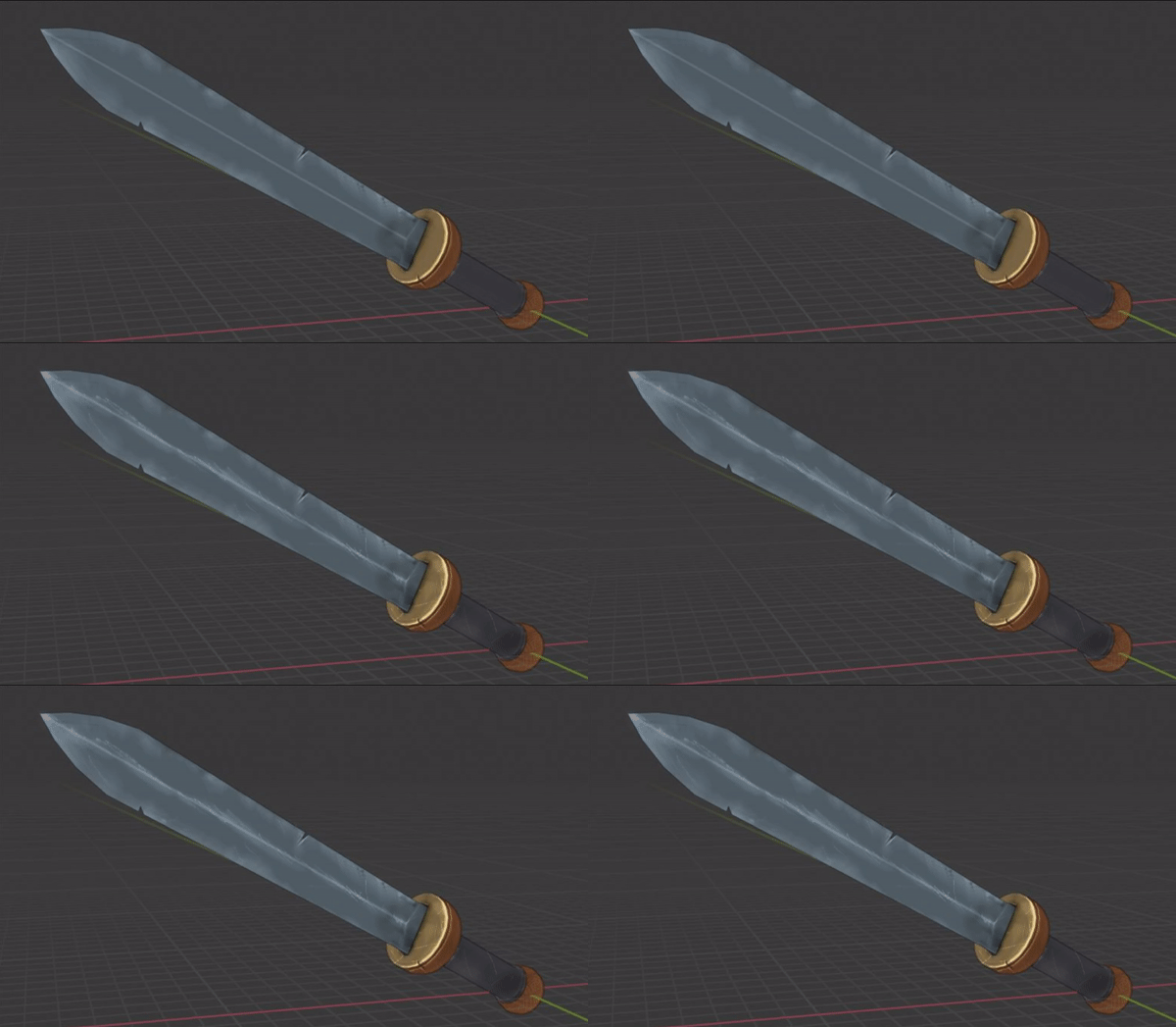
Week 3: This is like week 2 for me: Good with room for improvement. Also a B+.
- The detail suggestions for week 2 will transfer nicely over to the material, increasing wear and tear believability to the middle of the blade, the golden/brass toplate of the cross guard, as well as the grip.
- The grip’s leather procedural seems too broad and a bit stretched to me.
- The wood material could benefit from some reflective breakup. It’s surface quality is too uniform and dull to be natural.
- A subtle vignette would give the background more depth and not feel so 2D/boring.
Thanks for participating, Paul, and congrats finishing out all 3 homework assignments! 👏