@fide Wow, Ingrid! I really like to see how hard you went at the chest texture detail. I find that most people, including me, tend to be shy about adding distinct details in the texture. But you did it and did it well. Really nice job!
My only note on the chest is that I think the wood specifically could benefit from some broad gradients. Take this example from n647:
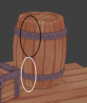
Notice how one side of the board is notably darker and the other side notably lighter. I find these broad gradients add a lot of appeal.
Your sword looks good too! Only one note there: The colors read more solid than with varied tones like the treasure chest. Here’s what I mean:

The left is solid colors and the right is the same colors but broken up with various subtle tonal varieties. Generally they look the same but the right is more painterly and more interesting. Your treasure chest has this kind of variety all over but the sword had it some places (like the grey piece between the horns) but a lot of it feels more like solid colors.
Still you’ve done great work this week earning an A+ 👏

