
Reply To: BC1-1908 Homework – Burn Arakiss
Forum Archive › BC1-1908 Homework – Burn Arakiss › Reply To: BC1-1908 Homework – Burn Arakiss

Hey Everyone,
First I added the correction Kent asked for to give the different wooden boards more variation of the base color and improved some other parts of the texture paint.
But for “shading and lighting” I wanted to tell a story that’s connected to the barrels and the carriage and get away from simply improving the model. Alternatively, you can say “How can you spend so many hours on details, and then let them disappear in favor of the story…
So I came up with this image I call “Drink to survive, but don’t drink and drive”:
Homework Week 3 Submission
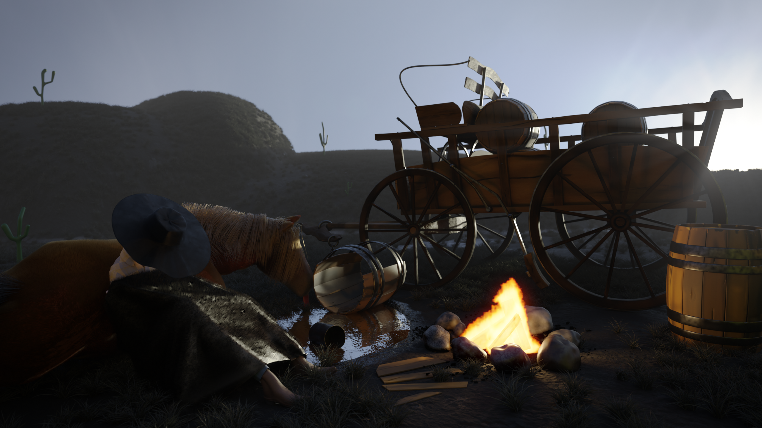
I’d be happy to know, if my thought process behind making this image is also received that way by the audience. That’s why I’d like to break elements, workflow, compositing down and you might have thoughts weather I succeeded and what I can improve.
Elements
Because the horse carriage already took a long time to model, texture shade, I wanted to keep the amount of work for the other elements as low as possible.
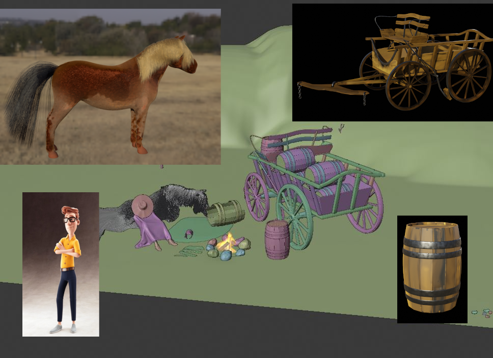
Horse carriage and barrel … if you took the course and class you know what I did/learned from Kent….
Horse – is only a base mesh I downloaded from blendswap. Used Rigify “Horse rig” to pose it more quickly (automatic weights worked very well). I didn’t even put eyes in, but I had some fun with the fur (which hardly shows in the final image). Fur is troubling, but after seeing an old (pre-cgcookies) tutorial of Jonathan about a cat fur, I got some nice results. As an Easter egg for people who know me personally I made the blond hair similar to my own. The posing is a bit weak… but I guess no one will see it???? Is it distracting that it didn’t have mouth and only a tongue?
Cowboy – it’s Vincent from blender cloud. A nice model, which renders fast and is not to high poly. Thanks and greeting to Andy Goralczyk from Blender studio. I took some time to make the material more fitting for my scene, which ended up ok…. until I put a blanket over the cowboy in favor of the story and made a lot of work invisible….
Puddle – is essentially a dip in the ground, and a plane with some voronoi displacement. While this was easy, I spend some time on making the wet effect around the puddle. First I couldn’t get vertex color to work (I still don’t know why it refused to work), so I used the “liquid plane” as a dynamic paint brush and the ground as dp canvas and enabled spread. This gave a nice gradient which were probably more difficult with vertex paint. I used this dp information to control the roughness (wet shine) and to darken the color of the texture at this point.
Stones subdivided cubes with displacement controlled by an empty… sorry that this is not low poly workflow.
Grass – is from the grass essentials pack on blender market. I typically prefer the “long grass bunches” because it makes a solid grass coverage without too many particles needed. Anyway, it for the material I wanted it to appear that a bit of morning frost is on it. However, I didn’t want to go to an extreme as seen in “Spring” Open movie and also spend too much time on it, so I simply decided to reduce the saturation to get a feel of cold morning in the grass with foggy-wetness.
Cactus – is a line of vertices + skin modifier + subdiv modifier. I feel the lightly weird shape gives a bit of comic feel back that started to disappear with the other elements.
Fire – A bunch of wooden planks from the barrel, quick fire, lower strength … done… kind of. I still struggle a bit with the fire: in the morning atmosphere you probably would expect the fire to be burned down. But I want to have the a plausible light source on this side of the carriage while having the sun behind carriage … but if you need to drink a whole barrel to have some wood for the fire you probably stay up a while before you have fire 😀
Blanket – The blanket was a late decision. Without it, only in pants, shirt and boots the cowboy never seemed to a cold enough. Finally with this blanket it had more “empathetic coldness” to it. à plane + clothsim + applying my new fur skills…. Too much fur in this area? …. (See material section)
Materials and Colors
I wanted to stay with brown or desaturated colors. I played with having the cowboy have blue pants as lower picture repetition of the blue in the sky and a yellow shirt as repetition of the yellowish sun. But I was not good for the story and distracted even more from the carriage as the two figures already do. So the blanket was the result and I actually like the contrast of organic shapes and fur on the left and hard surface stuff (barrel + carriage on the right).
The HDRi is the “dry field” from HDR Haven. I rotated it to be at the sunrise spot.
Composition
I intended to have the viewer’s eyes probably not start at the carriage but ending on it.
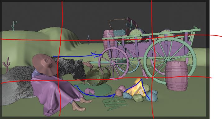
The neck of the Horse together with the broken barrel points towards the carriage. When you follow the legs of the cowboy you end up at the fire, which looks a bit like an arrow pointing upwards. At the same time the sun light behind the carriage and the reflections on the barrel are supposed to provoke some attention for the carriage.
Moreover, the horse and cowboy are on the left bottom of the “rule of third”-intersection, while the carriage is (more or less) on the diagonal point. Both are supposed to balance each other’s weight. On the other diagonal I intended to have less weight and have (lightly) the barrel and the background mountain.
Compositing
Compositing added a lot to the atmosphere to the image. Especially the fog which is “only” the mist path added on top of the image. A bit of color correction to push blue and yellow a bit more. I biggest problem for the final result is the brightness. The pic should have a dark, early morning feel. However, I find it really hard to get to a point where the image is bright enough to see a decent amount of detail, but not have it look like day light. Especially when I looked at the image on different screens I was completely lost, because on some details were hardly visible and on other screens it was too bright. I eventually looked at the histogram to have at least a good distribution between light and dark areas…. But that is really a point I’d love to have some advice.
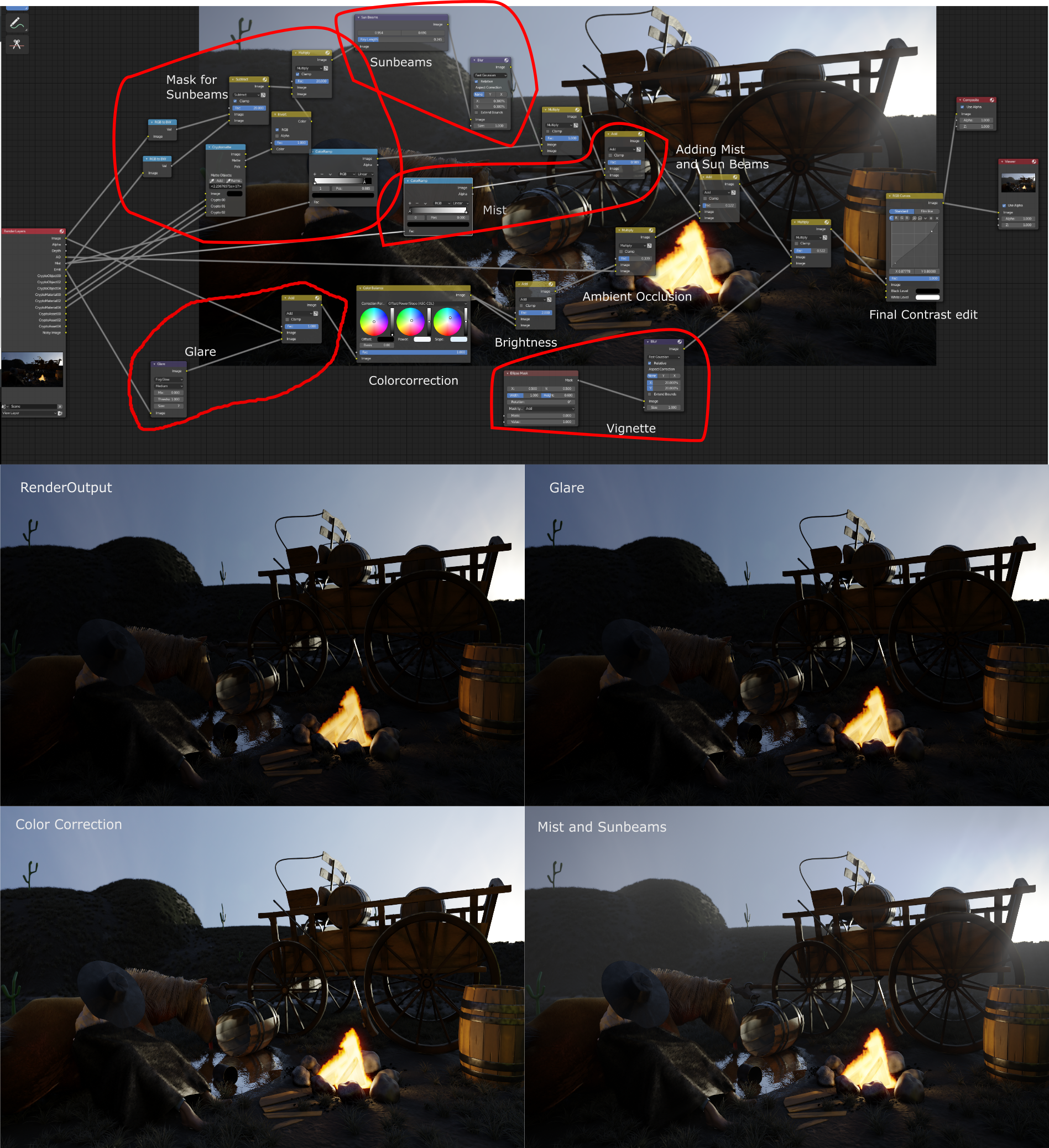
I hope that was interesting for some of you and maybe you have advice for improvements or any type of opinion, whether my thought process arrived at the result I intended.
Looking forward to see your results. 😀