
Reply To: BC1-1908 Homework – Aaron Rudderham
Forum Archive › BC1-1908 Homework – Aaron Rudderham › Reply To: BC1-1908 Homework – Aaron Rudderham

@thecabbagedetective WHAT A STORY. No wonder you’re exhausted. That would have taken me hours to imagine and then write. Probably longer than the actual creation of the sword render.
For what it’s worth, I was enthralled by the story. It really added a deep layer to the final piece. I remember in the stylized character class that the first assignment was writing a backstory for the character. The exercise works very well in this case too. I know that takes a lot of effort, so my hats off to you Aaron. You really go 100% no matter what! That will take you far in whatever you do – so long as you can control it and not let it hinder your physical and mental help, brother.
I can sense that you had big plans for this piece. Some aspects are amazing and others feel undercooked. Here’s a few suggestions I made with Krita:
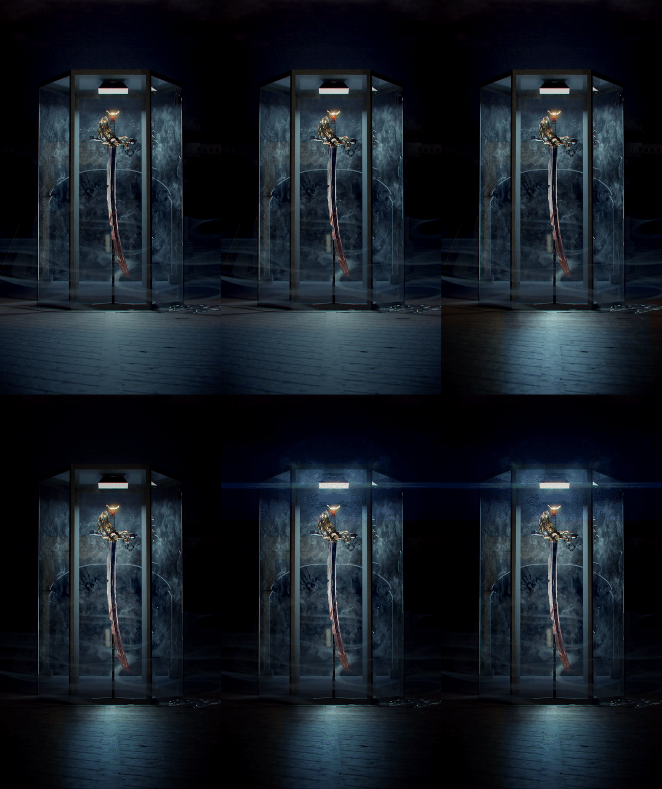
- Wood floor details. The floor is a fairly prominent portion of the image and currently it’s a little too evenly detailed / repetitive. Varying the damage and reflectivity will go a long way. I did my best to illustrate this with a wood floor photo overlayed on yours.
- Vignette around the sword. The lighting is good but still not highlighting the sword specifically as much as the composition warrants imo. I used a simple oval vignetee to brighten the sword and darken everything else. NOTE: The gif compression eliminated the fog which I don’t recommend doing.
- Light lens flare. The lamp at the top is too simple by itself. This is the perfect situation for a little lens flare addition.
I have a couple other notes not illustrated in the gif:
- The finger smudge texture on the glass is awesome! However it’s a bit too prominent and consistent. Makes me think “Geez a lot of people touch this all over”. I recommend limiting it to about 50% of its current coverage as well as decrease the strength of the effect. Make it more subtle.
- The archway in the back can be removed imo. It only appears in the glass and is confusing as to whether or not it’s a reflection or in the background. I think the scene is better without it, just using a black background + the fog layer.
- The sword case frame has an overly simple surface. It almost looks like plain shading, meaning no texture or edge detection detail whatsoever. Given the high-fidelity detail of the glass finger prints, there should be something on the frame too (grime, fingerprints, a bevel, subtle imperfection).
Keep in mind that a long list of notes typically means that I’m a big fan of the work and have invested significant time brainstorming how it could be a little better. You’ve earned an A++ in my book. As always, you do really great work and put forth much effort. Now go chill and recoup!