Working on the lighting matching at the end of the lighting course.
But ended up playing around and making this instead. It’s not based on anything, just out of my head.
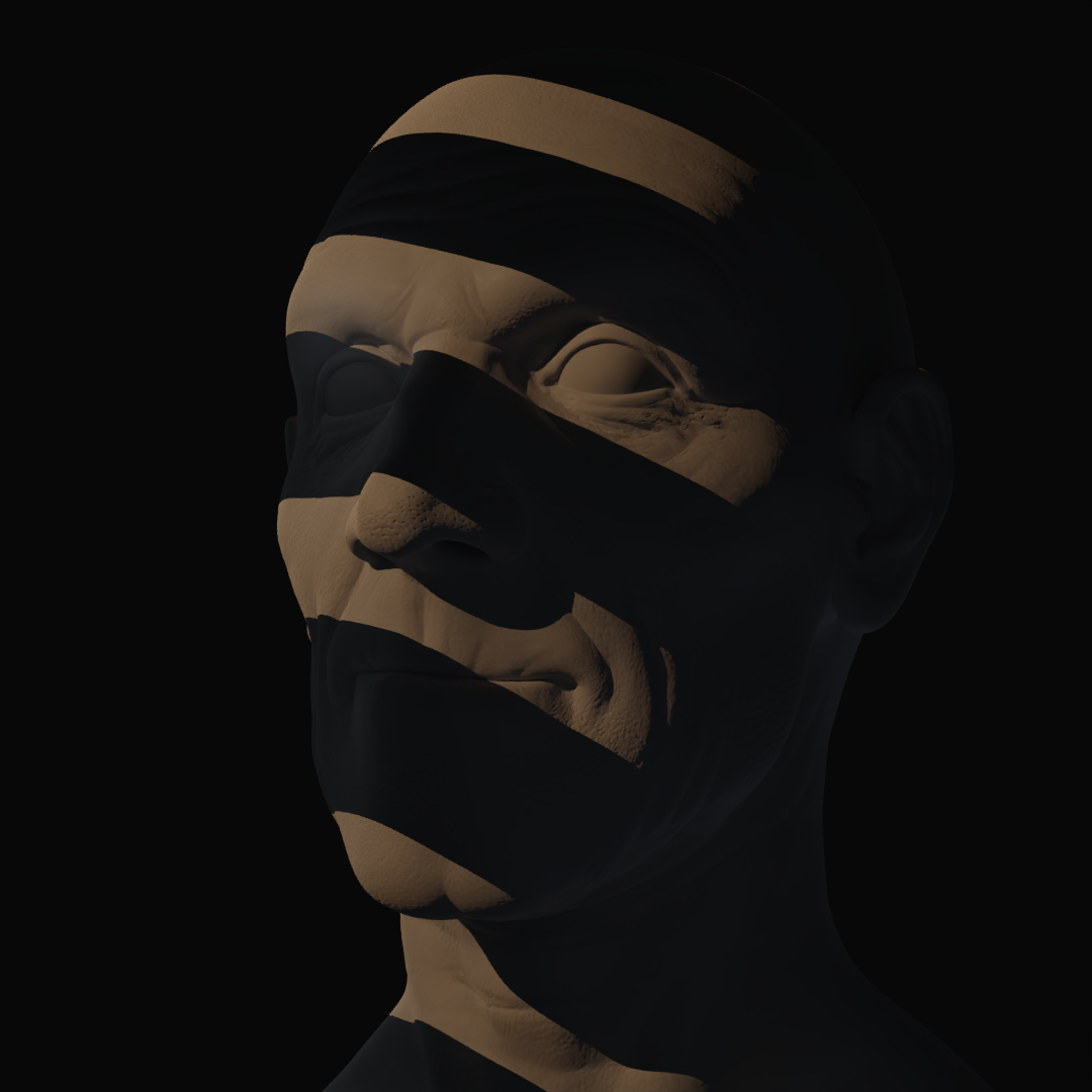
Then tried copying this. I still feel like the blue lighting is not ‘intense’ enough, but I was getting annoyed at it so tried something different for a bit.
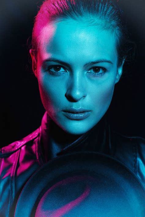
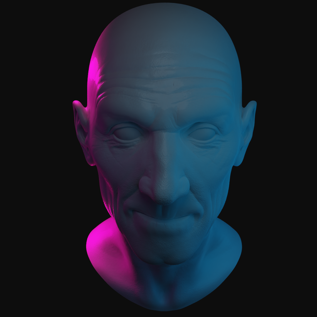

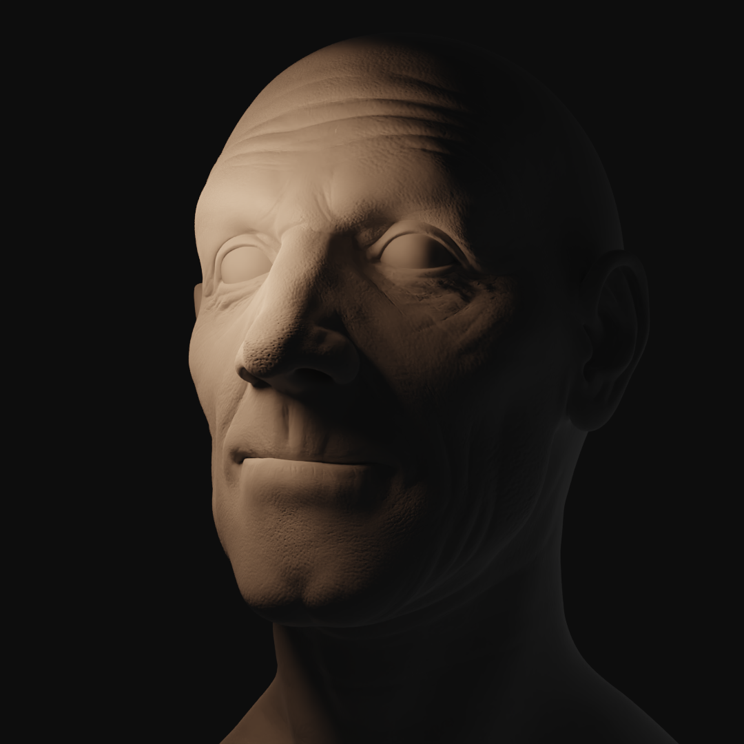
Which I’m also not sure about. On one hand, the main lighting definitely looks lighter and yellower in mine. On the other hand, I can’t quite decide if the light is lighter and yellower in mine or if it’s just because Mr. White Clay Material here is much, much paler than the guy in the photograph.
I was unable to find who the first photo is or who took it, I just keep getting caught in a spiral of people posting it on Pinterest, so if you find it, I’d love to know where.
The second photo I found on an article here but the photographer is Yuri Manei
That’s all I’ve done so far.

