
Reply To: Addyson_H. -Sketchbook
Forum Archive › Addyson_H. -Sketchbook › Reply To: Addyson_H. -Sketchbook

@addysonh I guess what I’m asking is what are you trying to communicate with these drawings? It looks like someone mildly enjoying sitting next to a stream in chillier weather.
Everything is overly blurry, which is okay; that can be corrected. The value range also feels quite limited. There are a lot of mid range values, but not a lot of darker values in the dress, hat, hair, etc.
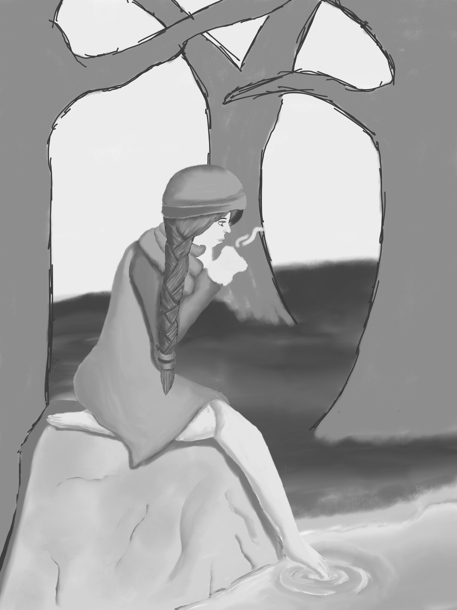
Your face is also quite small compared to the hat and hair, which is also throwing off the rest of the proportions. The leg in the water is also longer than the leg curled under. That’s okay, just double check in the future that the legs are the same length. The arm is actually pretty decent anatomy-wise. I suggest picking up some books on anatomy to help develop your understanding, like Figure Drawing for All It’s Worth.
The colors could use some help from hue shifting to just make things pop more. It’s a common beginner mindset to just make the base color darker or lighter, and that’s okay, but that’s not what is usually happening in nature. Take a look outside at different points of the day and really observe how the light interacts with the color of the grass, trees, the siding on your house. Are the shadows really black, or are they maybe a bit bluish? Are the tints really white, or are they yellowish from the sunshine? How do the colors change throughout the day? Color and Light is a great book that talks about this sort of stuff.
Anatomy and clothing go hand in hand since you need a firm understanding of anatomy to understand how clothing drapes over the forms. The dress is oversimplified, i.e. the clothing doesn’t fold over the legs in a realistic way. Similar idea for hair, too. The hair feels like a straight tube, not strands of hair moving over and under each other. Hair also tends to taper at the ends a little bit because unless it was recently cut, the lengths of each hair will differ from daily wear and tear. References are your best friend.
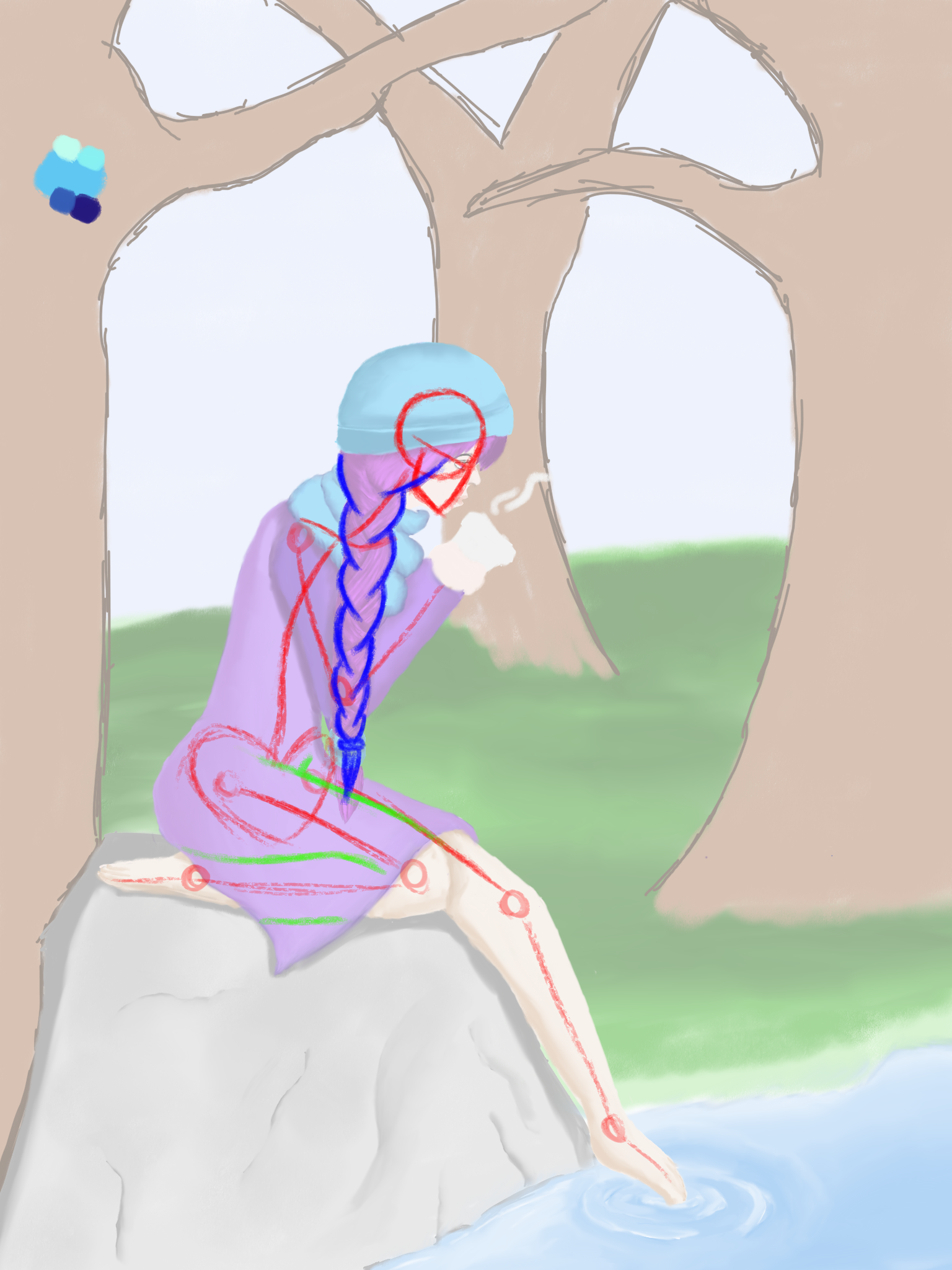
The red is the anatomy outlined for better visibility, blue for the hair, and green for folds in the dress and how it would hang off the form.
I hope this doesn’t discourage you; I know it’s a lot of feedback. It’s probably overwhelming and maybe you’ll think creating art isn’t worth it. I hope not because I wish I had someone to guide me when I was first drawing. Maybe I’d be better than I am today, but I can’t change the past. I can, however, help guide others towards creating the best art they can today. Keep drawing and improving yourself. You got this.