@theluthier hank you for your detailed comments and suggestions. That´s very helpful:)
Actually I had painted more variations in the texture. Gradient, first with big smooth brush then smaller brushes, and at least 2 different colours&different falloff (without culling) on every side for smaller strokes. For the colors (3 because it was convenient) I chose monochromatic -I like that.
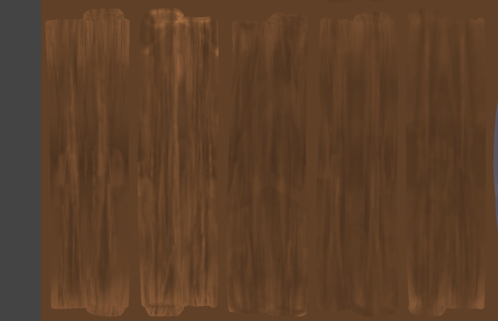
On the object the variations are hardly to be seen due to the resolution. I was too carefully and focused on the settings. Learning effect.
But..hmm..so much brighter on one end than the other at the same plank.I am not so happy with this idea even if it looks very good at the barrel of n647. I don’t want that please– laugh.
However: a compromise:
It really might be more interesting with broader grandient variety.
I would like to add Color Nr. 4 for some lighter areas so it is more visible also on the object.
But not on the same plank but distributed over all planks. So the planks do have more differences from each other.
All in all I would like to achieve a restful, quiet effekt/look (if this sentence make sense).
I hope I still have time this week.
There are some troubles with the shading&lightning part.

