@silentheart00 I don’t mean to suggest dark isn’t a good mood to go for. I just think dark isn’t the same as dim. Darkness can be achieved with colors (blues and purples for example) without being so dim that it’s hard to tell what’s what. Currently your scene feels too dimly lit imo more than it conveys a certain mood. If the viewer gets the feeling that the image is too dim to understand the contents then why does it exist, you know?
Granted I don’t know exactly which mood you’re going for, but here’s some examples of dark and moody scenes that are still lit appropriately and not too dim:

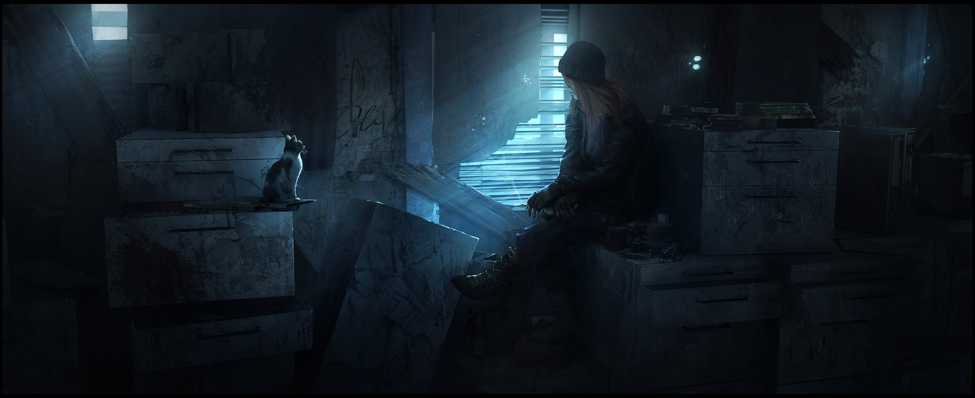
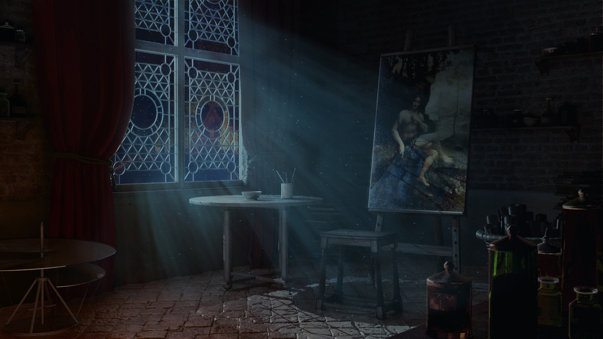 Hopefully those are helpful to convey what I mean. I like the work you’ve done and I like the effort toward dark and moody! It’s just a shame that I can’t make out the details clearly due to the dim lighting.
Does that make sense?

