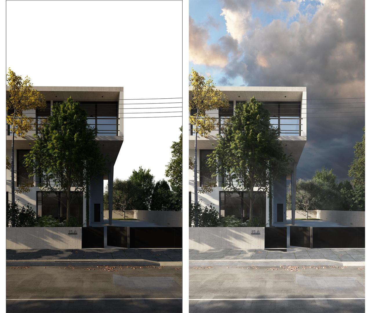
How can I make this mock-up more realistic?

Forum Archive How can I make this mock-up more realistic?

Viewing 6 posts - 1 through 6 (of 6 total)
  • Author
    Posts
  • #17396
    Juan M Muñoz
    Participant

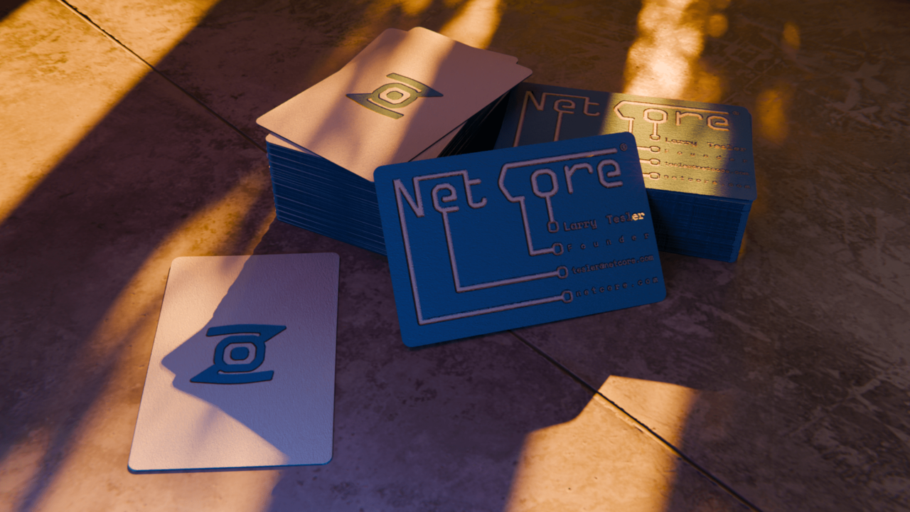
      I’ve made this mock-up for some business cards that I’ve made up. I added a sun, some tree shadows, several indirect sources of lights (white, pink, blue) with some glare in the compositor: Fog glow and streaks… and to me it seems a little bit more GTA 6-ish than realistic. What is my render missing? (I know it’s a little bit underexposed)

      ck-up render-min.png

      #83663
      Juan M Muñoz
      Participant

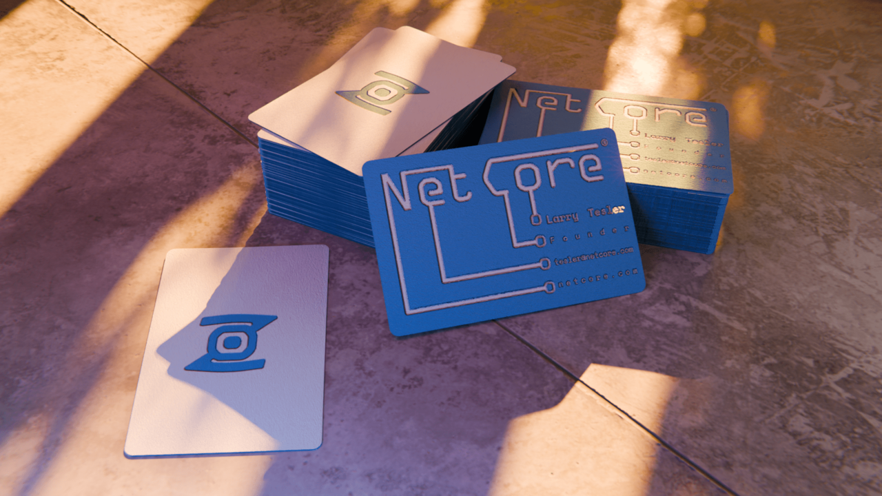
        Here is one a little bit more exposed:
        k-up render1-min.png

        #83664
        Omar Domenech
        Participant

          Well you’ve just touched on one of the most complex topics, realism. So much goes into it and it’s very hard to point your finger on a specific reason. It can be the most subtle thing, color grading, lighting, shaders, fresnel, IOR, camera noise, camera lens, depth of field, not enough detail, anything that varies by a bit can throw things off, so it’s an art from and it takes so much practice to develop the eye and make all the tiny right choices along the way. One thing that can help is trying to imitate by taking a photo with your phone and trying to match a render the best you can. If you practice a lot your brain starts to pick up on things.

          In you render I guess the color grading? Maybe the colors are too vivid and goes into videogame territory? You brain might be telling you it doesn’t look real, as to why and how to correct it is a whole different beast.

          #83665
          Juan M Muñoz
          Participant

            Thank you @dostovel for that elaborated and thorough response. You are right: I payed special attention to shaders and textures, trying to imitate the texture of a granulated piece of paper for a business card. I also played with the depth of field an all the distortions that a camera has… but the colors, as you stated, are really vivid. Probably I should make the color of the card more in touch with the sunset atmosphere. What does @spikeyxxx think?

            #83666
            Omar Domenech
            Participant

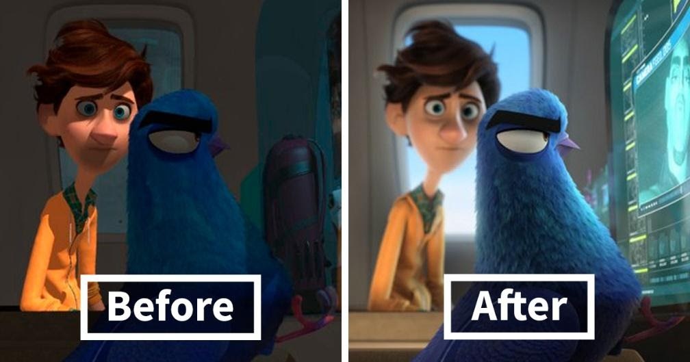
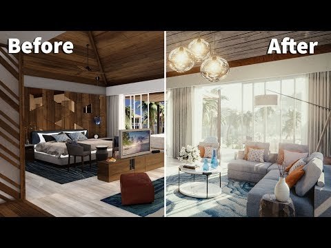
              Yeah texture, shading and lighting are big ones. You can see a clay render with great models and it looks cool. Then give that scene to two different persons and they will shade it and light it in different ways and the result will be totally different.It’s all about the composition.

              S2EEQdpVsmZO8WA.jpeg

              hqdefault.jpg

              fu1i8d9h2u261.jpg

              #83667
              Martin Bergwerf
              Participant

                Well Juan,

                I totally agree with Omar; it is a combination of things..I think focal length and depth of field are extremely important when it comes to realism..

                What looks ‘wrong’ to me, is the table…it looks to me as if it is flat (apart from the groove), like a photo of old wood, stuck on a flat plane…this could be due to the angle, but it diverts my attention from the main subject.

                With some magical compositing, that could probably all be ‘fixed’…

                But this is really not my field of expertise, I still struggle with composition and lighting…Omar is a lot better at this!

              Viewing 6 posts - 1 through 6 (of 6 total)
              • The topic ‘How can I make this mock-up more realistic?’ is closed to new replies.